


 Banamex Logo (Citibanamex Logo) PNG
The Banamex Logo represents Banco Nacional de México, a Mexican bank serving individuals and businesses. Its name connects the brand to the national banking system, while its services span savings, lending, and investments. Customers turn to the bank for everyday payments and financing for personal goals and business plans.
Banamex traces its roots to June 2, 1884, when Banco Nacional de México, later known as Banamex, was formed through the merger of Banco Nacional Mexicano and Banco Mercantil Mexicano. The first was backed by Paris bankers and held a government concession. Meanwhile, the second relied mainly on Spanish and German capital. José Valentín del Collado Albo became the first director.
From the start, Banamex held a privileged role in Mexico’s financial system. Its banknotes were once the only ones the federal government accepted for tax payments, and it served as a financial intermediary between President Porfirio Díaz and foreign creditors. The bank opened branches in Mérida, Veracruz, Puebla, Guanajuato, and San Luis Potosí, issued Mexico’s first bank check in 1886, and by 1937 controlled 36 of the country’s 50 bank branches.
In 1946, Banamex launched Mexico’s first drive-in banking service. From 1955 to 1964, it expanded into consumer loans and mortgages, then introduced Latin América’s first credit card and ATM. In 1982, after the debt crisis and the peso collapse, President José López Portillo nationalized Mexico’s private banks and placed Banamex under state control for 9 years.
In 1991, under President Carlos Salinas de Gortari, the government privatized Banamex. A group led by Roberto Hernández and Alfredo Harp Helú, founders of Accival, bought about 71% of the company for roughly $4.6–5 billion, forming Grupo Financiero Banamex–Accival. After the 1994 peso crisis, the bank entered the FOBAPROA rescue program and repaid it by 2000. In August 2001, Citigroup bought Grupo Financiero Banamex-Accival for $12.5 billion, later creating the Citibanamex brand and merging it with Citibank’s Mexican operations.
Meaning and History
What is Banamex?
It is one of Mexico’s largest financial institutions and a subsidiary of Citigroup. It combines local market knowledge with global banking expertise. The bank provides investments, asset management, and corporate and retail banking services. It has an extensive nationwide network of branches and ATMs that serves a diverse clientele.
1884 – 1959

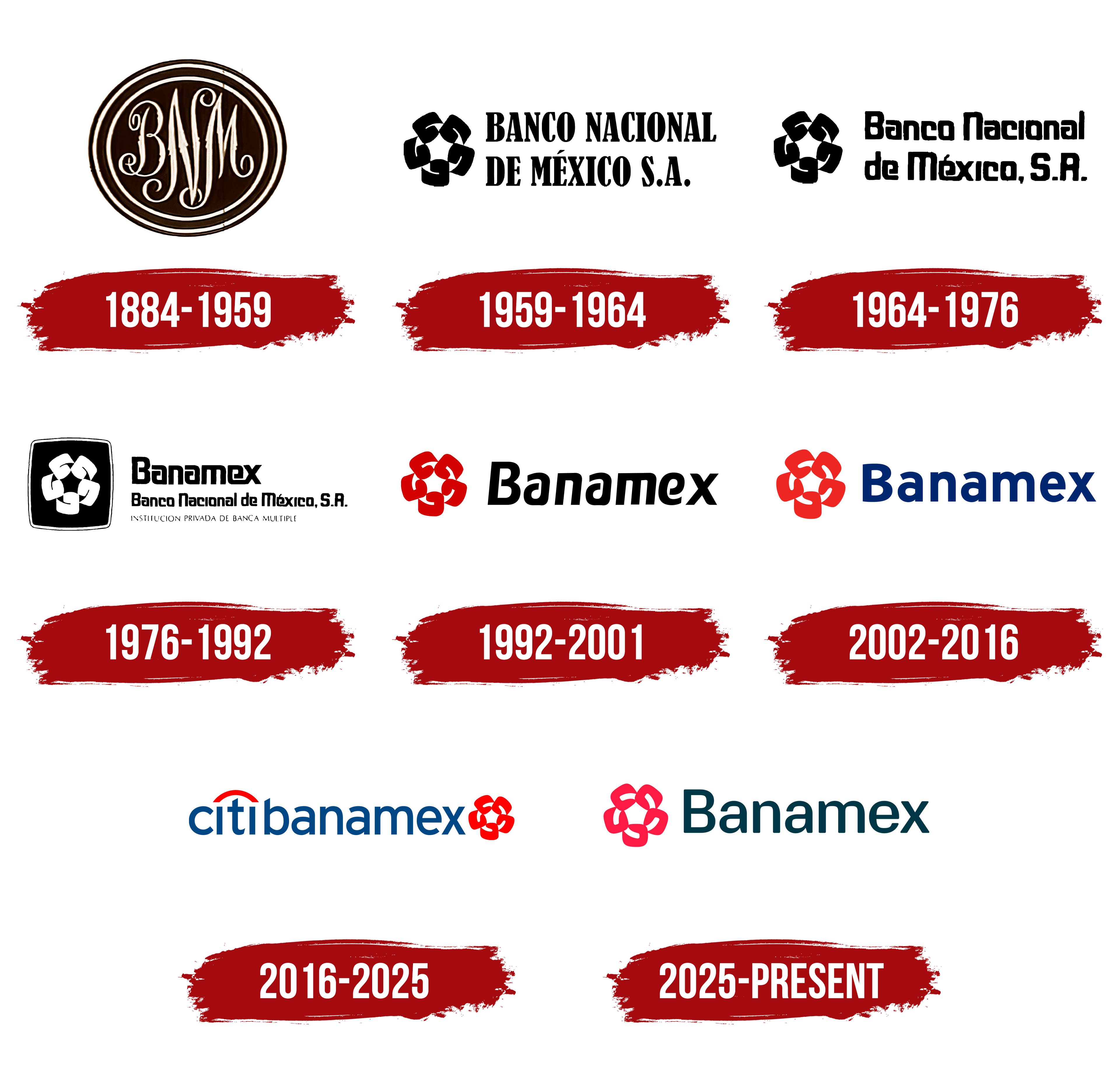
Banamex’s early identity was based on its full name, Banco Nacional de México, or “National Bank of Mexico.” The institution was established on June 2, 1884, through the merger of Banco Nacional Mexicano and Banco Mercantil Mexicano. Its first logo featured the initials “BNM” in a seal-like monogram. Landor Associates is credited with the design.
The emblem consisted of a dark circular medallion bordered by several concentric lines. Three elongated letters intertwined inside, with a tall “N” establishing the composition’s vertical axis. The calligraphic design combined heavy main strokes with fine connecting lines, while flourishes filled the spaces around the initials.
The name Banamex came from a different way of shortening the bank’s full name. It combined three fragments, “Ba” from Banco, “Na” from Nacional, and “Mex” from México. Unlike the initial-based monogram, Banamex formed a distinct word that gradually became a brand name in its own right.
1959 – 1964

A later Banamex logo paired the bank’s full name with a rosette. The words “BANCO NACIONAL DE MÉXICO S.A.” appeared on two lines in narrow uppercase serif letters with heavy strokes.
The rosette consisted of five identical elements arranged around a common center. Their edges defined a star-shaped opening between them.
1964 – 1976

Another version of the Banamex logo changed the lettering while retaining the two-line arrangement. The name used a tightly spaced, upright sans-serif typeface. Initial capitals were followed by lowercase letters. Curved letterforms became almost rectangular, giving the typeface an angular appearance.
The name included “S.A.,” an abbreviation of the Spanish “sociedad anónima,” meaning a corporation owned by shareholders. It identified the bank’s legal structure.
1976 – 1992

The shortened name Banamex appeared alongside the emblem in the bank’s visual identity program, introduced on January 6, 1975. A large Banamex wordmark appeared to the right of the symbol, with the bank’s full name retained below. An expanded version included the line “Institución privada de banca múltiple,” identifying it as a private bank offering a full range of banking services.
The rosette appeared as a light design inside a dark square with rounded corners and a thin outline. Its five components were interpreted as connected “B” letters. Each represented one of five organizations: Banco Nacional de México, Financiadora de Ventas Banamex, Financiera Banamex, Hipotecaria Banamex, and Seguros América. The letters were arranged at different angles around a common center. The spaces between them formed a five-pointed star.
Walter Landor Associates developed the program with Fernando Mercado del Collado. He refined the symbol’s design and proportions, along with those of its frame, developed the identity guidelines, and helped implement them. The palette consisted of ochre and brown tones, which Mercado associated with the brand’s Mexican character. These colors helped distinguish Banamex from financial institutions that favored blue.
1992 – 2001

The updated 1992 Banamex logo paired a red rosette with the shortened name in black. The square frame was removed. This version remained in use until 2002.
The name was set in custom lettering. The letters had a slight rightward slant and softened edges. Their forms were intended to complement the rosette and give the name a contemporary appearance. Ricardo Salas, Tullia Bassani, Gabriela Ricoy, Dorothea Flury, Rogelio Cuevas, and Mónica Puigferrat worked on the typography.
2002 – 2016

Banamex’s integration into Citigroup was reflected in its 2002 logo. The Mexican brand adopted a visual identity similar to Citibank’s. The redesign followed Citigroup Inc.’s acquisition of Grupo Financiero Banamex-Accival on August 6, 2001. After the acquisition, the group became Grupo Financiero Banamex.
Lippincott & Margulies designed the logo. The red rosette remained on the left, while the name on the right changed to blue. The red-and-blue combination connected Banamex to the American Citi group’s visual identity. The name used Interstate Bold, a bold sans-serif typeface, with an uppercase “B” followed by lowercase letters. Upright lettering with even strokes replaced the previous slanted design.
The 2002 version remained in use after the 2016 rebranding. It can still be found on payment terminals in some locations.
2016 – 2025
The new name Citibanamex, announced on October 4, 2016, reflected the bank’s relationship with its parent company, Citigroup. It combined the international Citi brand with the historic Mexican name Banamex. The name change accompanied a program to modernize banking services. The new logo retained symbols from both brands.
The name appeared on a single line in blue lowercase letters. The rosette moved to the right end of the wordmark, and a red arc appeared above “citi.” The five-part emblem represented the bank’s Mexican history, and the arc identified its connection to Citi.
The arc originated in the identity Paula Scher designed at Pentagram in 1998 following the merger of Citicorp and Travelers Group. The design drew on the Travelers umbrella. The curved line above the name suggested its canopy, while the vertical stroke of the “t” served as the handle. This simplified umbrella became part of the Citibanamex logo, where it appeared alongside the Mexican bank’s rosette.
2025 – today
The return of the Banamex name came as part of Citibanamex’s split into two financial groups. The planned changes were announced on May 28, 2024, and the separation took place on December 1. Grupo Financiero Citi México combined Banco Citi México, which serves institutional clients, with the brokerage firm Citi México Casa de Bolsa. Grupo Financiero Banamex continued serving individuals and small and midsize businesses through Banco Nacional de México, known as Banamex.
Interbrand began developing a separate identity in July 2023. The agency was tasked with introducing Banamex to a young audience while preserving the historic brand’s defining features. The new identity began appearing in December 2024. The agency officially unveiled the new identity and returned to the Banamex name on March 3, 2025. The update was accompanied by the slogan “Aquí. Para ti. Siempre.” or “Here. For you. Always.”
The Citi portion of the name and the red arc were removed from the logo. The rosette returned to the left of the name. Its five components received simpler, smoother outlines and a bright reddish-pink color. The star-shaped opening at the center remained. The bank associated the symbol with its willingness to evolve alongside its customers.
The dark blue-green Banamex wordmark begins with an uppercase “B.” Arilla Type developed a custom typeface, Banamex Display, for the design. The letters’ broad, rounded strokes echo the rosette’s contours, visually connecting the name and emblem.
The expanded palette included over 24 additional shades. Graphic elements were developed in both flat and three-dimensional versions with textured surfaces. Plenty worked with Interbrand to create animation based on the emblem’s geometry. Sixième Son developed the sonic identity around a new interpretation of the Leonora Banamex melody.