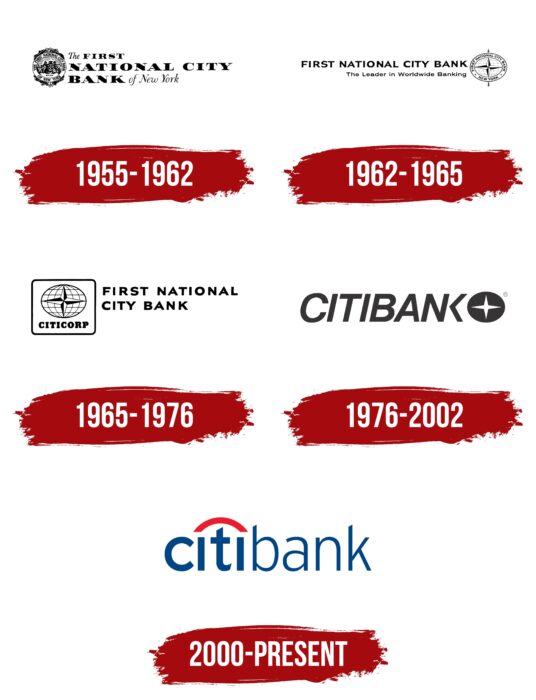
The Citibank logo represents a bank that works for city dwellers. The institution guarantees the protection of deposits and financial transactions of clients. The emblem focuses on the well-being of depositors and the ability to do business.
Citibank: Brand overview
| Founded: | June 16, 1812 |
| Founder: | Citigroup |
| Headquarters: | New York, U.S. |
| Website: | citi.com |
Meaning and History
Before getting the current name and logo, the bank went through many mergers and consolidations. Its graphic symbol often changed: it has come a long way of evolution from a four-pointed star to a red arc imitating an umbrella. The modern branding system was created by specialists from the New York agency Pentagram. The designers not only developed the distinctive Citibank sign but also thought over to the smallest detail how the facades and interiors of the branches should look.
1955 – 1962
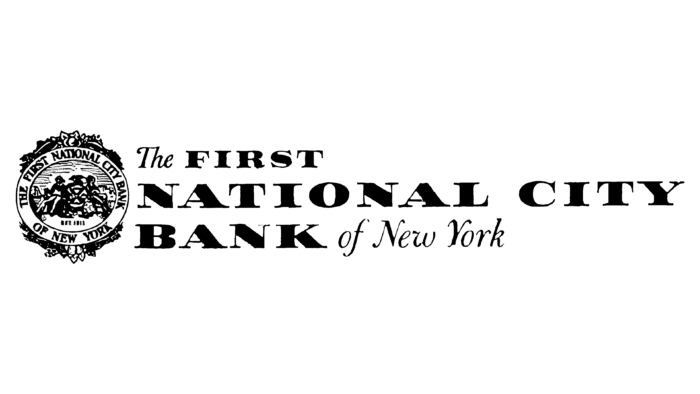
In 1955, First National Bank of New York and The National City Bank of New York merged to form The First National City Bank of New York. The new financial institution received a logo containing its name. It was divided into three lines and written in two different fonts: for the article “The” and for the words “of New York,” a handwritten typeface imitating calligraphy was used, and for the phrase, “FIRST NATIONAL CITY BANK,” a high-contrast font with long thin serifs was chosen.
The emblem on the left depicted two people: a sailor and a hunter. They sat next to a round stone, complemented by a pattern of windmill blades and barrels. On it sat a hunting bird. In the background, a sailing ship was sailing, and a forest could be seen. All this was placed in an oval, decorated above and below with fruits, berries, vegetables, and corn cobs. In the annular frame was the inscription “THE NATIONAL CITY BANK OF NEW YORK,” and under the seated people – “EST. 1812”
1962 – 1965
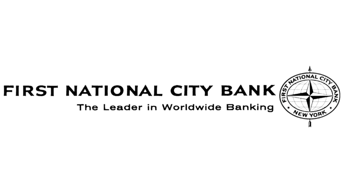
The full name of the financial company occupied the top line, and below it was the slogan “The Leader in Worldwide Banking.” On the right, the designers placed a new emblem in the form of an oval grid of degrees, consisting of parallels and meridians. It was divided by a black and white four-pointed star, reminiscent of compass needles. This symbol said that the bank is an international organization and works in all directions. The inscription “FIRST NATIONAL CITY BANK NEW YORK” without the preposition “of” was duplicated in a ring-frame and separated by two small five-pointed asterisks. The oval was pierced with an arrow, the ends of which looked out from above and below.
1965 – 1976
The designers removed some elements and changed the structure of the logo. An oval with a degree grid and a four-pointed star was on the left. Beneath it was the word “CITICORP.” This part of the logo was placed in a rectangular frame with rounded corners. The phrase “FIRST NATIONAL CITY BANK” was split into two lines on the right.
1976 – 2002
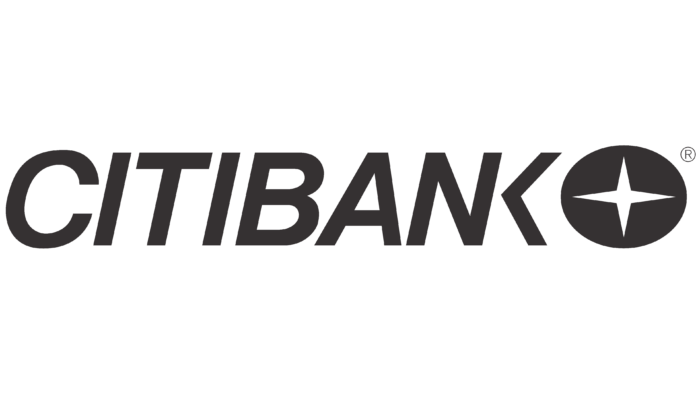
In 1976, the financial company was named Citibank, and a new logo was created in 1975 by Anspach Grossman Portugal. Two employees of the New York consulting firm worked on the visual style of the bank: chief designer Dan Friedman and his immediate supervisor, art director Gene Grossman. They simplified the existing emblem as much as possible by making the four-pointed star white and placing it in a filled-in black oval. The typography of Wolfgang Weingart inspired the “CITIBANK” lettering. The developers have made all the letters bold and italic. In doing so, they combined “N” with “K” – so that they had a common line.
2000 – today
The current logo cost Citibank $1.5 million. This is how much was allocated from the total 10 million budget intended for brand renewal by Pentagram designers. But it so happened that Paula Scher, the founder of the New York agency, drew the emblem on a napkin at the first meeting with clients. It took her no more than ten minutes. Citibank representatives initially refused to pay 1.5 million for such work, yet they had to do it: the value of the logo justified the costs.
The fact is that the rebranding was carried out after the merger of Travelers Group and Citicorp. Their executives wanted the new visual symbol to reflect elements of the identity of both organizations: the classic red Travelers umbrella and the first half of the Citicorp name. And everything had to look harmonious, combined in one picture. Paula Scher combined aspects of the identity of the two companies: she depicted the word “citi” with a red arc at the top. As a result, “t” looks like an umbrella handle. This know-how is part of the Citibank logo, used worldwide since 2001.
Font and Colors
The bank inherited the umbrella from one of its predecessors, the Travelers Group. Its characteristic curved shape can be recognized in many elements: for example, in ATM kiosks or the architectural details of branches. In the logo, the umbrella is represented by a red arc that replaces the dots over the “i” and forms an arch over the “t.” This is a symbol of merging two financial institutions into one streamlined brand.
The first half of the lettering (“citi”) uses Interstate Regular, a sans serif created by typographer Tobias Frere-Jones and published by The Font Bureau, Inc. It is characterized by unusual cuts at the ends of the letters. The designers chose the same typeface but less bold for the second part of the name (“bank”). The Interstate font family was developed from 1993-to 1999. It was based on Highway Gothic, designed for road signs in America and Asia.
The Citibank logo combines two multicolored elements: a red arch and a dark blue inscription. The red is a nod to the Travelers Group emblem, which featured an umbrella in that color. Blue is part of the Citicorp identity. It was originally included in the interiors of the branches and was inherited by Citibank.
Citibank color codes
| Dark Cerulean | Hex color: | #004684 |
|---|---|---|
| RGB: | 0 70 132 | |
| CMYK: | 100 47 0 48 | |
| Pantone: | PMS 2945 C |
| Imperial Red | Hex color: | #ec1b2e |
|---|---|---|
| RGB: | 236 27 46 | |
| CMYK: | 0 89 81 7 | |
| Pantone: | PMS Bright Red C |
