


![]() Citigroup Logo PNG
Citigroup Logo PNG
Protection from all adversity is the main theme of the Citigroup logo. The emblem evokes a feeling of comfort and home. The bank treats customers like family members. Thanks to the organization’s impressive cash dome, there is nothing to worry about.
City Bank of New York was founded in June 1812 by New York merchants with $2 million in capital. Led by Samuel Osgood, it financed trade and issued war bonds during the War of 1812. After the Panic of 1837, Moses Taylor took control and expanded its role in coal and railroad finance.
In 1865, the bank became The National City Bank of New York under a federal charter. It opened a foreign department in 1897 and by 1915 ranked among the leading US banks in international operations, with over 100 overseas offices by 1939.
The Glass-Steagall Act of 1933 forced a withdrawal from securities business. In 1955, the merger with First National Bank of the City of New York formed First National City Bank. The structure shifted to a holding model in 1967, and Citicorp was renamed in 1974, while Citibank became the main brand in 1976.
In the late 1970s, Citicorp expanded ATM networks. By the early 1990s, Citibank operated in more than 90 countries and became a major credit card issuer. On April 6, 1998, Citicorp announced a merger with Travelers Group, including Salomon Smith Barney. The deal closed on October 8, forming Citigroup.
In 2001, Citigroup acquired Grupo Financiero Banamex. During the 2008 crisis, heavy losses led to $45 billion in TARP support. In 2009, the business split into Citicorp and Citi Holdings, followed by a $21 billion share sale. In 2021, Jane Fraser became CEO and began restructuring operations.
Meaning and History
![]()
This banking structure has an even more ancient origin, dating back to 1791. It was then that the First Bank of the United States was established, but it went bankrupt a few years later. In 1812, its New York branch became independent and was reorganized into the City Bank of New York.
In 1865, he was granted a national bank charter and a work permit by the Treasury. Unlike many other financial services, the new player combined large-scale investment projects with retail deposits and operations, making it a winner. Gradually, he moved on to takeovers of competitors.
Later, in the 20th century, the bank became a powerful financial instrument at the international level. It received its name, reflected in the emblem, from the “progenitors” CITIcorp and Travelers GROUP. Overall, there are about seven logos in his career.
What is Citigroup?
Citigroup is the largest banking institution headquartered in New York City. It has more than 200 million customers across more than 160 countries. It’s now the third-largest bank in the U.S. It’s a multinational investment and financial services bank that is part of the Big Four. It was formed in 1998 by the merger of Citicorp and Travelers Group, but the latter separated in 2002.
1976 – 1980
![]()
Citicorp had a monochrome logo with simple elements. It showed the bank’s full name and a round icon with a white four-pointed star at the bottom right. The letters were very close together and almost merged visually. The font was straightforward, from the Sans Serif category.
1980 – 1998
![]()
After the redesign, the spelling of the word “Citicorp” changed: it became slanted. The font received elegance and refinement, and the black sign with a star was rearranged into a single row, with the name at the end of the word.
1993 – 1998
![]()
The Travelers Bank logo was colorful and original because it featured a red umbrella. He personified protecting clients from trouble. The umbrella was at the end of the title, which was written in a serif typeface.
1998 – 1999
![]()
During this period, the fateful merger of Citicorp with Travelers Inc. The result was a financial and banking organization called Citigroup with a combined logo. The background was a gradient blue; the name was white, and the umbrella was red. Moreover, he was still at the end of the inscription, covering the last letter “P.”
1999 – 2007
![]()
The developers have changed the logo’s font, making it thinner and lighter. Although the letters do not have serifs, in some places, they are replaced by oblique cuts, for example, “t” and “p.” The letters are blue, and the umbrella is bright red as before.
2007 – 2011
![]()
Earlier, designer Paula Scher at Pentagram proposed her vision for the corporate logo, which was approved by the bank’s board. It was “Citi” with an inverted parenthesis above it. In essence, the arch denoted an umbrella, which was simplified into an upward-curved stroke. Paula created her logo in ten minutes on a napkin, for which she received half a million dollars. During the indicated period, the text was gray, and the bar was red.
2011 – today
![]()
The developers returned the inscriptions to their original blue color without touching any other details. Today, the Citigroup branding looks the same as it did in 1999 when it debuted.
Font and Colors
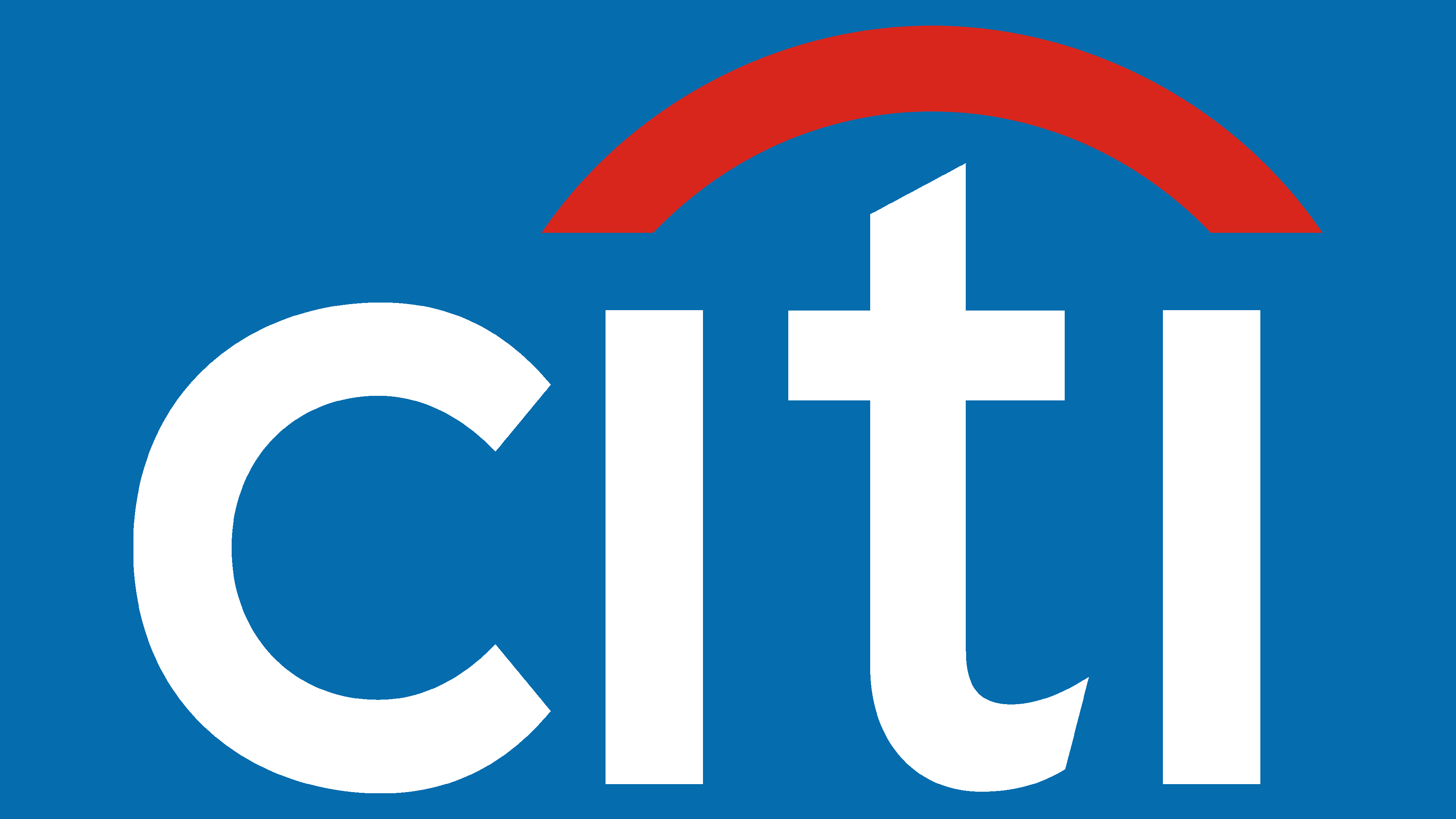
The bank’s identity has undergone a major change, reflecting the combination of the two financial institutions’ logos. The result is clear visual identification: a printed text of the first four letters of the name “Citi,” with an arch connecting the two “i”s and closing the “t.” That is, the authors have retained elements of the two previous structures while adding modern features.
After forming the new bank, the designers chose the commercial typeface Interstate Regular, designed by Tobias Frere-Jones, for its logo. It is a well-read sans serif with a medium intersymbol space and angled “t” and “p” legs. Its free counterpart is the Blue Highway-Regular font.
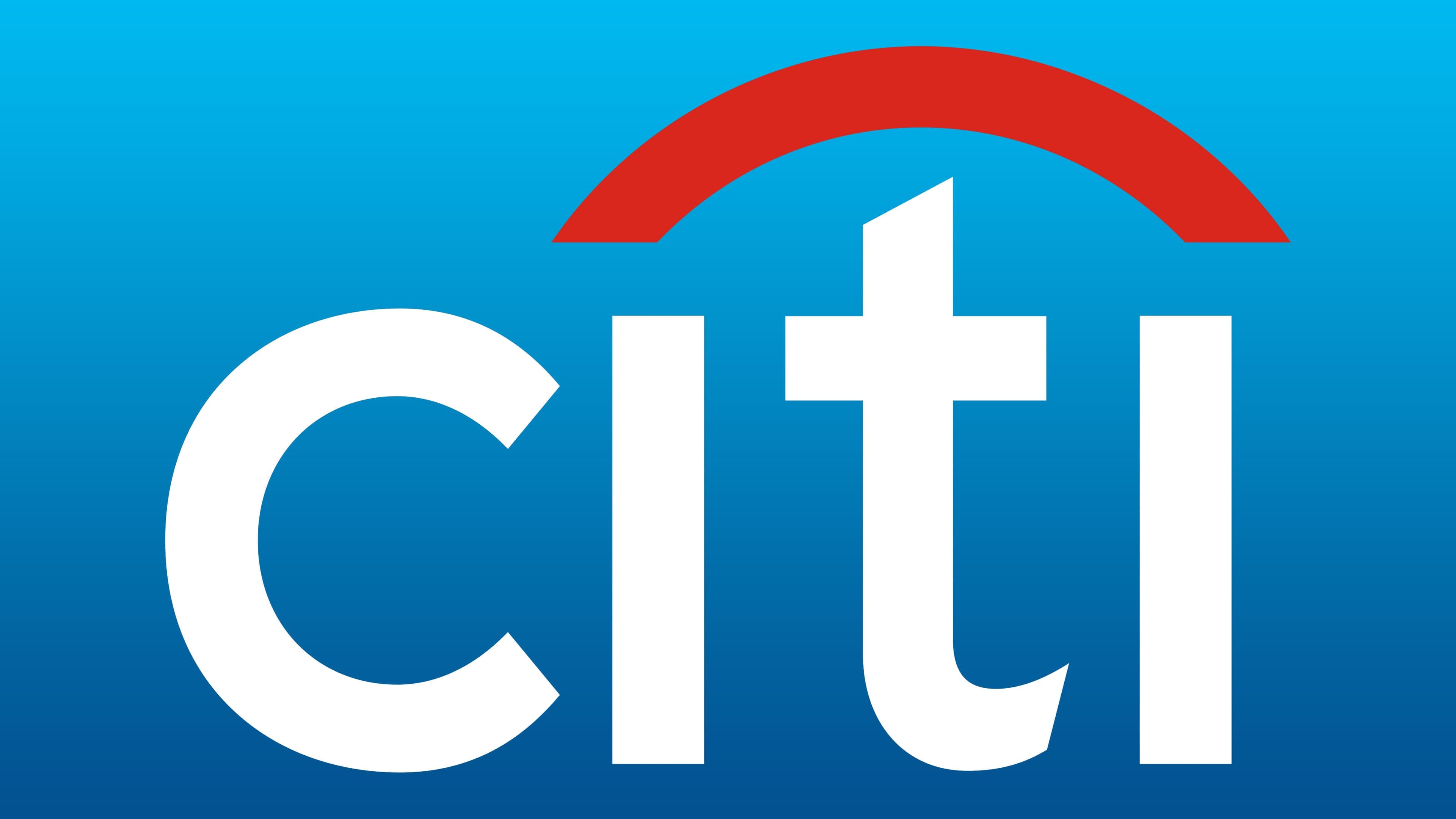
The logo’s palette consists of vibrant colors: Maximum red (#DB230B) and Ateneo blue (#003A72). Visually, they are perfectly combined and stand out strikingly against each other.
FAQ
What is the entity name of Citigroup?
The entity name is CITIGROUP INC. This is the legal name under which the company is registered and operates.
Citigroup Inc. is a major global financial services corporation offering a range of products and services, including consumer banking, corporate banking, investment banking, and wealth management.
The brand operates in many countries, making it one of the world’s largest financial institutions. With headquarters in New York City, Citigroup Inc. serves millions of customers, from individual consumers to large corporations and governments. The company provides innovative financial solutions and maintains a strong global presence.
Is Citigroup the same as Citibank?
Citigroup and Citibank are related but not the same entity. Citibank, N.A. (where “N.A.” stands for “National Association”) is the main U.S. banking subsidiary of Citigroup, a global financial services company.
Citibank was founded in 1812 as the City Bank of New York and later became the First National City Bank of New York. Citigroup’s consumer banking division offers checking and savings accounts, loans, credit cards, and mortgages.
Citigroup is the parent company that provides a range of financial services worldwide. These include consumer banking through Citibank and corporate banking, investment banking, wealth management, and more.
Is Citigroup a US company?
Yes, Citigroup Inc. is a U.S. company. It is an American multinational financial services corporation based in New York City. It is one of the world’s largest financial institutions, offering services including consumer banking, corporate banking, investment banking, and wealth management.
The company was formed from the merger of Citicorp and Travelers Group. This created a financial giant with a global presence, operating in more than 160 countries. The company is divided into two main segments: Citicorp, which handles traditional banking, and Citi Holdings, which includes brokerage and asset management.
As an American financial conglomerate, the brand plays a major role in the global financial system. It serves individuals, corporations, governments, and institutions worldwide.
Who owned Citigroup?
Citigroup is a global, publicly owned financial services company. It is owned by shareholders who hold its publicly traded stock. The largest shareholders include Vanguard, BlackRock, State Street Corporation, and Berkshire Hathaway. These major institutional investors own significant portions of Citigroup’s shares and substantially influence the company.
Over the years, the company has become one of the world’s largest financial institutions, serving millions of customers worldwide. The public ownership structure means that many investors, from large institutions to individual shareholders, influence the company’s performance and decisions.
What is the font of the Citigroup logo?
The logo uses the Interstate font, modified for a unique design. The most notable change is the letter “t,” which has a rounded bottom. This makes the “t” look like an umbrella handle, reinforcing the logo’s symbolism.
The rounded “t” fits perfectly with the logo’s convex top, giving it a large-umbrella look. This design choice represents protection and shelter, symbolizing the brand’s commitment to safeguarding its customers from financial risks.
Combining the modified Interstate font and the umbrella motif gives the logo a cohesive and meaningful look.
What does the Citi logo mean?
The logo represents the protection of customers from financial risks. Its iconic element is a red umbrella. Initially, the logo featured clear umbrella outlines, but they have since been stylized.
The current logo shows an inverted arch stretching from the left “i” to the right, with the letter “t” acting as the umbrella’s handle. This design symbolizes shelter and protection. In 2007, the logo was simplified by shortening the name to “Citi,” making it more modern and streamlined. The red umbrella remains a strong symbol of the brand’s commitment to protecting its customers’ financial well-being.