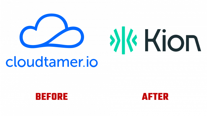
By announcing its rebranding to Kion 3.0, the cloud platform cloudtamer.io introduced its users to its new image and capabilities. The process resulted from a radical product update, the introduction of new functions, and improvements. All processes were optimized, many difficulties in use were solved, control was increased, transparency was ensured, and conditions were created to understand the right steps when making the right decisions. In addition, Kion 3.0 is the first and so far the only cloud-based tool that has been able to integrate financial and security managers to ensure that users get the most from the cloud.
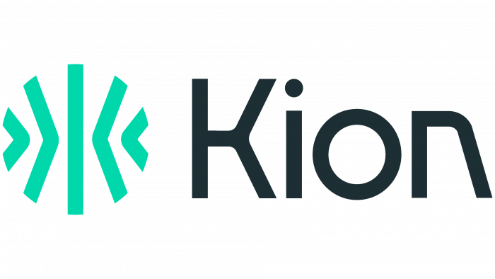
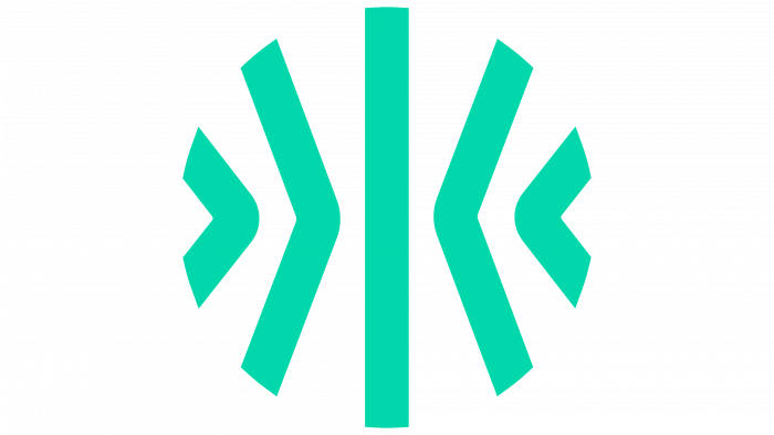
The update also affected the interface itself, which became automated and consistent, and gained financial management. Its visual changes are aimed at creating a new perception of an effective cloud platform. The new logo sign focuses on the platform’s purpose and on its essence, features, advantages, and new opportunities that open up to users. An element formed in a circle from several segments – a central vertical segment and several symmetrically inclined in a horizontal mirror reflection, demonstrates the absence of restrictions and a reflection of positive changes in all directions of using the platform. Inclined segments are inclined to the side in which they are directed relative to the central one.
To the right of the circle is the text – the cloud service’s name, whose letters were developed specifically for the brand. The uniqueness of the logo is provided by the graphics of the execution of the letter “K” and the execution of the “n,” the right leg of which is made flat, which symbolizes the gradual transition to the future transition to development without abrupt jerks and breaks.
The original combination of colors of the palette – light green elements in the circle and black text stand out in contrast against each other, providing catchy and clear reading and visual perception. The whole composition – simple and laconic in its execution, gives the emblem some dynamics informing the required perception and ease of understanding its meaning and symbolism. The sign and letter “K,” made equal in height, create a visual relationship. Despite the presence of gaps between us, such a construction creates the appearance of a smooth transition from the visual element to the textual part of the logo, uniting the entire composition into a single whole.


