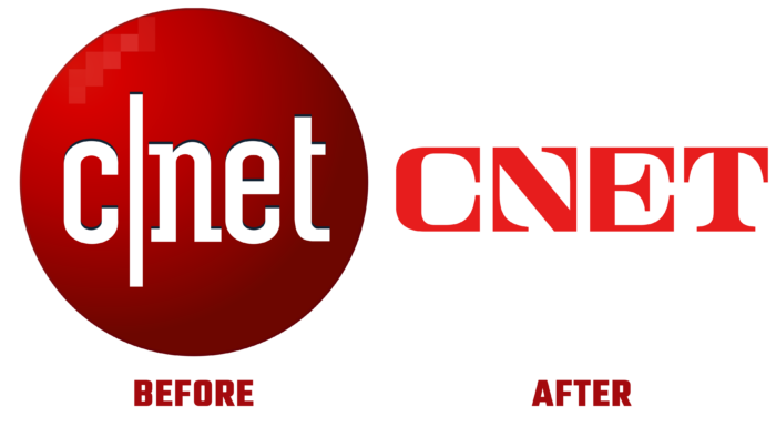
For 28 years, CNET, a popular web resource, has supported the information security of everyone interested in modern technologies. Following the achievements of the same technologies and the requirements of modernity, the media brand has undergone a radical rebranding. Now, with renewed vigor and vigor, it focuses on helping to achieve an understanding of what is happening in the world – in technology, medicine, finance, climate, entertainment, and much more. By keeping the same ways of presenting information in the form of reviews, articles, news, blogs and podcasts, and videos, the brand demonstrates its openness to improve and improve them, adding new options. Starting as a TV show, CNET has successfully “outgrown” this format, continuing to develop. The changes that have taken place at the moment, the change in the mission, and the complication of the tasks being solved necessitated changes in the resource’s visualization, which was completed.
In the new identity, the developers could reflect on the history, changes in strategy, the main goals, and objectives of the resource, managing to attract the attention of the whole world. The main task was to create an authoritative brand that deserves trust due to the provision of shockingly necessary and useful information and the presence of extensive experience in its field. The identity has managed to reflect the uniqueness of this form of service journalism.
The rebranding was based on elements of the previously canceled Doctrine of Justice, which required the presentation of different points of view in the media to ensure the possibility of comparison and the formation of the correct point of view. This approach required the creation of a new text block, with its graphics and design, inspiring confidence while pointing a new and correct direction for moving forward. Thanks to this, all information from the resource has gained significance, guaranteeing the absence of inconsistency in it.
In striving for everything new, the past’s legacy was considered. The square structure of the typefaces, the oversized serifs, the attention-grabbing N graphic, the quirkiness of the C, and much more reflected that truly appealing irregularity. At the same time, there was a place for bold surrealism, which contributed to the awakening of the imagination and promotion. The method emphasized the voice of identity, seeking to add pleasantness and optimism to this conversation while maintaining its individuality. All this made it possible to draw attention to the fact that the presented news becomes more than a summary of some conclusions. As a result, the entire flow of information provided becomes an important and useful tool that can improve everyone’s life.


