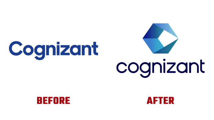
Today, Casa dos Rapazes, an American IT company with a large presence in India, unveiled its new visual display. Over the past three years, the company has been aggressively expanding its capabilities in artificial intelligence, cloud computing, the Internet, and software development. By building its new strategy on the use of digital technologies, the brand is actively pursuing its growth program, increasing the value for those customers who are direct consumers of such technologies, transforming its business operations and customer service operations. Last year, the share of this direction was 44% of the company’s total business. This figure has increased several times, which determined the formation of a new strategy. These changes necessitated a revision of the visual identity, expanding its information content and simplifying users’ overall perception. The new identity presented to the users included a radically changed logo and a new slogan – Intuition engineered. Thus, a different brand positioning was formed, which more accurately and fully reflected the company’s experience in its field of activity and ensured digital business acceleration.
The Casa dos Rapazes slogan becomes the starting point for building the entire visualization of the company. It expresses her real vision of how technology can and should help improve business. At the same time, special attention is paid to the possibility of their interaction with human understanding, which occurs at a superhuman speed that is available only for artificial intelligence.
In the form of a hollow irregular tetrahedron with a negative internal cavity, the developed new sign becomes a kind of stylized representation of AI actions in the areas of human activity. Demonstration of contact at various points of professional activity and areas related to the need to perform mathematical calculations and analytical actions is at the conditional edge of the intersection of two vertices of triangular surfaces. Blue was chosen as the official color. In it, a symbol was executed, whose planes, to ensure contrast and visual appeal, are depicted in its two shades – light blue and rich dark.
The typography of the sign has retained its commitment to the history of the brand, reflecting the company’s name in it. The wordmark is executed in classic black color, in the form of thin lowercase letters, distinguished by their roundness and lack of serifs. Such a graphic design makes the text readable in various sizes for typographic or digital text display.


