With the growing interest in artificial intelligence, Canadian company Cohere has updated its logo. What’s the connection? It’s direct. Cohere specializes in NLP – natural language processing models, which in turn improve the interaction between humans and machines. Therefore, at the beginning of 2023, it was decided to emphasize its affiliation with AI-building technologies through branding. To accomplish this, the company turned to Pentagram Studio.
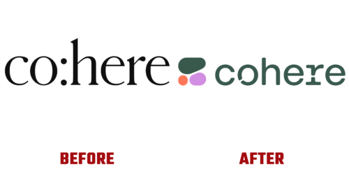
Designers were tasked with creating unique symbolism capable of simply illustrating NLP principles within digital technologies. The fact is that the previous logo was more related to the language theme and consisted of a classic inscription with an internal colon. Now, in light of recent events, the company wanted a technical sign symbolizing the new computer era. At the same time, the linguistics theme is still present.
The developer creatively solved the problem. They reimagined the image, using the concept of a new “nature” based on Georgy Voronoi’s template. It is a diagram named after the famous mathematician. Interestingly, a similar pattern is also found in biology: this is how a network of living cells looks, the ornament of fragments on insect wings, or the pattern of spots on giraffe skin. Cohere’s digital products are also a natural environment.
- The emblem consists of three freely arranged figures not touching each other. However, they are not arbitrarily positioned but strictly adhere to the principle of geometric compactness. The upper element corresponds in length to the two lower ones, despite their different shapes.
- The lattice design is also reflected in the inscription, located to the right. The wordmark is composed of ornate glyphs, two of which have cuts. These are “o” and “r.” All letters are lowercase, rounded, and with sloping sides. Serifs are absent. The custom font will be used for print and digital materials.
The improvised “cells” on the left are colored purple, dark green, and pale raspberry. The colors are restrained, close to the pastel palette, and appear as if the elements are at different stages of development or maturation.


