The Coinbase logo stands out for its simplicity and expressiveness, creating the image of a modern and innovative company. Its minimalist design emphasizes precision and reliability, reflecting the brand’s core values. Straight lines and a balanced text block give the emblem a sense of rigor and confidence, while the overall style makes it memorable.
Coinbase: Brand overview
Founded: | June 2012 |
Founder: | Brian Armstrong, Fred Ehrsam |
Website: | coinbase.com |
Meaning and History
What is Coinbase?
This is a leading Bitcoin exchange offering an easy-to-use interface for managing, buying, and selling various digital currencies, and is a popular option for both new and experienced traders. Reliable security protocols, regulatory compliance, and user funds insurance set the exchange apart. Services include an offline digital wallet, Coinbase Pro for advanced trading, and a commercial solution for companies accepting cryptocurrency payments.
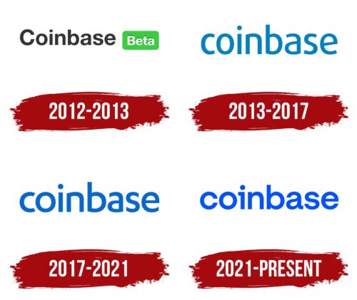
2012 – 2013
In 2012, the company introduced its first logo, with its key element being the name rendered in an elegant font. The word “beta” held an important place in the design, signifying the initial stage of development for the new exchange. Its inclusion emphasized the phase of the platform’s formation and active growth.
The designers’ primary task was to create a striking text block representing the service. The service name, executed in black, was excellently read due to its contrast with the white background. The thoughtful spacing between letters, the height, and the strict geometry lent the logo an elegant and professional appearance.
The designers highlighted “beta ” on the right side to draw attention. The light green color of the rectangle containing the word added a fresh and dynamic accent. The white text within the rectangle blended with the background, enhancing contrast and harmony. The bold, large letters of “beta” ensured high readability and completed the emblem’s overall look, adding modernity and expressiveness.
2013 – 2017
In 2013, the service attracted many users and achieved operational stability. This prompted an update to the logo, removing the word “beta.” The exchange name now stood out, rendered in light blue. The shade was chosen for its associations with modern technologies and developments, reflecting the company’s advanced nature.
The company name, presented in lowercase, appeared dimensional thanks to the large letters slightly elevated above the text’s baseline. The increased spacing between the letters enhanced readability and made the text visually light and easy to understand. The design added structure and elegance. The smooth lines of the text created a glowing effect, reinforcing the impression of modernity and harmony.
2017 – 2021
With the development and expansion of one of the largest exchanges, its branding changed, reflecting the platform’s growth and achievements. By 2017, the platform’s success was evident, expressed in a refreshed identity with new color solutions.
The light blue color was replaced with a rich blue, emphasizing Coinbase’s market leadership. The deep shade added a sense of permanence, highlighting the company’s stability and strength. Every detail was carefully considered: the letters became larger but retained a low-profile shape, making them visually solid and trustworthy.
The company name, centered within the design, was the composition’s focal point. This placement reinforced the perception of the emblem as a symbol of a thriving and dynamically evolving company, offering clients confidence in the quality of its services.
2021 – today
The modern Coinbase logo stands out for its simplicity, harmony, and balance. Every design element is precise and aligned. The letters’ color complements the background, enhancing the expressiveness of the text block. The company name in the branding serves as an independent and significant unit, giving the design a sense of completeness.
Large letters arranged in clear sequence with equal spacing create a visually appealing image. The rich shade of blue adds elegance to the text, highlighting the name and emphasizing its importance. The uniform size of the characters underscores unity, the preservation of tradition, and stability, which are associated with the company’s key characteristics.
The emblem of the new generation exhibits maximum steadiness. The stable and motionless shapes of the letters evoke a sense of reliability and solidity, reflecting the strength and confidence that define the company’s operations.