The era of digitalization has come, and all self-respecting brands with technical specialization have begun to update their visual “faces.”
This is what Collective did. It was created not so long ago (more precisely in 2017), but at the same time, it has already enlisted the support of partners around the world, which now allows it to be at a high level with other more mature brands.
The company’s activities aim to create connections, a common platform for organizations to exchange ideas, creativity, and implementation of ideas based on a variety of approaches and concepts themselves. New York-based design group Gretel helped design the company’s new visuals.
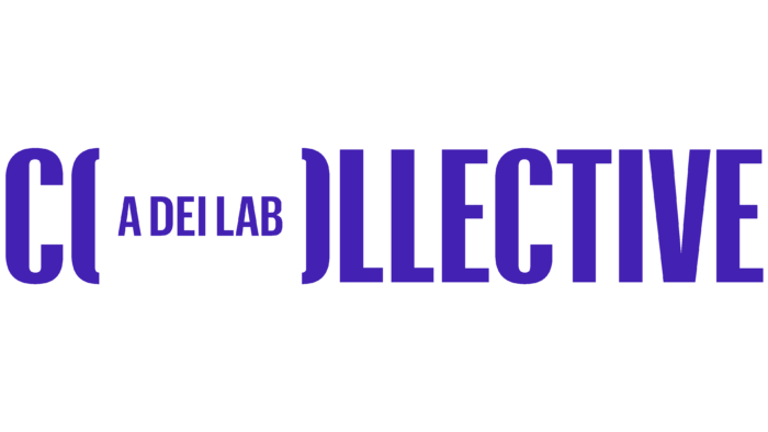
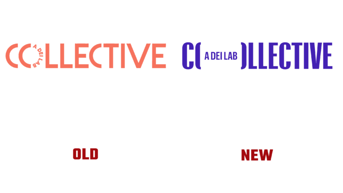
Both the old and the new logo have the descriptor “a dei lab.” This is necessary to clarify that this is a conglomerate of various partner organizations that have become a laboratory for creativity. If O was played as a wheel in the previous logo, now these are brackets that resemble code symbols. The wheel logo was half-arc, half-arc-descriptor. Now a full-fledged phrase, without coups, is inscribed in brackets. In the case of different publications, the logo is used without a descriptor. But the brand still becomes recognizable because the brackets that create a new O are very bright.
They also parted with the color scheme. From a soft orange ripe orange, the new logo is dressed in an official navy blue. The font has become less soft, stretched along the line, pointed.
This emphasizes rigor, seriousness, even if the brand is also engaged in “co-creation.” This fact testifies to the serious intentions of the company.
The speaking name of the brand, the connecting halves of the O, inside which the letters of the descriptor, like members of a mini-community, speak of unconscious unity, the continuity of common ideas, the desire to form a single whole with others. Nevertheless, there is a place in the arms of new partners, which indicates an openness to dialogue with representatives of other organizations.


