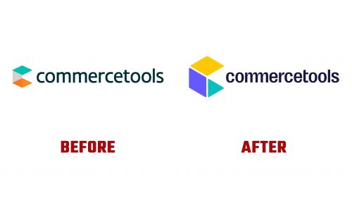
Founded in 2006, Commercetools is a leading composable commerce platform. The company is headquartered in Munich and supports brands like Audi, Danone, Eurorail, NBCUniversal, Sephora, and Volkswagen Group. Commercetools helps these brands adapt to changing consumer behaviors, reduce costs, and drive revenue growth. Recently, Commercetools introduced a new brand identity designed by Styles+Partners.
The old logo for Commercetools was generic and lacked distinct features. The new logo showcases a dynamic and strong design. The central element is a cube-slash—”C” monogram, constructed isometrically to give it a three-dimensional appearance. The cube’s rounded corners provide a softer feel.
The monogram is accompanied by a customized wordmark using the Right Grotesk typeface, which adds personality to the company name. The ligature in the “mm” of “commerce tools” blends seamlessly into the design without compromising readability. The altered “t” helps tighten the overall spacing.
The company name is styled in lowercase. While this might seem unprofessional when starting a sentence, it aligns with the contemporary and approachable image the company aims to project.
The identity system for Commercetools extends beyond the logo. The cube element is used creatively throughout the brand’s visual assets, appearing as a frosted-glass-textured 3D rendering. This versatile graphic serves as a background for various applications. The frosted-glass effect and its different crops highlight the typography in clear layouts, primarily using the Right Grotesk typeface.
The color palette is vibrant yet professional, ensuring consistency across different mediums. The icon set and illustrations are varied but unified through this color palette. Some illustrations use black-stroke isometric designs, while others employ abstract frosted-glass effects. This diversity adds visual interest without compromising brand coherence.
The collaboration between Styles+Partners and the Commercetools creative team was key to the successful rebranding. Using design collaboration tools, the team’s shared work in real-time provided immediate feedback and ensured all creative decisions were made jointly. This iterative process allowed thorough testing and refinement of each core element.
The new identity for Commercetools addresses issues with the previous branding. It provides a polished and professional appearance that reflects the company’s innovative and adaptable nature. The modernized logo, cohesive typography, and versatile graphic elements create a strong visual identity. This positions Commercetools as a smart and reliable choice in the composable commerce platform market.


