Olami – was founded in 2001 as a global community of young Jews. It provides for the creation of spaces, opportunities, and the exchange of experience among themselves and the acquisition of the experience of the older generation. Olami originally ran college education programs. The community has gradually expanded into a single network of 300 branches located in 30 countries of the world, where more than 1000 teachers work. First of all, the organization covers universities and colleges of various profiles. She provides all possible assistance to doctors and students of business areas and entrepreneurship, organizes four-week sessions of yeshiva with the effect of presence. Mentoring programs and summits for outstanding students are also being developed.
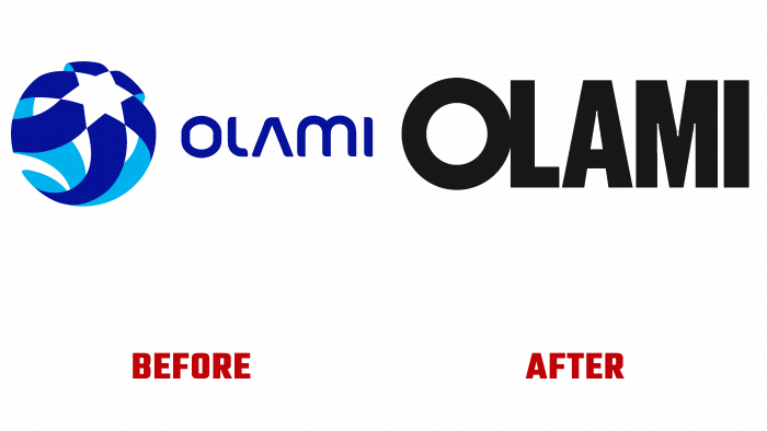
This year, the community decided to rebrand, radically change the visual identity, and create a new corporate identity. This important task was entrusted to the Israeli studio Emunah Winer, Tel Aviv. This need arose after a major organizational restructuring in the Olami network. The refusal to act on the B2B system that supports regional programs has led to creating a new type of strategy. Now all programs, sub-brands, and affiliates are united under the umbrella of the main brand. All divisions will be renamed “Olami” within two years. As a result, the brand starts working in the B2C field. The new logo will be proudly worn and represented by every young college student. The task of transforming the corporate world into a millennial one was accomplished brilliantly.
“Olami” in Hebrew has two meanings – “my world” and “globality.” But in the previous version of the logo, the power of this word was lost—just a simple old image of the Globe. Founders Grotesk’s new font revision introduces a bold interpretation of the name’s powerful meaning. The letter “O” is the leading one, defining the future not only of the logo but of the entire structure. The emblem, in its simplest form, very effectively demonstrates the connection between the world and oneself. In every new moment of the identity, the motive “O” is used very effectively but moderately.
The color palette also played an important role. A sophisticated, reliable color system allows each sub-brand to choose a different scheme while using only the Founders Grotesk font from Klim Type Foundry. Now each campus can have its unique color, which will add pride to students in their brand.


