In 2016, an effective electronic twin was created for any user, which automatically performed the most complex engineering calculations of any level of complexity, carrying out actions throughout the network. The cloud enterprise platform was named Power Lines Pro. Due to its effectiveness, it has become especially in demand in the work of public utilities engineering departments of various industries worldwide. Among the advantages of using the service is an increase in security with a significant reduction in risks in user networks, an increase in efficiency indicators, and the creation of conditions for a significant reduction in costs.
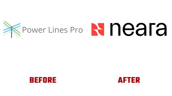
But the desire for change, helping to become better and more efficient, led to the need for rebranding, which also affected the company’s very name. With the help of the Spanish studio Mubien, the brand has managed to reflect its unrivaled ability to attract partners who benefit from the assets provided by the platform. The new look demonstrates a desire to diversify growth in new areas of infrastructure being created. The designer’s symbol has become the starting point, which opens up wide opportunities for integrating the services and products of the brand. With one of the largest portfolios of its products, the platform professionally uses the available negative space in its visualization to provide everyone with their own identity associated with the parent. With the help of dynamic generation, 256 different logos are created, each corresponding to a particular product.
Modern, more abstract thinking and vision of the world, which has its peculiarities of perception of visual information, necessitated a rethinking of both the name and visual identity. The new name is close in sound to the word near, reflecting the essence of the brand itself – to always be there for the successful solution of engineering problems. Adding the letter “a” to the word creates a new sonorous word, which becomes a good solution for forming a name. By adopting the revamped corporate name, the brand convincingly conveyed how the platform enables users to get closer to the network that composes it.
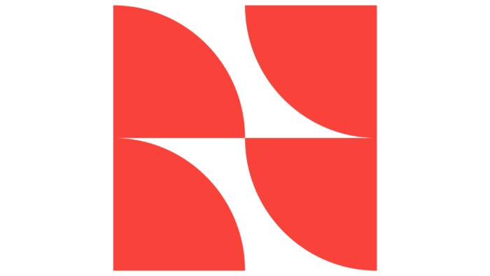
The abstract logo consists of an original monogram with a slash and a design letter N. The sign is easy to read on any surface, both typographically and digitally. The text element itself is attractive and provides the necessary recognizability. To distinguish sub-brands, effective work was done with counter space, which opened up a wide range of possibilities for creating new forms. Element in the form of a quarter circle and red-orange corporate colors in contrast with the white and blue form the necessary unity of the compositional solution. At the same time, the individual differences of each of them are effectively emphasized.


