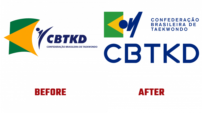
Founded in February 1987, Confederação Brasileira de Taekwondo (CBTKD) has revolutionized its visual identity. It is affiliated with World Taekwondo, World Taekwondo in Pan America, Kukkiwon, and the Brazilian Olympic Committee. The headquarters of the confederation is located in Rio de Janeiro. Over the years, CBTKD has undergone a complete rebranding for the first time. The rebranding was made in connection with the need to revise the strategy of its activities, and the introduction of visual changes would provide better information about the essence of the organization’s activities, its prospects aimed at opening a new milestone in history of this sport in Brasil.
The creative studio KOUS9 (Londrina, Brasil) was entrusted with changing the logo, changing the strategic direction of the methods of promotion and information. Known as a creative and innovative PR company with an unconventional approach to promotion methods, the company has carried out a complete reorganization of the confederation’s identity by the modern requirements and desires of the leadership of the sports structure. The visual style, logo, graphic material, advertising materials, and digital visualization methods and pages in social networks have acquired a new, more functional appearance.
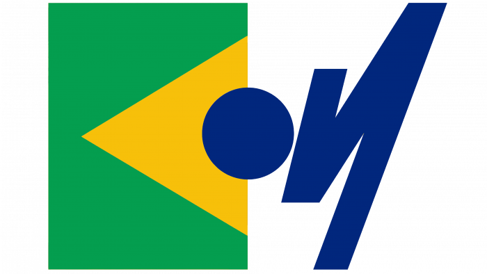
The design of visual identifiers and the logo has significantly improved perception and memorability by reducing graphic clutter and creating a concise and clear visual message. This was achieved by the rational use of the entire logo space, which was based on the practical geometric symmetry used in the formation of the competition hall. According to the same symmetry, the state’s official flag was adjusted on the logo, which ensured the simplicity and harmony of perception of the entire composition. The unifying symbol in the image is an important element of the athletes’ uniform – a belt, which in the dynamic image takes the position of a fighter striking Dolio Tchagui (high-kick, roundhouse kick).
A custom typeface was used to more accurately reflect the principles of order and style adopted in this sport, characterized by straight lines and geometric symmetry. This method ensures the generality of style and forms the unity of the composition, linking the flag and the text through the accent execution of the belt. His image brings dissonance to the overall picture, focusing on this element. This is how the viewer visually perceives the moment of the unexpected blow by the fighter after the deceptive calm before the strike. To highlight the text – the abbreviation of the name of the confederation, a deep shade of blue – blue dust – was applied, which ensures the clarity of highlighting each letter on any surface.


