In 1960, a conglomerate of 11 companies, assembled under the name The Reed Group, went into business, postulating that the purpose of their work was to improve life through the process of work. The company is named after the founder Alec Reed and includes:
- Developments related to improving conditions.
- Optimizing processes.
- Increasing the efficiency of activities within the very “field” of work.
The leading experts of this brand are high-class economists from various fields.
An innovation introduced in 1995, the first recruiting site, reed.co.uk, offered its services to all regions of the United Kingdom. This created a great sensation in the world of work, and to this day, the company, which has undergone a rebranding, is considered one of the reliable partners for the business. In Britain, there is a perception that reed.co.uk has become a career ladder for many leaders in the labor market.
As befits connoisseurs of the British tradition of modern design, who have their own opinion on the use of visual graphics in business, representatives of the London agency Dragon Rouge (London, UK) noted the presence of basic values and brand mission. Therefore their goal was to reflect the history of the company’s identity development in the logo.
Therefore, the turning point in the development of the logo was the study of the job niche itself and specifically the range of services provided by the Reed team. These are both headhunters and experts in personnel, outsourcing, verification, monitoring, development of personal support, programs of socio-psychological adaptation, maintenance, and implementation in the employee’s sphere. It is necessary to consider three actors in the business process – the client, partner, member of the executing team (or negotiator).
The designers assure many key insights, during which a lot of valuable information was extracted to create a visual image. The creative team spent a lot of time analyzing the market and highlighting the competitive advantages of the brand.
Finally, the main idea of the company was derived – “What’s next? What’s next? “This is both a provocation and an answer to the question of how the workflow is generated within the company. This is how three anchor points appeared – three characters, three important elements.
These are Curiosity, Dynamics, Optimism – the three pillars on which the company is based. They were the decisive figures in the new logo.
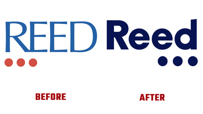
Until today, the brand had a blue logo with red dots under the letter.
It seems that the font is interesting; at the tops and extreme corners, it is pointed, as if saying “We bite competitors,” and below the red dots said, “We will put your business on wheels, you will reach the result quickly and easily!”.
But this logo was too contrasted. Especially the range of colors did not reflect the essence of the company. They wanted to emphasize with red spots – the importance of the founder of the company, r – as a reaction to a changing time, or something else, is unknown. Maybe this is generally a visualization of a locomotive that pulls all the resources of activity with it.
But now, the logo underlines the solidity and decisiveness of the company. First, the font was used by Raisonne. Now the font has become thicker and more homogeneous, without narrowed parts, geometrized and even. The underlining with “ellipsis” of the last letters – e and d – indicates a focus on the result, completeness of processes, and focus on the future, growth, and the beginning of a new path.


