


![]()
Contentsquare, a platform known for digital experience analytics, has introduced a new logo and brand identity created with the help of Saffron. This update reflects the company’s evolution, highlighting its growth and fresh focus on turning data into actionable insights. The goal was to create a clear, polished, and more people-focused look while setting the company apart from other tech brands.
One of the biggest changes is the move away from the old minimalist icon—a stylized “C” with a square tucked inside. That design was clean and functional, with a geometric look and rounded lettering in shades of blue, which is common in tech. It did its job but didn’t have much personality.
![]()
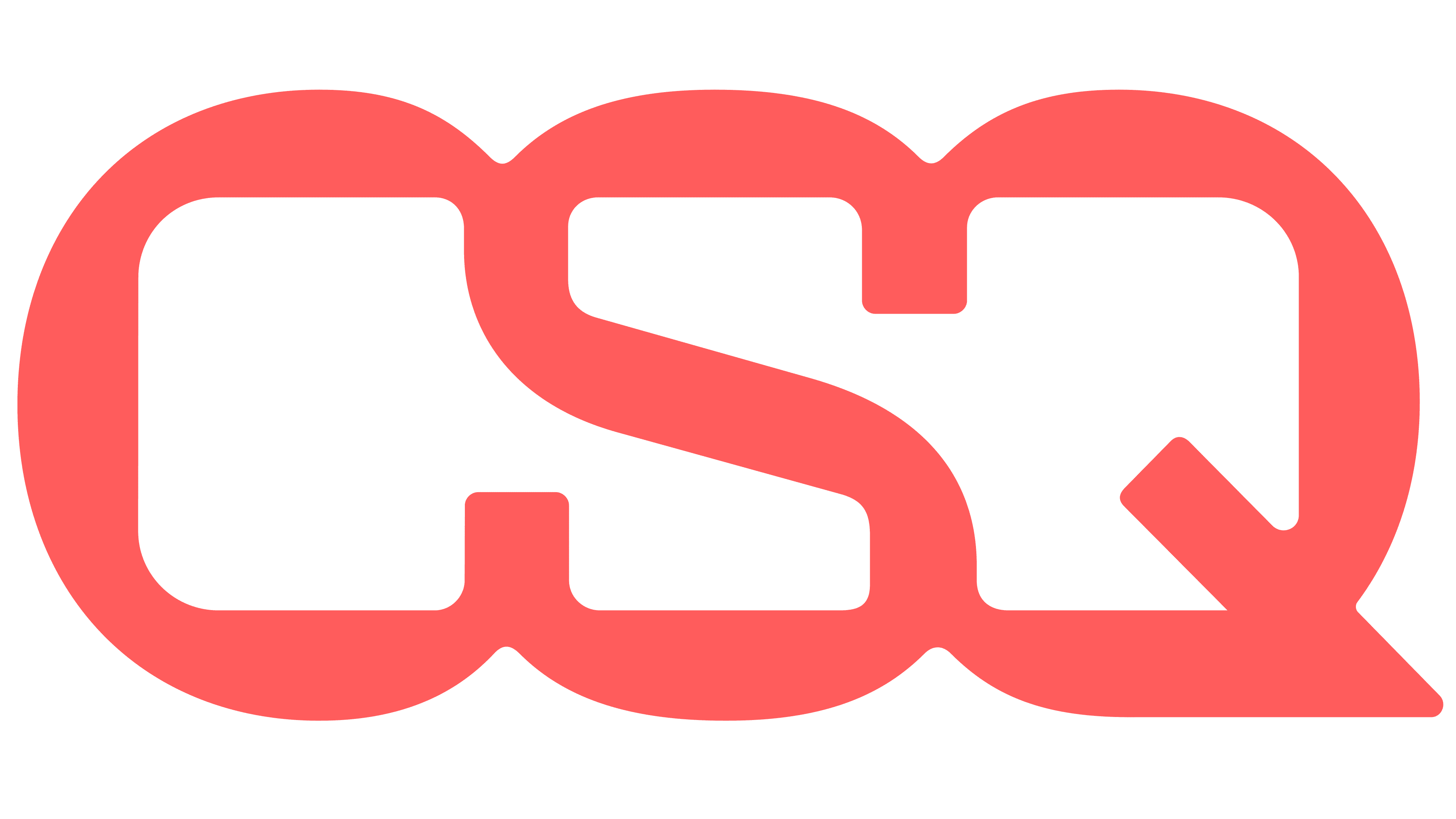
Now, the icon is gone. Instead, the spotlight is entirely on the brand name. But the “square” idea hasn’t disappeared—it’s subtly woven into the typography itself. Letters like “C,” “O,” “S,” and “Q” feature customized shapes that hint at square forms, creating a clever connection to the name without needing an extra graphic.
The new font is bold and geometric, with sharp edges and crisp lines, giving it a fresh, modern vibe. The standout detail? The letter “Q” has an angular tail that adds a sense of movement, hinting at growth. The typeface strikes a nice balance between professional and approachable, reflecting the analytical side of what Contentsquare does and its focus on user experience.
Out with the typical tech blue and in with deep burgundy paired with bright coral accents. This mix feels warmer and more energetic while still looking sophisticated. The dark background makes the coral text pop, improving readability and helping the brand stand out.
Another change is how the name is presented. “CONTENT” and “SQUARE” are stacked, creating a more balanced layout that mirrors the structured way the platform organizes and analyzes data.
The overall visual style uses simple geometric shapes, clean layouts, and a restrained color scheme, ensuring consistency—whether on a website or in print. Negative space and bold typography are smartly used, and subtle graphic touches inspired by data visualization, like grids and modular layouts, are also present. This reinforces Contentsquare’s identity as a leader in digital analytics.
![]()
Typography plays a big role here, with two main fonts: New Edge Rounded and Inter. New Edge Rounded has a modern feel with soft curves inside the letters and sharp corners on the outside, mixing technical precision with a human touch. Inter adds versatility, keeping things easy to read across everything from reports to app interfaces.
All in all, this rebrand marks a big step forward for Contentsquare. It captures the company’s mission to make digital analytics simpler and more useful. The fresh logo and identity reflect a brand confident and ready for what’s next—embracing the complexity of data while making it easy to understand.