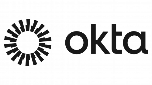
Okta, internationally renowned as the World’s Identity Company and the premier independent Identity partner, has recently lifted the veil on a revamped visual identity. This shift aligns with the company’s dedication to offering secure access, authentication, and automation across devices and applications. With a sprawling network of over 7,000 pre-built integrations, Okta’s rebranding mirrors its fundamental principles of flexibility, neutrality, and an unwavering commitment to its customers.
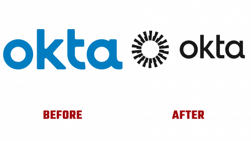
Though functional and unique in some aspects, the company’s prior logo, like the rounded corners and elongated tail of the letter “a,” was relatively unexceptional. Dubbed the “Aura,” the old “O” icon provided simplicity but lacked flair.
In contrast, the Okta new logo’s design is a daring divergence. It keeps some aspects of the old but adds an abstract twist, culminating in a complex and robust shape symbolizing Okta’s multifaceted approach to identity. This intricate symbolism might not immediately resonate with the product, but its dynamism and equilibrium make it nothing short of eye-catching.
Okta’s wordmark has also transformed into a more defined and streamlined version that effortlessly dovetails with the overall aesthetic theme.
But it’s the supplementary design elements that truly differentiate the new identity. Abstract gradient visuals, termed “layered radiance,” infuse the bold iconography with an added visual allure. This phraseology might bemuse some, but there’s no denying the visual charm of the design.
Another striking aspect of Okta’s rebranding is the thoughtful integration of video content and photography, which infuses the brand with a warm and welcoming persona. By symbolizing individual identity verification, the imagery robustly represents Okta’s core focus. The use of panel-like visuals interspersed with varying degrees of blur crafts an intricate depth and texture in the overall design.
Okta’s rebranding comes across as a thoughtful and cohesive execution, resonating well with the firm’s overarching mission. Though certain elements might be perceived as over-elaborated, the harmonious design fosters a trustworthy and progressive image for the company. Skillfully juxtaposing abstract artistry with human-centric features, the new look encapsulates Okta’s technological prowess and customer-oriented mindset.
Okta’s revitalized visual identity is more than a cosmetic upgrade. It reflects the firm’s ambition, innovation, and constant drive to remain at the forefront of digital identity management. The balanced blend of abstraction and humanity paves the way for a new chapter in Okta’s story, reasserting its status as a trailblazer in an ever-changing technological world.


