State-of-the-art fingerprint and face control technology showcases the Okta logo. All clients available to users of the program are the focus of attention. The emblem promises that no one will go further until they are authorized.
Okta: Brand overview
| Founded: | January 2009 |
| Founder: | Todd McKinnon, Frederic Kerrest |
| Headquarters: | San Francisco, California, U.S. |
| Website: | okta.com |
Meaning and History
Okta’s services are in demand among corporate IT teams. Its clients include over 4,000 large and well-known organizations, including Nestle Purina, JetBlue, 20th Century Fox, Pandora, and LinkedIn. Therefore, it is not surprising that the logo of this company is always in sight. It contains the actual name of the service, written in round lowercase letters.
In metrology, Okta is a unit of measure for cloud cover. It corresponds to 1/8 of the open sky cloud cover. The word “okta” comes from the transliteration of the Greek “okτώ,” which means the number 8. In numerology, the eight symbolizes a new beginning and a connection with the past.
It’s worth noting that the identity management service was called SaaSure in the past. But Frederic Kerrest and Todd McKinnon dropped the name due to inappropriate associations. According to McKinnon’s wife, SaaSure sounded like the name of a French perfume brand. This is what caused the unplanned rebranding.
What is Okta?
Okta is the new name of the American company Saasure Inc. It is the creator of cloud-based software offering effective security solutions. Its products are used by enterprises operating in industries such as manufacturing, healthcare, finance, and others.
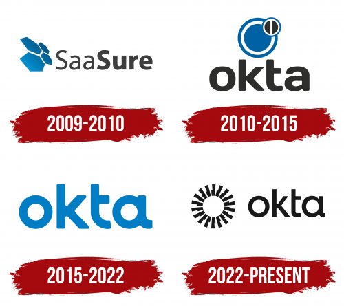
2009 – 2010
The logo is made of two parts: there’s a text part and a graphic part. The graphic symbol looks like blue bee hives arranged from four hexagons. They’re separated by a thin white line and are tilted sideways. This visual effect makes the right part appear distant to the viewers while bringing the left part closer. This is achieved by placing larger elements in the foreground and smaller ones in the background. On the right side is the word “SaaSure,” written as one word. At the same time, the right and left segments have different thicknesses in the letters. The font is mainly lowercase and rounded.
2010 – 2015
Saasure Inc. appeared in 2009, and just a year later, it was renamed Okta. Together with the name, it received a new logo, where the designers depicted several concentric circles in white and blue. The largest blue circle symbolized Single Sign-On, a technology that allows applications to be accessed from any device without re-authenticating. And two rings around it resembled the letter “O” and connected the emblem with the inscription “okta.”
There was a smaller circle on the right. It looked like an inverted prohibition sign with two black semicircles inside. This symbol represented secure access to applications and protection against data loss. The company name was at the bottom. Letters with smooth curves in shape were combined with circles and the dark color of the inscription corresponded to the chosen palette.
2015 – 2022
In the updated version of the logo, the designers removed the composition from geometric shapes and left only the word “okta.” The lowercase letters “o” and “a” are now circular to compensate for the old emblem’s lack. The inscription is not black but light blue, which is another attempt to preserve the familiar corporate identity.
Dropping the logo with circles, Okta relied on the wordmark. She had to leave the encrypted message right in the caption: “o,” and the main part of “a” is in the shape of a ring, which in the company’s iconography symbolizes each user, application, and process. The concentric circles on the old emblem had about the same meaning.
For Okta, lettering comes first because it’s the only element in the logo. The current typeface is vaguely similar to Odudo, which was created based on ITC Avant Garde and Futura in 2016. Only details distinguish them: Okta has all the corners rounded, and the lowercase “a” has an additional bottom line.
The developers of the word mark did not focus on Odudo but made their own modified typeface. It was based on the font of the first company logo. It resembles Days Regular, created by Jovanny Lemonad in 2011. Only Okta has a smoother “k” with no curves on the diagonal lines.
The lettering is presented in the corporate blue color of the company. It has a shade of # 007BBF and is close to azure. In the past, the emblem palette contained three colors at once: blue (# 0169AA), white (#FFFFFF), and black-brown (# 212121). Now white continues to be used only as a neutral background.
2022 – today
Okta logo delves deep into the theme of user identification by incorporating a new symbol next to its brand name—a circle made of multiple vertical rectangles resembling the iconic Easter Island statues. Positioned with their wider sides toward the center, these rectangles coalesce to form a symbolic sun with blunt rays. This unique feature unmistakably ties into the company’s focus on identity, invoking notions of ancient civilization and modern tech in one seamless design.
Next to this striking symbol, the brand name “Okta” sits harmoniously aligned to the center of the adjacent circle. The letters of the name have been designed with geometrical precision. A balanced ratio of sides for each character is evident, and the typography has unique alterations to make it memorable. The “k” features a tiny crossbar, while the “t” lacks the left half of its horizontal line. The “a” is adorned with a rounded and elongated tail. All these elements are part of a meticulous design strategy that encapsulates Okta’s essence—precision, balance, and a touch of innovation.
The company adopted a strict monochrome color palette, steering clear of distracting hues. The black and white shades deliver a message of professionalism and straightforwardness, qualities that Okta prides itself on. The monochrome scheme serves as a stark backdrop that emphasizes the intricacies of the design, making every element pop out distinctly.
The Easter Island-inspired figures are more than an aesthetic choice. These statues were often placed at the island’s perimeter, serving as protective monuments. Drawing a parallel, Okta aims to serve as a guardian of digital identity, keeping the sanctity of user information intact. The sun-like formation of these statues implies radiance, clarity, and omnipresence—qualities that a company specializing in identity and authentication should manifest.
The Okta logo combines elements from history, typography, and design to create an identity that is deep in meaning and visually compelling. It stands as a confluence of ancient wisdom and modern technology, wrapped up in a design that is as functional as it is aesthetically pleasing.
Okta: Interesting Facts
Okta, Inc. is a top company specializing in business identity management, ensuring users can access tech and apps safely. Founded in 2009 by two ex-Salesforce employees, Todd McKinnon, and Frederic Kerrest, Okta quickly became important in cloud identity and access management.
- Cloud Identity Innovator: Okta was one of the first to use cloud computing to manage digital identities, making it easier for companies to control access to apps and services with benefits like scalability and security.
- Unique Name Origin: “Okta” comes from a meteorological term measuring cloud coverage, hinting at the company’s cloud-based focus.
- Growing Fast: Okta has grown quickly, adding more products and attracting many customers, including Fortune 500 companies.
- Wide Range of Solutions: Okta offers identity solutions like Single Sign-On, Multi-Factor Authentication, and more, ensuring secure access to technology anytime and anywhere.
- Extensive Integration Network: The Okta Integration Network boasts thousands of ready-to-use integrations for different applications, simplifying secure access implementation for businesses.
- Dedicated to Security: Through continuous security enhancements, Okta works hard to keep its platform and customer data safe from online threats.
- Public Company: Okta went public in April 2017, trading on the NASDAQ, which was a big step in showing its growth and the demand for identity management.
- Worldwide Operations: Okta supports its international customers and meets diverse identity management needs with offices worldwide.
- Okta for Good: Okta’s social impact program supports non-profits and community organizations with its technology, sometimes offering it at a discount or for free.
- Industry Recognition: Okta is seen as a leader in Identity as a Service and is praised for its innovative tech, wide-ranging solutions, and focus on customer success.
Okta’s story, from its start-up days to becoming a leader in identity management, underscores the critical role of secure and efficient technology access for businesses and individuals in today’s digital world.
Font and Colors
In different versions of the Okta logo, the inscriptions are done in bold lowercase fonts with smooth lines. The base font is Days Regular, created by typographer Jovanny Lemonad in 2011. As such, the developers modified it multiple times to fit the company’s concept. In the end, a version appeared that resembles Odudo with rounded corners and an elongated leg on the “a.” The “k” is also slightly different: it’s smooth, without bends on the diagonal lines.
The corporate color palette is based on azure blue #007BBF, classic black, and white #FFFFFF. Previously, the scheme included dark brown #212121 and blue #0169AA.
Okta color codes
| Star Command Blue | Hex color: | #007ec5 |
|---|---|---|
| RGB: | 0 126 197 | |
| CMYK: | 100 36 0 23 | |
| Pantone: | PMS 7461 C |
