Sometimes, it is extremely difficult for some industry or business niches to find the right image, an element of identity, to catch the wave that the brand itself sends. It is always very interesting for creative agencies to work on such projects because this is a real challenge to their creative abilities. When the first logo for the Contrarian Ventures brand was created, you can imagine what was spinning in the minds of the brand makers. The first step was to sweep aside what constitutes the primary associations, the chain of banal images. Looking ahead, it is worth noting that it was in the identity of the new year that it was possible to release the potential of creativity and open the arms of the brand to the new digital era.
It is worth emphasizing that the brand itself was created in 2017, was engaged in venture capital, and was focused on investing in technologies that are gaining global importance. Now it is not just a company but a whole fund specializing in promoting sustainable energy. Foundation agents cast a shadow over the use of fossil fuels and see their mission to expand the horizons of inexhaustible sources. Brand strategy is based on courage, audacity to go against the current, openness to new ideas. Therefore, even in 2017, when the first logo was created, there were probably many ideas that wanted to implement. Still, the formal subtleties did not allow for a creative breakthrough.
Serious individuality, dedication to its conceptual idea, the strictness of morals – all this is reflected in the old logo, which seems to be modern and holistic, but it clearly could be improved. The situation has changed this year. The identity is in step with the times, mixing humor, seriousness, daydreaming, down-to-earthiness and rationalism.
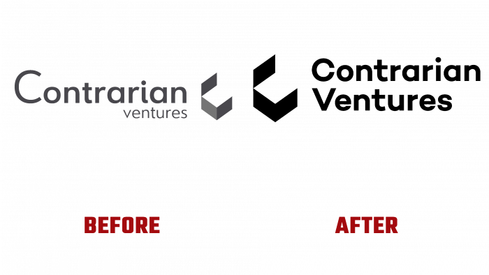
If we talk about the previous Contrarian Ventures logo, then it is made in gray tones. By type – this is a gray font inscription with a graphic element. This element is the same gray, only decorated with a gradient, because it depicts the letter C in the form of three walls. Geometrization is likely a bright spot in the visual culture of business for 2017, which determines the creative focus of creatives. But the distance between the letters of the latter in the word N and C as a grapheme does not inspire confidence, does not give the correct impression of inviolability and firmness. It looks as if some unclosed box was placed next to the word, and then they decided to move it because it got in the way.
Today, the logo has elements that fit together in terms of location, color, and shape. This is the same “box,” the letter C, turned to a two-level inscription of the brand name; the open edges are partly directed into the open space and partly indicate the name. All the parameters of harmony are met, and you can’t even find fault with the black color; it balances all aspects involved in the design, makes them closer in spirit to each other. I especially want to say about the font, which looks in a new way on the logo. It is soft-sharp at the same time, fat and more massive, and more advantageous than the previous one. Immediately there is an association with the solidity, reliability of the foundation, and full involvement in the business.
The brand identity has become a real paradise for designers and added bright reddish, neon green, and purple. Deliberately, the authors of the rebranding introduced ridiculous characters – a unicorn, a tyrannosaurus, and a headless office worker. These symbolic illustrations convey a message from the company and express a relationship between fossil fuels and energy. Therefore, humor and wit have finally found their place in the holistic image of the Contrarian Ventures brand.


