


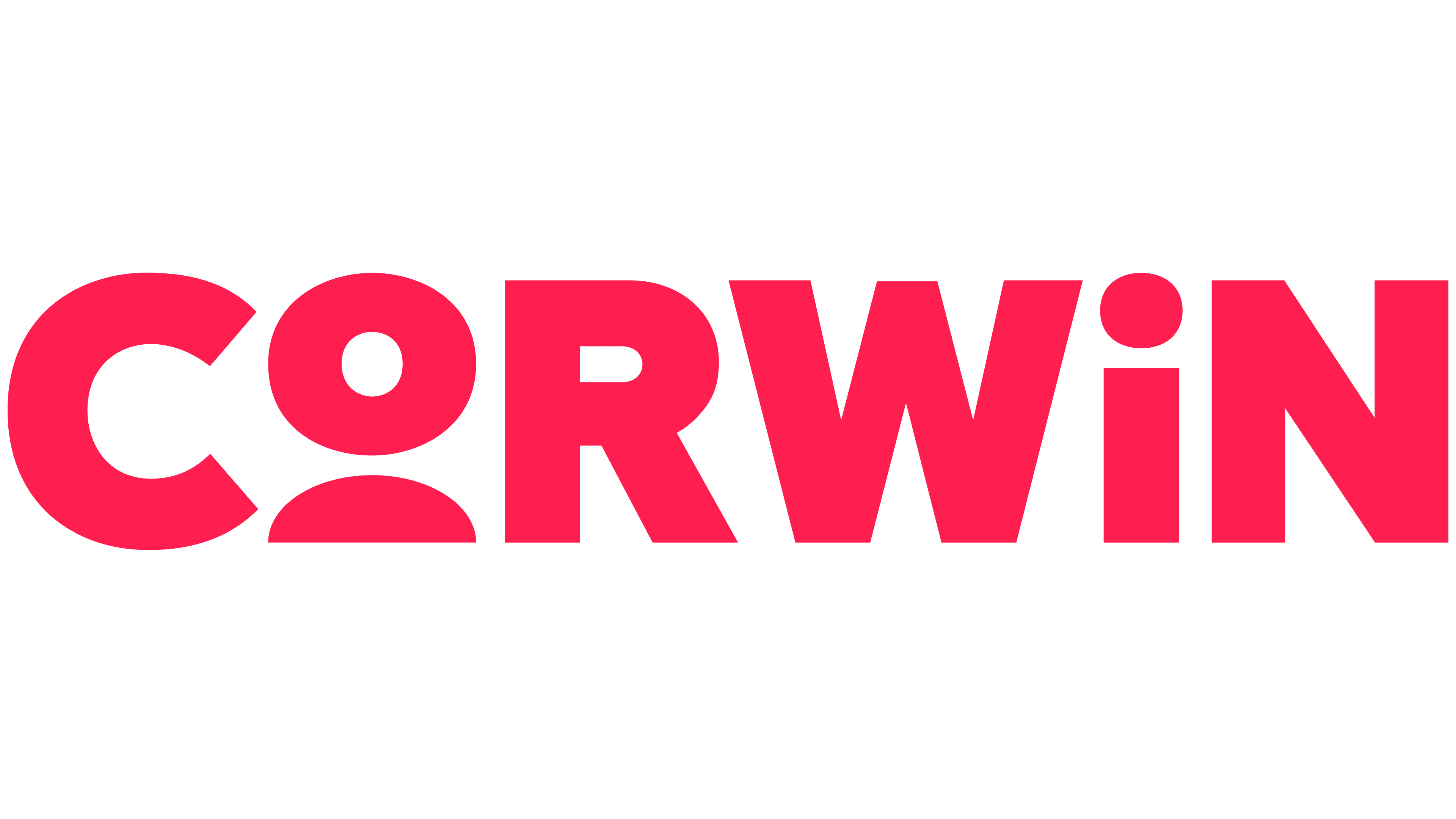
Corwin, a company with extensive experience in the field of professional education for teachers, has introduced a completely refreshed brand developed by Limber Brands. The central concept of the new visual language highlights the relationship between teachers and students, creatively embodied through symbolic characters integrated within the company’s name.
Previously, the company’s logo featured a strict and restrained style, incorporating the image of a raven to symbolize wisdom and profound knowledge. However, despite its solid reputation, this imagery gradually became outdated, perceived as overly serious and detached. Limber Brands felt it essential to maintain a link with the company’s heritage, so they designed a separate emblem featuring the raven and the company’s founding date, specifically to represent special areas of the company’s activities.

The modernized logo speaks directly to the essence of the educational process. In the company name, the letters “O” and “I” have been transformed into two characters, symbolizing the interaction between teacher and student. Thus, the brand’s name now literally embodies its central mission, helping educators enhance their students’ lives. The new typography provides brightness and warmth, bringing the brand closer and making it clearer to the audience. This approach emphasizes accessibility and equity in education, principles that the company promotes in all of its projects.
The overall concept has been simplified. Previously, clients saw the company exclusively through various sub-brands, but now the entire spectrum of offerings, including books, consulting, seminars, events, and resources, is consolidated into three clear areas. This decision clarifies the brand, highlighting the importance of the core name.

The color palette has become bolder and more emotional. The vivid red-pink hue distinguishes Corwin from competitors, reinforcing the company’s image as modern and open to interaction. The brand now feels not merely like an educational resource but a community in which every educator finds support and inspiration.
By moving away from a fragmented perception, Corwin achieved cohesion. The new visual language emphasizes inclusivity and humanity over formality. It conveys to audiences that the company’s focus is always on real people, their needs, and growth opportunities.
The refreshed style has made Corwin more relatable, humane, and understandable, clearly demonstrating its readiness to assist every educator in creating an environment where students can unquestionably succeed.
