The period 2019-2020 turned out to be a difficult test for the business community around the globe. The coronavirus pandemic has become a litmus test for modest and unsuccessful startups. Strong and courageous brands have found qualitatively new ways and innovative solutions to rebrand and strengthen their positions in the market.
Unfortunately, the tourism business and any area related to movement suffer greatly, whether within the country or outside one state. First, because people are exhausted by quarantine measures, their internal resources are not enough to restore physical strength and find inspiration for life in new conditions. Second, there is a purely economic reason. After all, many went to work remotely, someone despaired and decided to leave the workplace altogether. And some people want to give up everything, but they cannot because they provide for the whole family, so the entire financial burden falls on their shoulders. One can only dream of resorts and rest. Although borders open at times, warm countries invite tourists to visit, negative forecasts for the spread of the pandemic return, and everything becomes dull again.
Some travel businesses did not despair but began the organizational stage of rebranding to return to the seething life before the pandemic when anything was possible.
This is how Costa Crociere and National Geographic Expeditions start collaborating to revitalize the industry. A new visual image appears, which determines the main goal of their common activity – the popularization of travel to open up new opportunities for a person in a new world.
Costa Crociere executives believe there have not been such surprising and unexpected turning points in their 70 years of brand history. This is a new chapter in the company’s biography. The brand is taking a path corresponding to current trends, a new outlook on business, new traditions. The rebranding authors say they want to rewrite the future of cruise travel, taking into account the needs of customers and the ecology of the planet. Therefore, the new cruises will be organized according to inclusiveness, accessibility, and sustainability principles.
The company has been working on an “experience” strategy, both onboard and on land. The work touched upon gastronomy, excursions, and the “internal homeostasis” of the brand – its reliability and sustainability. The company’s commitment to growing and promoting safe, reliable, and meaningful travel is admired and competitive.
New routes for the fleet were developed, new places to visit were studied, and honed practical service skills.
But the first thing that potential clients of the company see is not the evidence base for the success of the tour, not the prospects for travel as a guarantee of excellent impressions. This is a visual component that should be engaging.
As such, the logo in blue and yellow looks like a great bait for adventure hunters. Or rather, for the catchers of new perspectives.
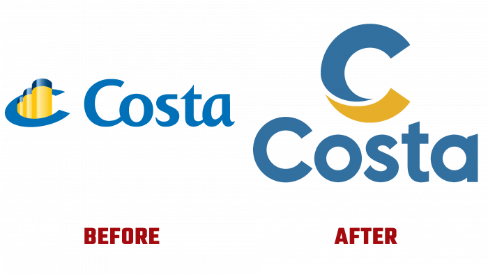
The logo is simple – there is a graphic element consisting of the letter C, in which the upper part is light blue, and the lower part is yellow. You can guess what this means. It seems that this is the wave and the side of the ship. Or gold, a treasure that means a wealth of places and the brightness of new flavors.
The name Costa is capitalized below the graphic icon. Simple, bright, and cute. It will be easy to attract new customers with such a logo because it looks contrasting and neat, although not in a minimal style.


