Philosophy of the Creative Circle brand – creativity above all else is highly valued not only by companies that form their effective team. This philosophy helps creative individuals find themselves and express themselves in a cause that becomes their life’s work. The brand provides effective assistance in selecting valuable personnel for companies and professional consulting services effectively. It presents itself as the most valuable network of diverse and talented people willing to offer their knowledge, skills, and abilities to be most important and appreciated. Today, the brand is on the verge of new achievements, changing its strategy and its visual image. With a range of flexible individual solutions, the company offers a wide range of choices – from a Fortune 500 list to offers from exclusive agencies and start-up structures; the brand selects candidates based on their skills, doing this with a mandatory personal meeting with each other candidate. The company seeks to reflect the upcoming changes and expansion of its capabilities in the new development of its style, making it more modern and attractive.
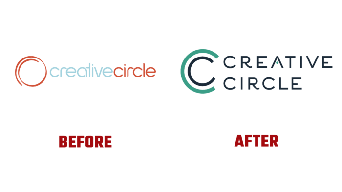
The new identity is presented in a redesigned visual representation. The changes affected everything – the logo, the color palette, the website, and all digital and typographic visual support. Graphic changes affected the formation of a new logo, the reflection of the necessary information, the brand sign. The new sign is a double letter C, which more accurately demonstrates the connection of the visualization with the brand itself, that the name consists of two words starting with this letter. Executed one within the other, they demonstrate the deep connection of each element of the logo, thereby communicating the direct relationship of each brand proposal with each other. As well as the general dependence of each client and the brand itself on each other. At the same time, the sign, made in two different contrasting colors – the outer letter in light green and the inner letter in black, symbolizes the presence of a wide variety of both opportunities and ways to implement the tasks.
The brand palette now consists of black and light green, reflected when creating the logo text block, where the name letters are in contrasting black. And only the shelf of the letter A is in light green, which is a spectacular graphic solution. This option draws the eye to the name, forcing you to get to know it, study it, and remember it. The original font enhances brand recognition and ease of reading in any execution – both digital media and typographic printing.


