In the midst of what has been dubbed Black Lives Matter 2020, the creative agency Athletics has responded to an open call to bring this innovative idea to life. It all started with Creative Activist Annika Hansteen-Izora having a vision of developing black creative ecosystems, black-led communities to advance art, creativity, and imagination.
The brand naming is based on the concept of an ecosystem, which means a complex living environment in which each organism interacts with another unit can unite, attracting the “forces” of others.
Collective creativity – as the conceptual basis of the brand – is the product of the activities of different cultural representatives, whose nationality and racial affiliation evokes a special attitude from the society. In the midst of the Black Lives Matter flash mob, the emergence of such a brand becomes key, as the community aims to popularize talent and expand the experience of interacting with various representatives of contemporary art. It is a kind of support tool for black creative forces that is capable of developing, teaching, cultivating, caring for, and identifying different units of society who want to be recognized through art and creative practice.
The brand’s design is simple but clear at a glance. The logo is a black font variant that looks uncompromising and aesthetically pleasing. Smooth font, accent details on the letter r, t, y, and the close position of the letter row speaks of the unity of groups of people who could collaborate under the auspices of Creative Ecosystems. By the way, the font seems to strive upward; it is quite elongated, the letters are rounded. It looks presentable, but, unfortunately, it is impossible to say that it conveys the idea of the brand and illustrates its specialization.
This may not have been the goal when Athletics created the logo.
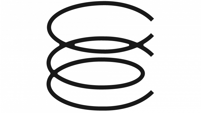
The result is a neat and presentable, well-defined logo that will look great on any medium, especially digital. Accompanying elements of identity, such as, for example, the spiral created from the letters C and E, looks unusual and intriguing. This already speaks of a certain manifestation of creative thought, participants’ attraction to the creative process.
An interesting graphic element in the brand’s corporate identity may well be that it will appear soon. In the meantime, he is gradually being promoted. More and more people will learn about his initiatives, which speaks of expanding the sphere of influence of this community of creative people.


