


![]() Credit Agricole Logo PNG
Credit Agricole Logo PNG
The Crédit Agricole logo depicts a passionate dance and a whirlwind of money. The logo shows the pooling of cash flows for various financial transactions. The sign is complemented by a common strategy across all system institutions and a special focus on agriculture.
Crédit Agricole is the world’s largest cooperative financial institution. It includes an extensive network of local banks of the same name, 39 regional banks, and the Crédit Agricole SA institute. His expertise encompasses retail banking, asset management, cooperative banking, investing, personal deposits, and other related areas. Due to its agrotechnical focus, the company is often referred to as a “green bank.” It appeared as an independent structure in 1894. Its head office is located in Montrouge (France).
This banking organization’s work began at the end of the 19th century, following the approval of a document regulating the freedom of professional associations’ activity. Among other things, it allowed the formation of farmers’ unions and local banks for mutual assistance. A year after adopting the Act, the foundation of the current organization took the form of Société de Crédit Agricole. The society was founded in February 1885 at Salins-les-Bains in the Jura region.
Then, the Minister of Agriculture of France, Jules Méline, began promoting the opening of such financial services on the ground, so that farmers could receive the necessary financial support and actively develop the industry. Lending was mainly related to small family-type farms. So Crédit Agricole spread throughout the country.
The first banks were established by the rural elite, comprising agronomists, teachers, entrepreneurs, and private property owners. Because farmers themselves were in the minority, the banking network declined to lend. In 1897, the government required the Banque de France to finance Crédit Agricole and issue a one-time loan of 40 million gold francs, with an annual interest fee of 2 million francs.
Meaning and History
![]()
After the cooperative bank regained its confidence and finally got back on its feet, it began to reflect on its identity. Therefore, the history of logos counting does not begin immediately; it begins several years later.
Many emblems of the financial conglomerate remind us of its connection to the agricultural sector, as it provided loans to farmers in its early history to help them develop their businesses. This explains the image of grapes and spikelets on old logos. Also symbolic is the name Crédit Agricole, translated from French as “agricultural credit.” Over time, the bank shifted its focus away from crop production as it expanded its range of services. So he began to have universal visual symbols in the form of multi-colored monograms and word marks.
What is Credit Agricole?
Credit Agricole is a financial conglomerate formed from several dozen local and regional banks in France. It bears the unofficial name “La banque verte” (The Green Bank). Since its inception in 1894, it has provided loans to farmers. Now, its range of services is much broader, including investments, insurance, deposits, and asset management. It has branches in many countries worldwide.
1930 – 1948
![]()
The debut logo was an unofficial prototype. It emphasized the financial institution’s agricultural focus and featured a double-edged circle. In the center were an ear and grapes (on the right) and the inscription “MCA” (on the left). The letters were classic, serif, and the color was monochrome (white and beige).
1948 – 1959
![]()
In 1948, the official emblem was approved as a semi-oval seal. The developers aimed to ensure that it conveyed the agricultural sector’s priority as effectively as possible. Grapes were chosen as the main element. A dense bunch was in the center, on a carved grape leaf against the background of a map of France. Under them were the elongated letters “C,” “A,” and “M” with unevenly protruding ends. Along the edge, a wide strip bore the company’s full name: “Crédit Agricole Mutuel.” On a separate fragment at the very bottom, the abbreviation was repeated once more, but in a standard uppercase font.
1959 – 1971
![]()
The structure of the logo has remained unchanged; it has simply been enhanced. The designers made the oval distinctly elongated, resembling a horseshoe. This is the link between the agricultural and livestock sectors. The authors still left the logo with a bunch of grapes on a broad, carved leaf, a map of France, and a shaded sea. Added three ears and removed the schematic inscription from three separate letters “C,” “A,” and “M.” But they did not touch the lower abbreviation.
1971 – 1987
![]()
The beginning of this period marks a watershed in the history of the Crédit Agricole logo. It has become much more laconic and modern. The developers removed all unnecessary elements because the financial cooperative was already widely known and familiar to most people. The logo contained the abbreviation “CA.” Both letters were shaped like horseshoes. The lower part “C” served as a crossbar “A.” The focus on the agricultural sector was conveyed through two shades of green.
1987 – 2017
![]()
The logo is a stylization of the previous one. The designers have made some adjustments to emphasize the bank’s desire to move forward and be ready for openness. They positioned “C” diagonally and extended the bottom side; “A” added angularity, making it classic. Below the abbreviation is a single green stripe, the same width as the letters. There is a bright red stroke on the top right.
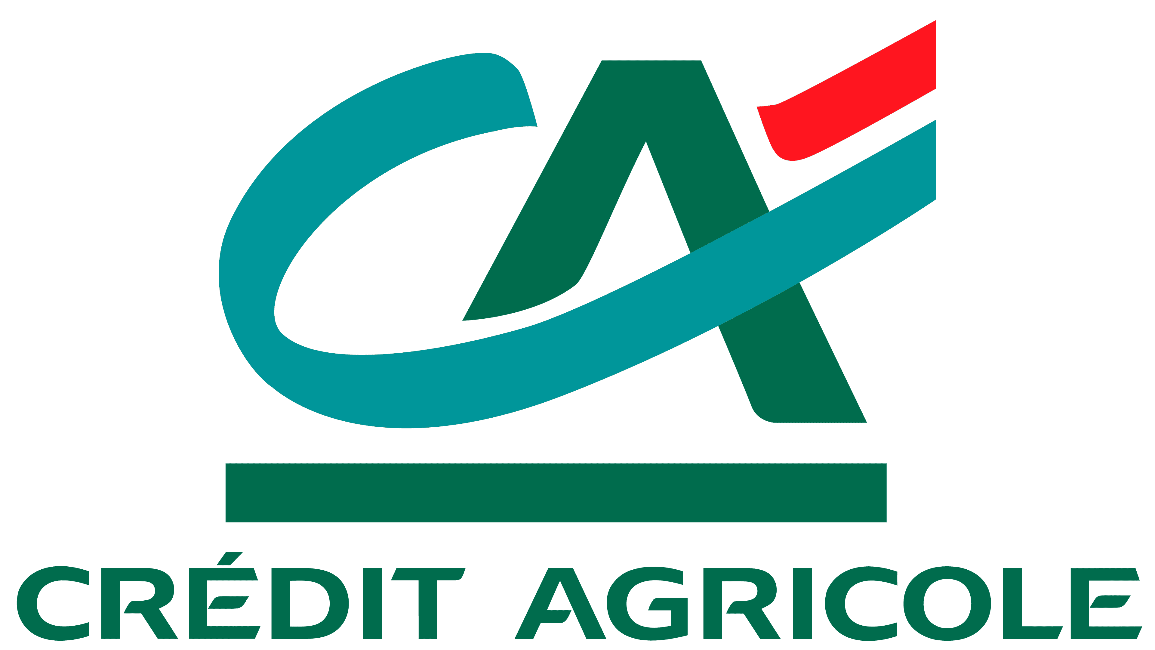
2017 – today
![]()
The name of the bank, located on the right and divided into two lines, has become the same turquoise as the diagonals that form the outline of “A” in the stylized monogram on the left. At the same time, an additional horizontal strip, also turquoise, appeared under the monogram in the form of a narrow rectangle. But the blue-green color is now much brighter than in the previous logo. A long curving line that mimics the letter “C” has taken on an azure hue. The dark red color gradually faded to light red.
At the same time, the designers have retained the iconic typeface that identifies Crédit Agricole. It is distinguished by open letters: in “R,” “E,” and “A,” the middle strokes are separated from the vertical ones. Moreover, many glyphs have cuts at the same angle, which creates a sense of smooth movement in the inscription.
Font and Colors
The evolution of the logo was categorical because, as a result, only two laconic letters remained from many small details. But the agricultural theme has always been supported. Initially, it was expressed in agricultural terms and then in colors. The management approved this financial group concept at the stage of its inception.
The developers have chosen two typefaces for the emblem: a sans-serif for the side text with an expanded name, and a serif for the central lower inscription with an abbreviation. In modern versions, graphic characters are used instead of block letters.

The color palette is restrained, with a predominance of green tones, including olive, khaki, and dark green. Now, the designers have added red (#ed1c24) and emerald (#009b9d) to green (#006f4e).