The rebranding includes the updated logo and the idea of supporting an honest and open Internet.
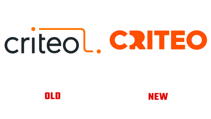
The company is headquartered in Paris since 2005. Criteo’s main specialization is the placement of personalized advertisements on behalf of commercial companies. In the previous logo, one of the main elements is points connected by a line. The dots have become the same integral part of identity in the new interpretation, having changed their location.
The company logo is the name Criteo. One of the dots is nicely styled between the letters “C” and “R,” and the other point can be seen inside the “O.” The logo was created to draw attention to the expansion of the range of services for its clients. For example, the company owns the Criteo Commerce Media platform with a database of 2.5 trillion daily transactions on the Internet.
The rebranding is accompanied by the slogan “The Future is Wide Open.” CEO Megan Clarken says Criteo is committed to leading the industry through its expertise, data, and powerful tools. The position was also reflected in the design: the name Criteo is in bold type, drawing consumers’ attention. The visual identity was developed by Criteo’s team in collaboration with the creative agency Technology Humans and Taste (THAT) on positioning issues.
The slogan “The Future is Wide Open” highlights the company’s ability to improve communication with consumers on the Internet. Criteo is committed to working with all market players – from marketers to brands and improving the industry.


