Today, the CSS Group is a leader in its field. Insuring more than 1.5 million people, it takes responsibility for health, property, and accident insurance cases. As a leader in basic insurance, the brand has its offices worldwide, with more than 100 agencies in Switzerland alone, striving always to be close to its customers – present and future. The resource not only simplifies the process of issuing contracts and tracking their implementation but is also constantly supplemented with new components, the testing process of which is carried out in real-time, determining their effectiveness and necessary adjustments. Introducing innovations and making changes and additions, the brand is experiencing an urgent need to reflect these changes in its visualization, leading to the rebranding of its corporate identity and its visual component.
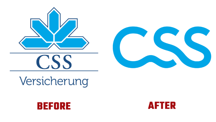
The new logo has become the main reflection of the current changes. Having retained the historically accepted abbreviation of its name, the brand paid special attention to graphic design. The new logo demonstrates greater openness and a significant expansion of its capabilities and services. The rejection of some strictness and special seriousness of the logo made it possible to talk about growth prospects and a willingness to be ready for change, allowing them to be introduced into all aspects of the process. The brand also demonstrated its direct commitment to past achievements by maintaining the brand’s color scheme. The light blue hue in the execution of the logo’s text form reflects the brand’s warmth and friendliness. The original execution of the text sign demonstrates the direct relationship of everything that makes up the basis of the brand, its actual meaning, and each user. The smooth curves and double bond of the two “S”s reflect the interdependence of each of the components of the brand’s offerings.
Rejecting the graphic overload of the logo, making it more concise and simple, the company has gained the ability to convey much more information visually, opening up new possibilities for its perception by the viewer. The new visual design made the logo more understandable, easy to remember, and recognizable. Redesigning the graphics with modern advances has made the sign easier to read and remember, enhancing the relationship between the brand and its users.


