Based in Pennsylvania, Customers Bank, one of the 100 largest digital financial institutions in the country, has a new visual identity. As the brand expanded its reach and services and created new loan programs totaling $10 billion, it needed a dramatic change in its identity. As a result, the company underwent a complete rebranding, encompassing all of its lines of business. The new identity responds to the need to expand the reach of Customers Bank to the Northeast, providing full service to its customers throughout the country.
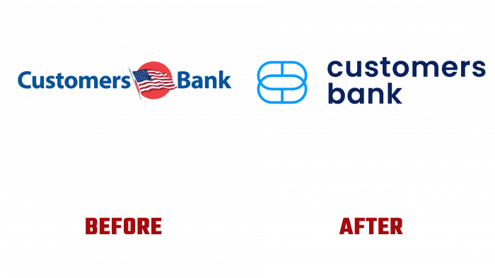
The current changes were prompted by the bank’s accelerated growth, the need to expand its offerings, and its geographic reach. By providing customers with favorable offers, the bank generates a growing interest in itself. Their interest in the bank’s offerings is due to the opportunities for the latter to grow prospectively. The emphasis on national characteristics in the new logo with a red-white-and-blue theme and an accentuated American flag in the center was instrumental in attracting new customers from all over Pennsylvania. The logo’s successful conveyance of the idea of the American dream and the bank’s emphasis on helping medium and small business owners and creators from all categories, entrepreneurs to achieve their goals and further growth made its offerings especially sought after.
One of the main areas of rebranding was creating a new strategy – the opening of new lines of financial and commercial products and additional offices, the location of which covered key positions. The task of the new brand is to include young, technically savvy members of our community, who are now looking for a new customer experience in the range of their customers. The founders of the brand managed to keep the familiar name and unite around themselves the best of modern technology and a deeply human approach characteristic of each member of the company’s professional team. When forming the new image, the basic strategy and each element of the brand, its logo, and color palette were carefully analyzed, their impact on the external experience and internal beliefs. The two overlapping rings depicted on the logo symbolize the most important goal of the company – striving to be one with each of its customers, providing any of them with highly personalized service. At the same time, the positioning of the sign itself demonstrates the lack of dependence of the goal itself on the location of the graphic element.


