


![]() Dallas Mavericks Logo PNG
Dallas Mavericks Logo PNG
Founded in 1980, the Dallas basketball club boasts a memorable logo effectively combining a mascot, heraldry, and the name of a popular series. Independent and vibrant, it reflects the state’s characteristics, making the Dallas Mavericks logo stylish and appealing.
The Dallas Mavericks club was founded in 1980 in Dallas, Texas. Since its inception, the team has been based in Dallas. Throughout its history, the players have never relocated. In 1980, at the NBA All-Star Game, league owners voted to create and accept a new team into the National Basketball Association.
Fans chose the name “Mavericks.” The final choice was made between three names: Dallas Express, Wranglers, and Mavericks. Eventually, the latter option received the most support from voters. A group of 41 people who suggested naming their home team “Mavericks” received a pair of tickets to the opening game as a reward. One of the lucky ones, Carla Springer, said the team’s name fully reflects the “independent, bright, attention-grabbing style of Dallas residents.”
The Mavericks’ name and the Cowboys’ nickname are associated with the American comedy-western series Mavericks. It aired on U.S. screens from 1957 to 1962. Actor James Garner, who played Bret Maverick, the series’ main character, was one of the club’s co-owners.
The evolution of the term “Maverick” is no less impressive than Dallas’s 2011 championship. Originally, the term was coined by Samuel Maverick, a Texas landowner and one of the signatories of the Texas Declaration of Independence. The farmer’s dissent was that he refused to brand his cattle. Historians explain this decision as a lack of interest in cattle breeding rather than humanitarian or innovative motives. Soon, people began to call unbranded cattle mavericks. Moreover, it became a term for independent people aimlessly wandering the prairies.
Champ and Mavs Man are the team’s mascots.
Meaning and History
![]()
The “Texas Rebels” basketball team appeared relatively recently, in 1980. Over 40 years of existence, the Dallas Mavericks have changed their emblems four times. Moreover, all versions go in pairs: the first exactly repeats the second, and the third repeats the fourth. Thus, after 1981, the franchise had only one significant redesign, which completely changed the team’s image.
What is Dallas Mavericks?
The Dallas Mavericks are a National Basketball Association team that has never relocated or changed its name. It was formed in 1980, despite the league initially refusing to grant Dallas a franchise. The club currently plays in the Southwest Division and calls the American Airlines Center its home arena.
1981 – 1993
![]()
In 1980, a young basketball team, the Dallas Mavericks, was born in Dallas, Texas. Before the Dallas Mavericks owners liked the first logo, designers remade it 77 times. The result was a simple but iconic drawing: a large blue letter “M” with a cowboy hat in the foreground and a green basketball in the background. The blue-green palette reflects the mood of the provincial northern Texan landscape. To the right is the club’s name, written in white and outlined in white and green.
1994 – 2001
![]()
In 1994, the emblem changed slightly. Mainly, this concerned the color palette: the shades became slightly lighter, making the drawing feel less “heavy” than before. Designers also altered the font, removing the outlines and choosing a standard italic serif font.
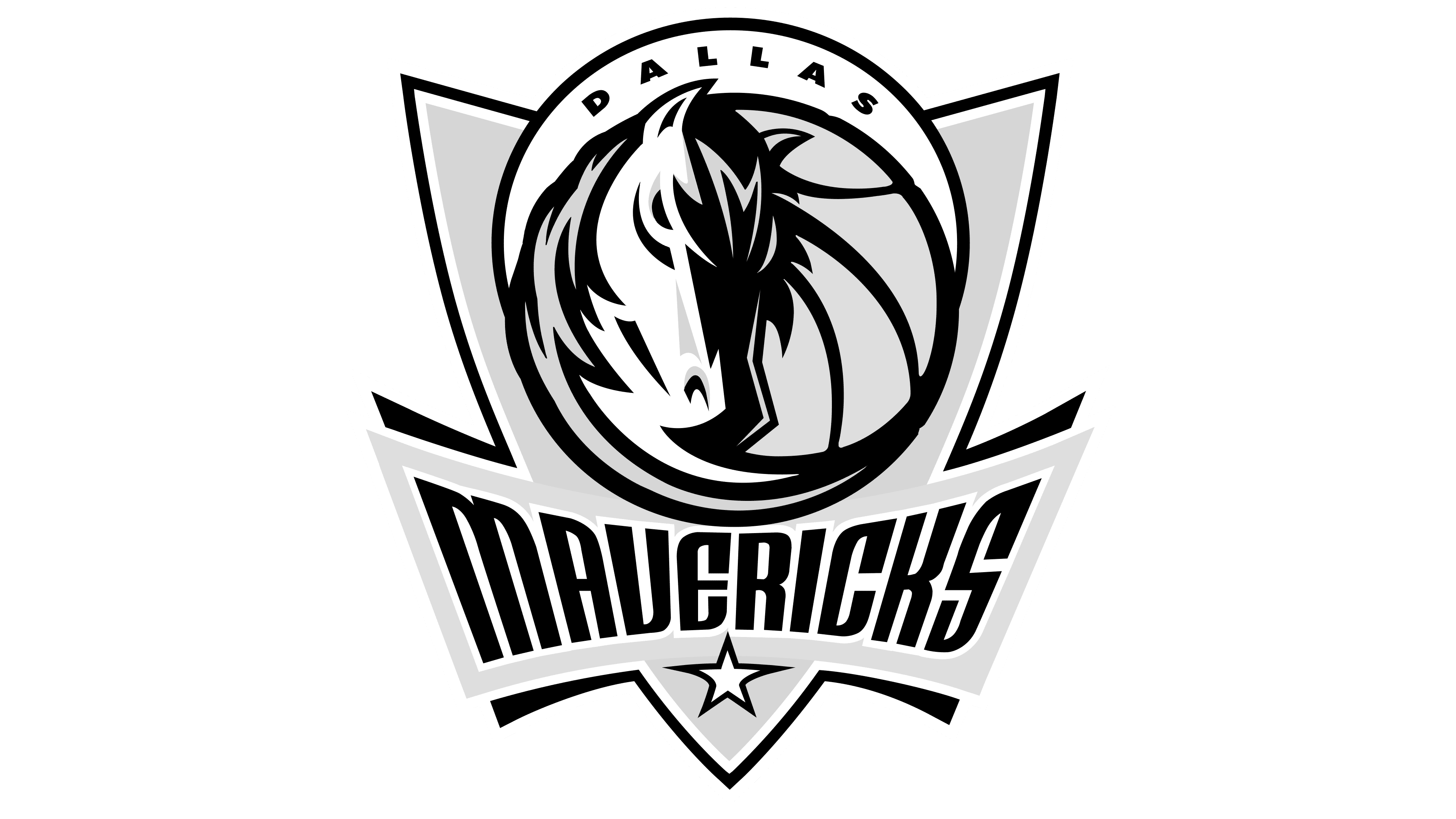
2002 – 2017
![]()
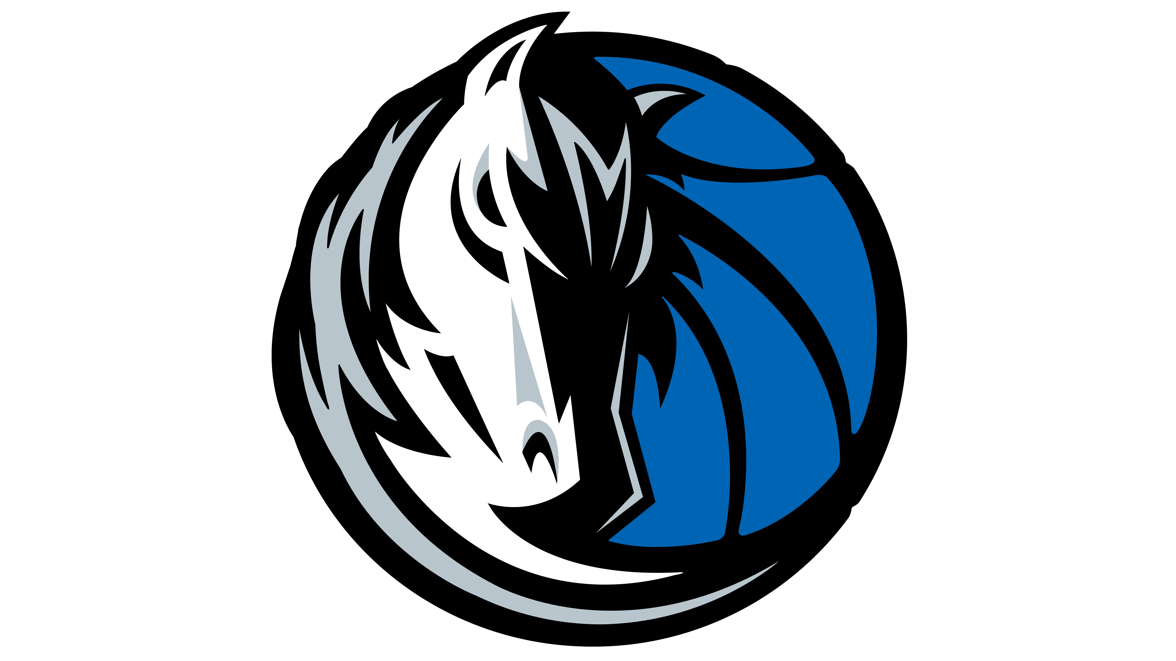
In 2002, the team completely updated its logo. When the controlling stake, valued at $ 280 million, passed to Cuban, the new owner decided to rebrand. That’s how the Dallas Mavericks got a transformed logo. It included a silver triangular shield with a white five-pointed star in the bottom corner, the words MAVERICKS in a blue frame, and a large circle consisting of a blue basketball, a horse’s head, and a white crescent with the word DALLAS.
2018 – today
![]()
In 2018, the designers of the Dallas Mavericks logo updated only the colors. As a result of the last redesign, the silver on the horse’s back and mane became darker, and the blue of the basketball and the frame around the inscription became slightly lighter.
Font and Colors
One of the main elements of the Dallas Mavericks logo is the horse. It replaced the cowboy hat that the team’s first owner, Donald Carter, loved to wear. This image didn’t appear randomly and is connected to the franchise’s nickname. In the literal sense, “Maverick” means an unbranded bull. But this word has another meaning, which should be interpreted as “yearling.” This is sometimes how one to two-year-old animals, especially colts, are referred to in North America.
For the “DALLAS” inscription, a sans-serif font is used. For the “MAVERICKS” inscription, the logo designers created a custom font with rounded letters. This is a significant departure from the standardized version that was in effect from 1994 to 2001. The color palette also changed drastically: in 2002, the green was replaced with silver. Dark blue, black, and white colors complemented it.
![]()
mavs logo
FAQ
What does the “Dallas Mavericks” logo represent?
The team’s logo is multi-layered. The main one is a gray triangular shield. It features a blue basketball, topped with a crescent bearing the inscription “Dallas”. A horse’s head covers the left side of the ball. The word MAVERICKS is located at the bottom of the shield. It’s written in black, deformed letters in a blue frame and complemented by a five-pointed star.
Who designed the “Mavericks” logo?
Mark Cuban, who bought the Dallas Mavericks in 2000, commissioned the basketball team’s redesign to the vice president of marketing at Coca-Cola, who provided letters from freelance designers with ideas for the new logo. The first version of the symbol with the shield and horse’s head was developed. Additionally, it was important for Mark Cuban that the resulting emblem matched well with jeans, his favorite clothing.
Why is “Dallas” called “Mavericks”?
This option was suggested by one of the team’s fans, who explained his choice, saying that the word “Maverick” perfectly conveys Dallas’s mood. This is because it’s the name of an American western television series in which one of the roles was played by James Garner, who joined the group of owners of the newly created NBA franchise.
Have the “Dallas Mavericks” changed colors?
Since its foundation, the team has used a blue-green color scheme. In 1996, the Dallas Mavericks got a new owner who wanted to change the palette to turquoise and orange. But his project was never officially presented; it exists only online. Then the basketball club was passed to Mark Cuban, and under his leadership, it adopted new colors: black, silver, dark blue, and royal blue.