


 Davivienda Logo PNG
Buying a home connects Davivienda to Colombian families’ long-term plans. The Davivienda Logo represents a bank where mortgage lending plays a distinct role in serving individual customers. Even the name refers to housing, linking the banking brand to a borrower’s specific goal of purchasing an apartment or a house.
Davivienda began after Colombia’s May 1972 decrees No. 678 and 679, which introduced the UPAC system for inflation-indexed savings and long-term housing finance. On August 1, 1972, Corporación Colombiana de Ahorro y Vivienda Coldeahorro was registered in Bogotá, with Banco de Bogotá, Seguros Bolívar, and Colseguros among its founders. It opened to clients on November 15, 1972.
On January 30, 1973, the institution was renamed Corporación Colombiana de Ahorro y Vivienda Davivienda. The name came from “da vivienda,” meaning “provides housing,” and the red house logo, Casita Roja, became its main public symbol. In 1994, the bank introduced credit cards and launched the slogan “su dinero puede estar en el lugar equivocado.”
During the 1980s and early 1990s, Davivienda remained focused on mortgages. Later, financial liberalization allowed savings corporations to enter universal banking. On July 1, 1997, it became Banco Davivienda S.A., entering a market already dominated by Bancolombia and Banco de Bogotá. In 2006, it acquired Banco Superior and won the auction for Granbanco S.A., known as Bancafé. The deal closed on August 27, 2007, bringing corporate, agribusiness, Panama, and Miami operations.
On January 24, 2012, Davivienda agreed to buy HSBC units in Costa Rica, El Salvador, and Honduras for $801 million, expanding into Central America. By late 2012, it had 572 branches in Colombia and one in the United States. In 2023, Holding Davivienda Internacional was created in Panama. In 2024–2025, Davivienda agreed to absorb Scotiabank Colpatria and Scotiabank’s units in Panama and Costa Rica, giving Scotiabank a 20% stake in its capital.
Meaning and History
What is Davivienda?
Davivienda is one of Colombia’s largest banks and also operates in Central America. It offers financial services, including investment products, credit cards, mortgage loans, and personal and corporate banking. The bank is known for its focus on technological innovation, providing digital solutions for clients who increasingly bank online. The company plays a key role in the housing sector and supports Colombia’s economic development. With its expansion into other Latin American countries, the bank is strengthening its position as a regional financial leader.
1972 – 1973
Davivienda’s history began in Colombia in 1972 with the establishment of Corporación Colombiana de Ahorro y Vivienda. The company initially operated as Coldeahorro. Its founders included Banco de Bogotá, Seguros Bolívar, Colseguros, and other banks and construction companies. It was among the country’s first savings-and-housing-finance institutions.
Coldeahorro adopted the name Davivienda on January 30, 1973. The new name reflected the company’s original purpose of helping customers build savings and finance homes.
1973 – 1976

The Davivienda name was introduced in 1973, less than a year after Coldeahorro was founded. Two options, Dacasa and Davivienda, reached the final round of discussions. Davivienda was chosen following conversations with prospective customers. They associated the Spanish word “vivienda,” meaning “housing,” with homeownership, family, security, and a sense of belonging. These associations shaped the company’s identity.
The company’s first president, Álvaro Mendoza Ramírez, commissioned Aser Publicidad to develop a welcoming emblem that would convey the idea of home financing. The agency explored images of a small house. The sketches ranged from tall, narrow buildings and austere structures to whimsical cottages. The designers studied how audiences responded to the drawings. The designers chose red early in the process because it evokes energy and vitality. The emblem became known as Casita Roja, or “Little Red House.”
Colombian advertising professional Peter Martin created the illustration, inspired by the fairy tale “Hansel and Gretel.” Several details gave the house its storybook appearance. A broad, mushroom-cap roof stretched over curved walls, curtains framed the windows, and a tall, rounded door sat at the center of the facade. For Davivienda, the little house represented hospitality and openness, suggesting a home where everyone felt welcome. The company adopted the illustration as its emblem in 1973.
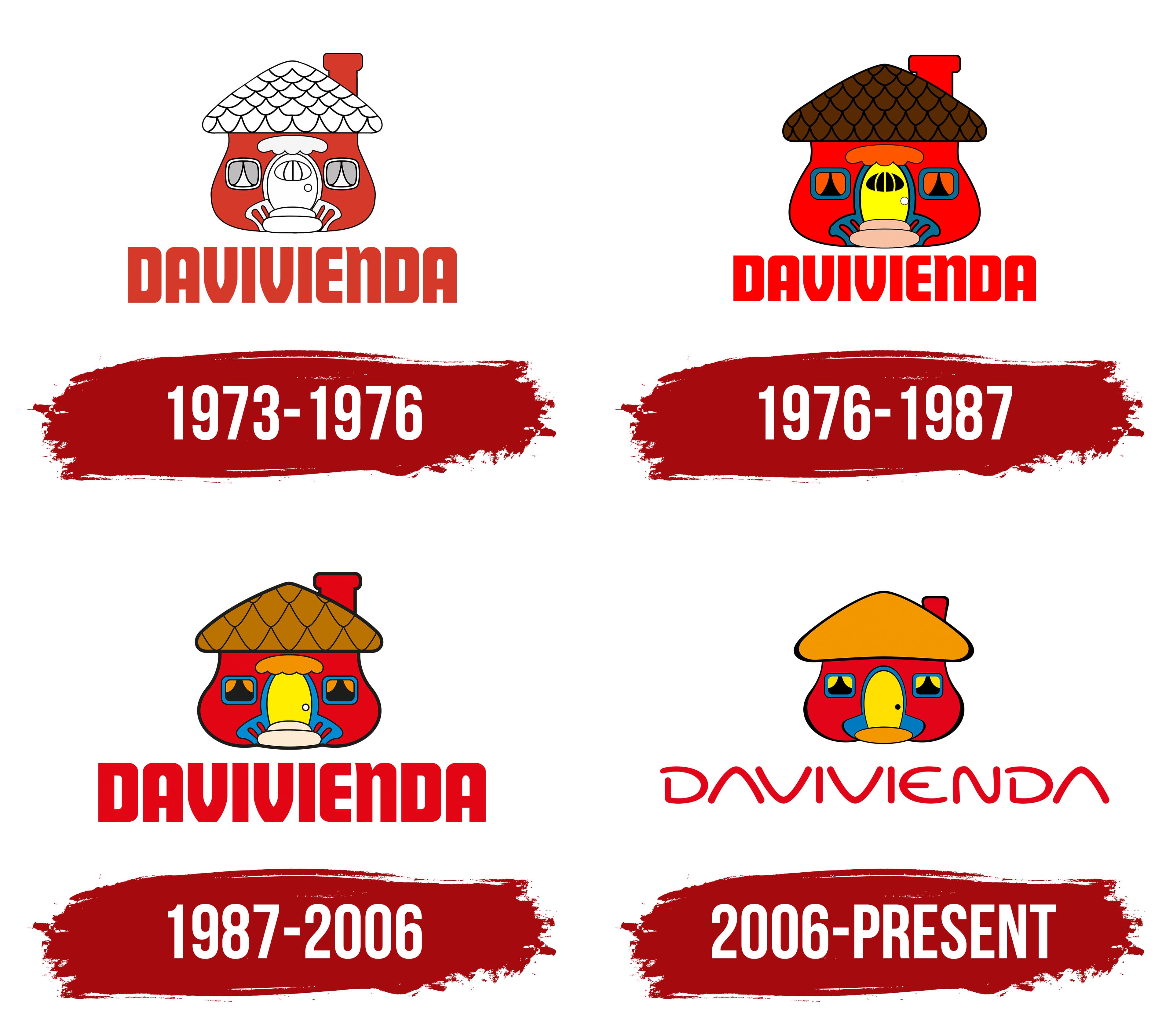
In the early version, the house sat above the DAVIVIENDA wordmark. Red unified the facade, the illustration’s outlines, and the lettering, while carefully drawn rows of tiles covered the light-colored roof. A small window appeared near the top of the door, with a round doorknob nearby. An awning, steps, and curved railings completed the entrance. Beneath the soft, almost toy-like silhouette was a row of heavy, uppercase sans-serif letters. Tight spacing and strong vertical strokes made the wordmark look dense, anchoring the composition.
1976 – 1987

In the next version of the Davivienda logo, the house’s features received different colors while retaining their original arrangement. A brown roof was paired with a yellow door, while blue was used for the window frames and railings. The curtains and awning appeared in warm shades of orange, and the steps became light beige.
1987 – 2006

When Davivienda became a bank in 1997, it retained the little red house as its emblem. Subsequent revisions preserved the building’s familiar proportions while gradually simplifying its architectural details.
The roof became orange-brown, and the tiles were drawn larger. The small window on the door was removed, and the awning became rounded. The heavy red wordmark remained.
2006 – today

By 2006, Davivienda’s technology had advanced faster than its visual identity. Younger audiences were beginning to see the bank’s branding as dated. The redesign aimed to modernize it while preserving its warmth. TXT Agencia Transmedia, led by Alexander Toulemonde, was commissioned for the project. The agency focused on the wordmark and overall visual identity, simplifying the house illustration while retaining its familiar silhouette.
The lettering changed in both stroke weight and shape. TXT replaced the heavy wordmark with custom uppercase letters featuring thin strokes and rounded curves. The crossbar was removed from the “A,” giving it a rooflike shape. This letterform connected the wordmark to the house and became a recurring motif in the bank’s branding.
The detailed roof tiles were replaced with a solid orange fill outlined in black. The facade remained red, the door and curtains stayed yellow, and the window frames retained their blue color. A small orange oval remained at the base of the entrance. This multicolored composition, with the same set of details, became part of Davivienda’s registered emblem.
The logo’s shapes informed the Davivienda type family, introduced in September 2024. Óscar Guerrero Cañizares of Sumotype Foundry created it under the creative direction of TXT Agencia Transmedia. The letterforms’ details connect to the emblem. The enclosed space within the lowercase “a” echoes a motif from the bank’s visual identity, rotated 45 degrees. The Davivienda family replaced Myriad, which had been used from 2006 to 2025. The bank has used its custom typeface since 2025.