The business logo of DECA conveys the strict atmosphere of the international association for preparing leaders in management, hospitality business, finance, and marketing. The emblem is highly esteemed because the organization has a reputation as an effective tool for training qualified specialists.
DECA: Brand overview
| Founded: | 1946 |
| Founder: | Chris Kimbell, Michael Wayne |
| Headquarters: | Reston, Virginia, United States |
| Website: | deca.org |
Meaning and History
This organization positions itself as a center for training leaders – responsible, experienced, academically well-versed, and community-oriented. It connects to education at the high school level, with already about 3,200, and continues it in colleges and universities. Its logo is present in every corner of the USA because the association covers all 50 states and even extends beyond the country’s borders: the emblem is well-known in Spain, Puerto Rico, Mexico, Poland, Germany, China, and Canada. Everywhere, its visual identity resonates with four key factors conveyed in the four corners of a diamond. Until 2010, the logo represented professional understanding, social intelligence, civic consciousness, and leadership. Then, the principles were updated, so now the organization’s corners stand for ease of learning, connection to business, application of knowledge, and competitiveness.
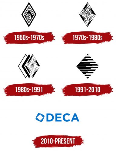
DECA’s activities are sanctioned by education departments at all levels – from state to district. They are based on four fundamental aspects that form the foundation of the emblem – the trademark diamond, symbolizing the flawless “cut” of one’s personality. The first version was adopted in 1950. It was an elongated diamond with two pointed ends – top and bottom. Over time, it increasingly took on the shape of a precious stone. For example, the 1970 emblem featured 3D elements – a voluminous frame with highlights and shadows. The 1980 version was triple-layered and served as the basis for the abstract 1991 design, where designers combined three square diamonds of different sizes. The current logo emerged in 2010.
What is DECA?
DECA is an international educational student organization founded in 1946. It prepares new generation leaders who successfully compete in management, entrepreneurship, marketing, finance, commerce, hospitality, and service. It includes students, faculty, and teachers forming two foundational divisions of the educational association: high school level (over 173,000 individuals) and university level (more than 4,000 members). Each has its own programs tailored to the student’s level of preparation. The main office is located in Reston, Virginia.
1950s – 1970s
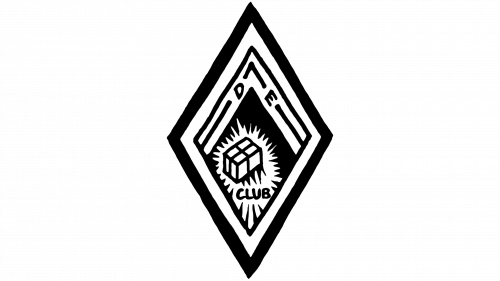
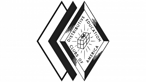
The DECA logo from the 1950s contains several visual elements that reflect its message and history. The main shape of the logo is a diamond, a geometric figure associated with clarity and stability. Inside this diamond, nested diamonds create an effect of depth and complexity.
At the top of the inner diamond are the letters “D” and “E,” representing the initial letters of Distributive Education and indicating the organization’s educational focus. These letters are positioned in the sharp part of the diamond, demonstrating direction and purpose.
The central design element is a box with rays emanating from it, symbolizing the idea of radiating knowledge and light. This motif represents a “Pandora’s box” of knowledge and opportunities that DECA opens for its members.
Below the central image, the word “CLUB” is placed, highlighted in bold sans-serif font. This word affirms the community and solidarity of DECA members.
The logo’s color palette is black on a white background, providing high contrast and simplicity, emphasizing the seriousness and professionalism of the organization, which is characteristic of the time, considering the limitations of printing and visual advertising of the era.
The 1950s DECA logo is a reflection of the era, and the organization’s mission focused on spreading educational opportunities and supporting young leaders in the field of distribution and commerce.
1970s – 1980s
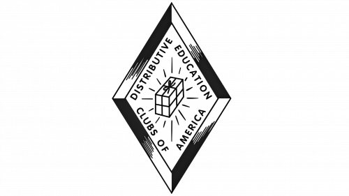
The primary shape of the logo remains a diamond, continuing the tradition of using this shape from the 1950s logo. The diamond symbolizes dynamism and is a sign of innovation.
The text “DISTRIBUTIVE EDUCATION CLUBS OF AMERICA” frames the diamond, following its contours. This gives the logo a sense of completeness and structure. The font is straightforward, sans-serif, reflecting the directness and accessibility of the educational opportunities provided by DECA.
The central element in this logo, a box with rays, has added elements resembling ties, suggesting that the box contains a valuable “gift” — the education and knowledge that DECA offers to its members.
The color palette of the logo remains black and white, ensuring high contrast and recognizability. This color scheme is classic and timelessly stable.
This DECA logo reflects the organization’s key mission in the 1970s: providing students with the knowledge and skills for their future careers in distribution and commerce. The emphasis on education and professional development is constant, and using established symbols emphasizes DECA’s enduring values.
1980s – 1991
The DECA logo from the 1980s features three diamonds overlaid to create an effect of volume and depth. These enhancements make the image more dynamic and align it with contemporary trends compared to earlier versions. The central diamond remains unchanged from the logo’s 1970s version.
The distinction of this logo from its predecessor includes the addition of layered diamond shapes, making it more prominent and expressive. This alteration underscores DECA’s evolution and growth while maintaining recognizable elements such as the box and rays, emphasizing the continuity of the organization’s core mission – to develop leadership qualities and business skills among youth.
1991 – 2010
The logo consists of a series of black horizontal lines of varying lengths arranged in the shape of a diamond or rhombus. These lines create an illusion of depth and volume while maintaining geometric simplicity.
There is no visible text or typography in the logo, marking a significant departure from previous versions of the DECA logo. The absence of words enhances the visual impact and focuses on the symbolism of the shape.
A unique design element is the stylization of the diamond, traditionally used in DECA logos, ensuring brand continuity. The diamond in this design is transformed, gaining a new dynamic and modernity.
This design reflects the evolution and progress of the DECA organization during the indicated period. It emphasizes the importance of innovation and adaptation to the changing business landscape and educational trends of the late 20th and early 21st centuries. The redesign from previous versions indicates DECA’s desire to remain at the forefront of educational organizations focused on marketing, management, and entrepreneurship.
2010 – today
The base of the DECA emblem is the acronym formed by the Distributive Education Clubs of America. It is set in a smooth font in uppercase. The letters are bold, large, grotesque, wide, and therefore highly legible. They are optimally spaced from each other and do not merge.
The glyphs are the same size as the individual symbol placed on the left side. This is the trademark symbol – a diamond, conveying the brand’s fundamental message. As stated in the guide, its facets represent business partnerships, creative solutions, unique methods, and healthy competition.
Each of the four sides of the diamond consists of a narrow, elongated triangle with a pointed tip. They form another diamond in the negative space – white, with improvised radiance in the form of thin lines radiating in different directions.
Font and Colors
The inscription in the DECA logo is set in Gotham Bold font. The letters are wide, even, sans-serif, with an optimal balance of angles and curves. The educational organization has only one corporate color – blue. Depending on the system, it has the following designations: WEB RGB 00, 53, 98; RGB 0, 83, 155; CMYK 100, 68, 0, 12; PMS 287 C. If blue is unavailable, it can be replaced with black. Any other palette is excluded.
