


![]()
Delta Beverages has completed a full rebranding and launched an advertising campaign titled “There’s A Delta for That.” The company, a leader in the U.S. THC beverage market, is changing its communication style to emphasize brightness and a lighthearted brand tone.
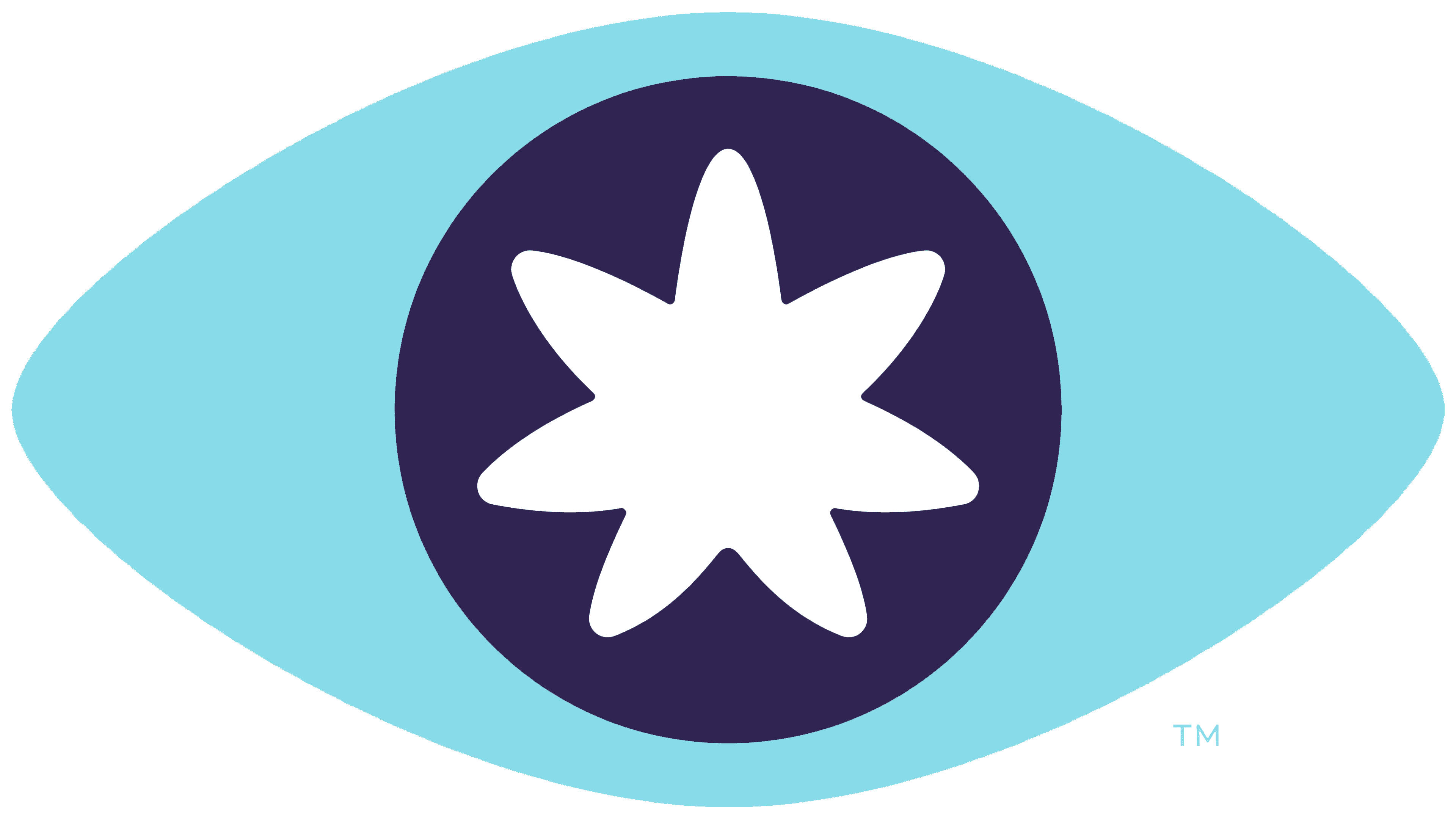
The new logo and packaging were created by the agencies Tattoo Projects and McLean Design. The brand has moved away from its previous strict design with heavy lettering and an eye symbol. The updated identity is based on a handwritten typeface that is not overly rigid, creating a sense of freedom and ease.
![]()
The update reflects the concept of fast-acting seltzers with varying THC concentrations of 5, 10, and 20 mg. The drinks contain no sugar, calories, or carbohydrates, making them suitable for people with varying sugar tolerances. The lineup includes eight flavors, including “Blood Orange” and “Pink Lemonade.” Delta positions them as a modern alternative to alcohol and a way to relax at any time of day.
The campaign is built around the idea of micro-moments, short episodes of everyday life filled with lightness and joy. It depicts relaxing with friends around a campfire, a pre-game evening, and a calm break after work. Delta aims to break stereotypes by forming a positive image of cannabis beverages and making them part of an open, modern culture.
Founded in 2020, the company has earned consumer trust through consistent quality. Over the next year, Delta plans to produce about 11 million cans, which will be available at more than 8,500 retail locations nationwide.
The rebranding reflects the brand’s focus on lightness, enjoyment, and positive communication. The campaign is promoted through social media, outdoor advertising, and digital platforms, combining humor, energy, and a sense of freedom that resonates with Delta’s audience.
![]()