


![]() Denny’s Logo PNG
Denny’s Logo PNG
The Denny’s logo symbolizes refined taste and unique dishes. It remarkably combines authentic cuisine and traditional cooking, offering guests classic, hearty, modern food. The emblem conveys confidence that visitors can always expect a diverse and delicious menu. Denny’s emblem is bright and vibrant, like the restaurant’s menu. The emblem reflects a love for cuisine and always wanting to be number one. It reflects the unique atmosphere of the establishments, making guests return time and time.
Denny’s is a 24-hour fast-food restaurant chain. The Denny’s logo unites 1698 establishments, most located in America, plus 578 independent restaurants in Japan.
Two partners, Butler and Jezak, opened the first donut shop in California. However, after three years, all assets were transferred to Butler, who transformed six establishments into cafes with spaces for presentations, concerts, and other performances. In the 1980s, the number of such restaurants reached 1000, and they operated around the clock. The chain expanded to South America, New Zealand, and Canada thanks to franchising. After Butler’s departure, the chain changed ownership, contributing to its further expansion. Snack bars are now located along highways, near gas stations, and major supermarkets.
In 1953, Harold Butler and Richard Jezmin opened Danny’s Donuts in Lakewood, California. It was a simple place that sold donuts and coffee. This small shop was just the beginning of what would later be known as Denny’s, a name familiar to people across America.
In 1956, things started to change when Butler’s partner, Jack Bony, decided to add burgers and sandwiches to their menu. This change was well-received, and by the end of the year, they renamed their business to Danny’s Coffee Shops. Their success continued to grow; within three years, they had 20 locations in Southern California.
By 1961, Butler and Bony sold their business to investors who changed the name to Denny’s. They started serving breakfast around the clock, which helped the chain grow fast. By 1981, Denny’s had more than 1,000 restaurants across the U.S.
But not everything was smooth sailing. In the 1980s and 1990s, Denny’s faced accusations of discrimination, which hurt its reputation. To fix this, Denny’s worked hard to change its image by starting diversity programs, training employees, and bringing in a more diverse leadership team.
In the 2000s and 2010s, Denny’s faced tough competition in the casual dining market. They updated their menu with healthier options and redesigned their restaurants. Denny’s also got attention with its funny, self-mocking marketing and social media presence. This approach helped attract a younger and more diverse group of customers.
Denny’s has over 1,600 locations worldwide and is a go-to spot for 24/7 breakfast and affordable dining. Despite the challenges, Denny’s has shown it can evolve while staying true to its roots of providing quick, budget-friendly meals in a friendly environment.
Meaning and History
![]()
Denny’s logo has changed many times, but its distinctive feature has always been the company’s name, centered in the composition.
What is Denny’s?
Denny’s is a chain of American diners that operates 24/7. It offers fast food and positions itself as a hospitable place with its favorite dishes. Denny’s is owned by a company of the same name.
1953 – 1957
![]()
Initially, Denny’s was opened as a donut kiosk. The fluffy pastry with jam inside was served with high-quality coffee and enjoyed great popularity. Therefore, the first logo featured the product: a large round donut and a box for packaging the filling’s sweetness below. The name of the snack bar, “Danny’s Donuts,” was placed on the package. The owner simply made up the name Danny’s.
1957 – 1961
![]()
Three years later, Butler’s partner left the business. The remaining owner had his vision for the development of the snack bars. In 1956, he changed the restaurants’ names to “Danny’s Coffee Shops” and introduced a new concept. The cafes now operate around the clock, not closing even on holidays. To attract customers, shows and concerts were held inside.
A new logo was introduced since donuts were no longer the main menu item. The sign was straightforward and conceived hastily: the black name “Denny’s” in print letters.
The emblem resembled the notation of weekdays in a calendar. All days in the cafes were the same, without holidays or weekends. The logo also indicated stability and nighttime operation. The brand name already lacked the letter “a,” which was replaced with “e.” The primary reason was the similarity to the “Coffee Dan’s” night establishments that appeared in the 1920s. Therefore, the company was renamed “Denny’s Coffee Shops.” The last part of the name was gradually removed, leaving only “Denny’s.”
1961 – 1973
![]()
The chain was preparing to operate under a franchise system to expand into other cities and countries, which happened in 1963. A new, colorful logo was designed to present the cafes in a presentable manner.
The cowboy-style name indicated the snack bars’ American origin. At the end of each letter was a notch resembling a tray on which waiters served food. The similarity was especially noticeable in the “U,” the lower leg of which was bent like an arm carrying an order.
The caption “restaurant” clarified what was being offered to visitors. The beige-brown colors corresponded to the interior and to the fried dishes on the menu (pancakes, donuts, fries, toast, and deep-fried chicken).
The shape of the emblem hinted at a takeaway food packaging box.
In some cases, the name was used in bright red, indicating rapid preparation and always hot dishes.
1973 – 1994
![]()
In 1971, Butler handed over the reins and ceased to be chairman of the company’s board of directors. The new management reviewed the brand’s visual identity.
A very bright and attractive logo was designed. The name was set in a childlike, cartoonish font, with slightly dancing, rising letters of varying sizes. The bright red shade demonstrated a love of their work and a commitment to fast service. The diagonal placement indicated the constant growth in the number of establishments.
The background shape resembled a breakfast box. Its red border pointed to the delicious contents. The yellow background represents the pleasant emotions visitors experience in the restaurants.
The logo became family-oriented and targeted a younger audience, as children often visited the snack bars. The image conveyed festiveness and elegance. Denny’s had a promotion offering free birthday treats, attracting birthday guests and their visitors.
1994 – 2002
![]()
In 1987, the Trans World Corporation (Flagstar Companies) acquired the restaurants, which were later bought out by Kohlberg Kravis Roberts in 1992. The new investors demanded modernization and the sale of unprofitable assets. The fast-food chain actively participated in popular public programs such as “Save the Children.”
The innovations led to the redesign of the logo and the restaurants themselves in 1994.
The name remained at the center but lost its childishness and disorderliness. Slim and beautiful letters soared, lifting the right edge upwards. They symbolized systematic development and a desire for the future. The font was focused on many consumers: workers who came out to lunch, business people who resolved issues with partners and clients, and families who decided to relax on weekends.
The logo had three substrate layers. The top two reflected changes within the establishments. The top layer showed new floors with tiles of two different shades. The second layer, orange-brown, showed the predominance of these colors in the restaurants’ decor.
The lower substrate was unusual for the emblem. The green color first appeared in the visual identity, symbolizing the restaurant’s new life and the presence of fresh salads and vegan menu items in the assortment.
The multilayeredness focused on many consumers and hinted at a stack of pancakes and burgers.
2002 – 2019
![]()
In 2002, Flagstar Companies renamed Advantica Restaurant Group and changed its name to Denny’s, as the restaurants were its most profitable project.
The updated owners’ and restaurant chain emblem returns to yellow and red, without multilayer substrates. The name is written in bold letters with a slight arch, demonstrating the establishment’s friendliness and significant presence worldwide.
Depending on the country, the main logo undergoes minor changes. For example, in Canada, a maple leaf is used instead of an apostrophe, and in America, the slogan “See you at Denny’s” or “Real breakfast 24/7” always accompanies the logo.
2019 – today
![]()
In the new Denny’s logo, the focus has shifted to simplicity, openness, and accessibility. It is now a modern sign that meets current requirements due to its:
- Two-dimensional design,
- Easy perception,
- Absence of unnecessary details.
This approach has proven effective: customers’ attention is immediately drawn to the most important element, the text. The result is a harmonious connection between the name, which has always been simple, and the easy design that prompted the update to the emblem.
The slightly curved text is in bold Titla Cond Black serif font. This gives the text a dual impression, as it:
- It has an informal style,
- Looks very businesslike and strict.
This original approach is achieved by combining traditional Tex-Mex dishes and classic American culinary products into a single menu. The logo conveys a desire to unite the majority’s tastes to create a worthy product, hearty, accessible, and modern.
The emblem’s shape is unusual: it is a hexagon with two short sides and four long ones, resembling a flattened diamond. Its ends are protruding but not sharp, rather blunt, which speaks of the brand’s openness to consumers and customer orientation.
Overall, the logo looks like a sign on an old tavern or pub, which is a big plus for the fast-food chain, as it directly suggests that Denny’s menu features original, traditionally delicious dishes.
Font and Colors
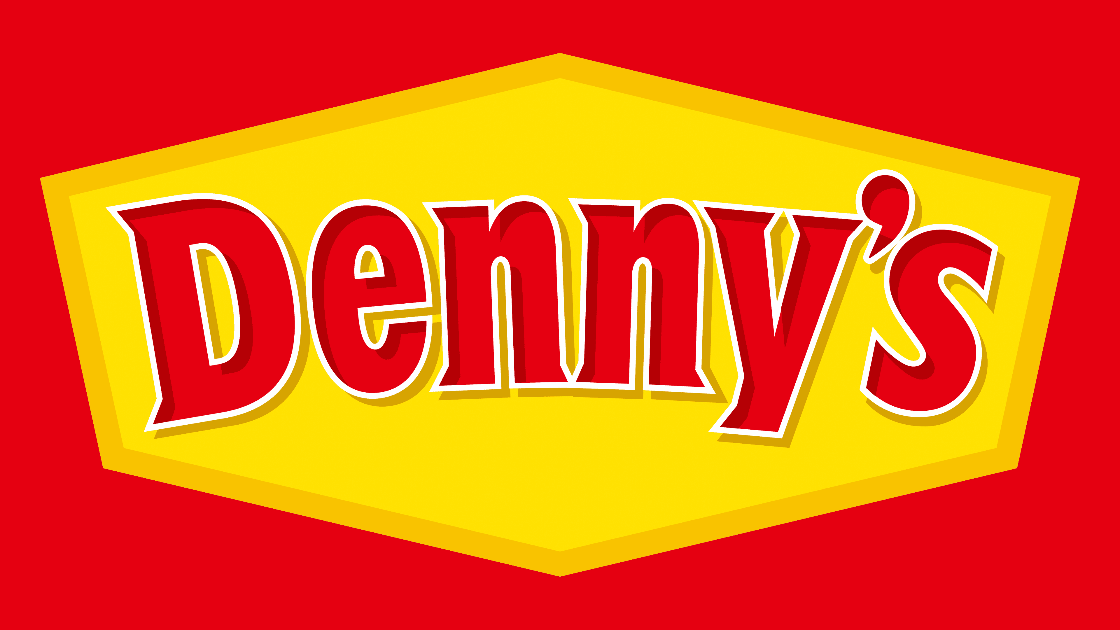
The main colors of the emblem are yellow and red.
- A pleasant yellow symbolizes renewal, a bright, warm morning sun that never sets in establishments around the clock.
- Red indicates love for customers, their business, and a striving to be the best.
The font resembles Titla Cond Black, which makes it stylish and modern.
FAQ
What is Denny’s slogan?
Denny’s slogan, “America’s diner is always open,” shows what the brand is all about a friendly place where you can get a meal anytime, anywhere in the U.S. It tells us that Denny’s is always there to offer comfort and a warm meal whether it’s day or night, making it a key spot for gatherings of family and friends for any meal.
Reddit users, known for their honesty and humor, have their fun version of this slogan: “Because it’s 2 am, you’re drunk, and you need pancakes.” This take on the slogan explains why many people end up at Denny’s late at night, looking for some tasty comfort food after a long night out. It’s a funny and accurate reflection of one of the many reasons people love Denny’s, highlighting its role as a late-night haven for pancake lovers.
While not official, these Reddit versions show how much people like Denny’s. They capture all the reasons people go there: for the food, the friendly vibe, and sometimes because it’s the only place open when you want some pancakes in the middle of the night. Both the real slogan and these playful takes underscore Denny’s place in American culture, not just as a diner but as a place that creates memories, any time of day or night.
Why is the Dennys logo yellow?
Denny’s logo is yellow because the color represents happiness, confidence, and creativity, all of which are key to what Denny’s wants to be known for. Yellow is a bright, happy color that evokes good times and warmth, just like the welcoming feeling Denny’s aims to give its customers.
Choosing yellow shows that Denny’s is more than just a place to grab a bite; it’s about creating a cozy spot where people can relax and have fun anytime they visit. The color reflects the diner’s goal of making everyone’s visit positive, with tasty, inventive food options in a place where friends and family can enjoy being together.
The yellow in Denny’s logo also helps it stand out from other restaurants, signaling a friendly, fun atmosphere. This choice underscores Denny’s effort to offer a happy, creative dining experience, showcasing what makes the brand special.
Who is the CEO of Denny’s?
Kelli Valade took over as the CEO of Denny’s Corporation in June 2022, starting a new era for the company. She brings much experience and success from the restaurant world to Denny’s. Her role is crucial in keeping Denny’s loved by its customers and adapting to changes in the food industry. With Valade leading, Denny’s aims to keep up its tradition of serving people everywhere, focusing on new ideas, great food, and making customers happy. Her leadership is expected to help Denny’s grow, work more efficiently, and build a positive workplace culture, helping Denny’s stay strong in a tough market.
Why is Denny’s called Danny’s?
Originally, Denny’s was called “Danny’s.” Harold Butler and Richard Jezak, the founders, didn’t name it after anyone they knew. In a 1985 interview with the Los Angeles Times, Butler said they picked “Danny” because it was popular and easy to remember, not for any special reason. They wanted a name that sounded friendly and welcoming to everyone. Later, they changed the name to “Denny’s” to make the diner stand out more in the restaurant world. This name change was a step to ensure Denny’s had its distinct place among other diners and restaurants.
How did Dennys start?
Denny’s started in 1953 when Harold Butler and Richard Jezak opened Danny’s Donuts in Lakewood, California. At first, they focused on donuts, hoping to become the go-to place for them. But in 1956, after Jezak left and they already had six stores, Butler saw a chance to reach more people and offer more than just donuts. He turned the donut shop into a coffee shop, which was a major step toward creating the Denny’s we know today. This shift allowed them to serve a variety of diner meals, laying the foundation for Denny’s to grow into a well-known diner nationwide. This change was key to making Denny’s a place where people could enjoy a full meal any time of the day.
Who is Denny’s parent company?
In 2002, Denny’s parent company, previously called Advantica Restaurant Group, Inc., changed its name to Denny’s Corporation. This change was to show the company’s strong commitment to the Denny’s brand. By renaming itself after Denny’s, the company aimed to focus more on the diner chain, making its operations and marketing strategies more efficient and centered around Denny’s. This move helped to highlight Denny’s key role in the company and brought it closer to the values and reputation Denny’s is known for. It was a way to make Denny’s brand even stronger and more visible in the competitive restaurant world, linking the corporation directly to Denny’s longstanding reputation and growth plans.