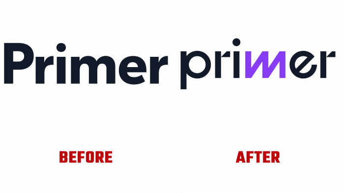
Primer is an original virtual community of ambitious children who share common interests. The brand’s goal is simple and effective – to create conditions for the next new generation of children who can become ambitious and creative, able to think for themselves. The community strives to demonstrate the mistaken attitude of the education system towards children. Aimed at “mass production,” it does not differ insufficient creative approaches, the presence of imagination, to shape the individuality in every child. By underestimating today’s children and building learning on tests instead of teaching them to think and solve real problems, the education system creates mindless mass consumers. Primer offers a different approach – forming young members of society who blaze their path, have different hobbies, think outside the box. The community builds in children the ability to choose new non-standard paths.
For all this to be reflected in the visual image, the brand team turned to young artists, storytellers, and simply creative personalities with a request to present their vision of the logo. And first of all, such a task was set for the children. A huge number of drawings, descriptions, statements were provided, which were transferred to the professional designers of Replica Studio. Its love of experimentation and creativity distinguishes the studio. Considering the community’s peculiarities, the studio focused on the playful embodiment of the logo, which was supposed to become a platform for children’s imagination, a creative canvas. It became possible to decorate the emblem, apply it to one’s work, and change it.
The original letter “m” has become an accent element of the text logo. Made in the form of a mysterious zigzag, friendly squiggle, lightning, or something else that children can see, it affects their imaginations. And here, the creative peculiarities of children began to manifest themselves. Some add wings and wings to the sign and see it in the form of a butterfly. Others are comic characters from comics. The third was able to “see” the elements of the teaching primer. Many saw this logo as their own home or magical element. The children themselves also created signs for mobile applications, which were brought to mind by the professionals of Replica Studio.
The color palette also played a role. All text is typed in black, which allows you to apply the logo to any background. Only the “squiggle” is made in an attractive shade – a purple heart. The color is distinguished by the absence of negative psychological effects on a person, especially on children.


