


![]() Desigual Logo PNG
Desigual Logo PNG
The Desigual logo offers a look at the world from the perspective of the owner of a fashionable brand bag. Feel the prestige of owning a unique and stylish accessory. The emblem evokes a desire to make a purchase.
Desigual is a Spanish fashion brand specializing in clothing, footwear, bags, and accessories. A distinctive feature of products under this brand is bright and rich colors, embroidery, appliqués, and ethnic motifs. The word Desigual is translated from Spanish as “not like everyone else,” “unique,” “special.”
In 1984, when the brand was created, the couturier Thomas Meyer, originally from Switzerland, was only 20 years old. He lived in Barcelona and was fascinated by the vibrant colors of Spain’s nature and cities. This prompted Meyer to create an equally colorful collection of clothing for young people.
Until 2011, things were going well, but not very quickly. And that year, the management took an unprecedented and shocking step: it was reported that the first 100 visitors to the Desigual store, who came only in underwear, would be dressed from head to toe. The trick was that it was the Christmas holidays, and the temperature outside did not rise above +4 degrees. Nevertheless, almost 200 people came. They were all dressed up, and the company received a big and loud advertisement. The products sold out instantly, and I had to make another collection.
In the same year, the famous couturier Christian Lacroix was invited to serve as the chief fashion designer, bringing a fresh perspective to the design of bright models.
In 2013, Desigual entered the American market, where its bright clothes and comfortable shoes were hugely popular. Now the brand has more than 200 branded boutiques worldwide while maintaining affordable prices for youth.
Meaning and History
![]()
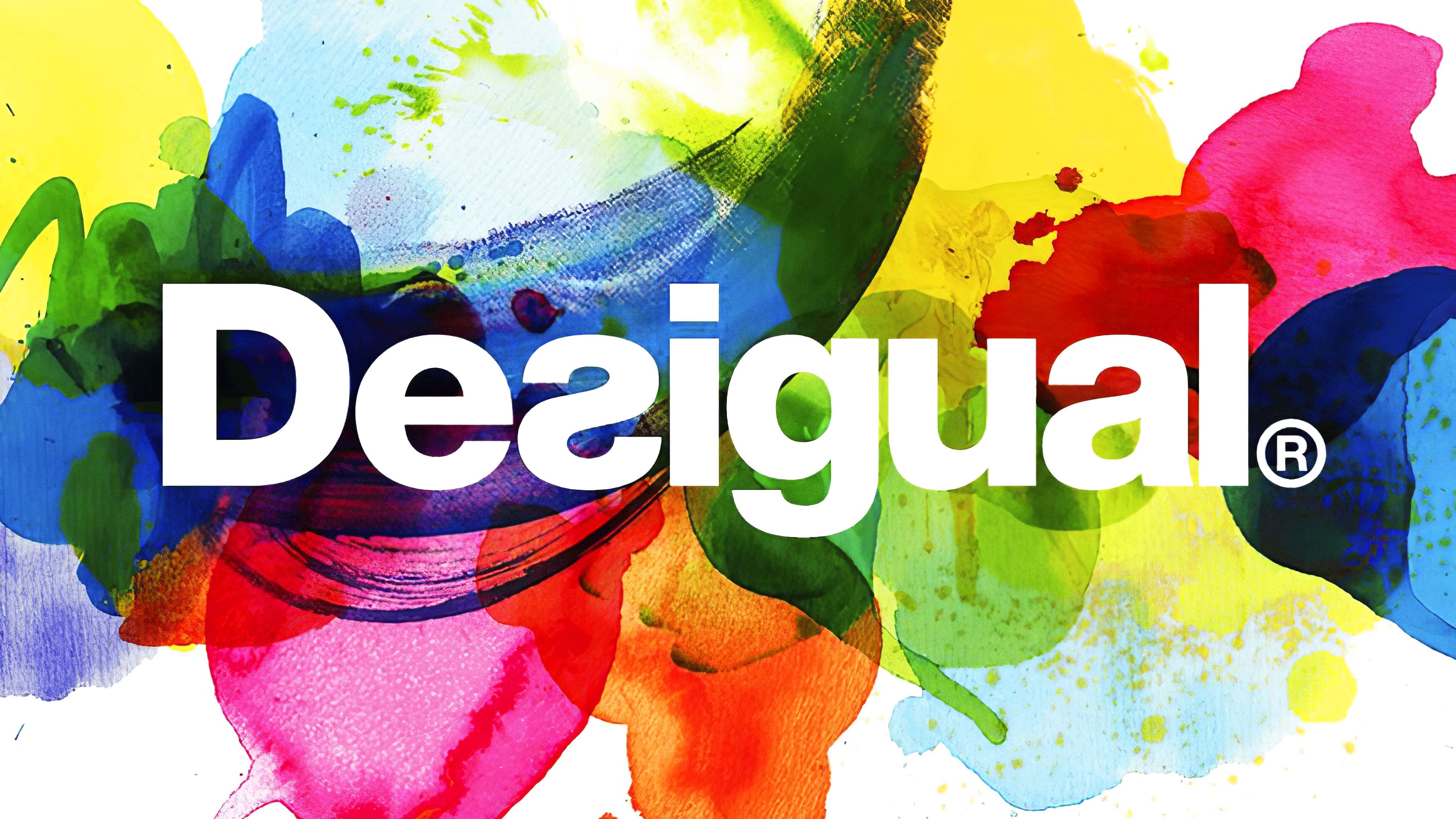
Bright and juicy, like the brand’s clothing, the logo was created in 1984 by the fashion designer Thomas Meyer himself. He took a white sheet of paper as a basis and randomly placed bright spots on it with transparent watercolors. Desigual’s name and ® are centered in white. The letter “s” in the word is mirrored. Such an emblem, like nothing else, successfully reflected the essence of the collections under this sign.
In 2019, a large audit of the company’s activities was conducted, resulting in reduced sales and income. Experts found that the average buyer age has risen to 35-40, while young people are less interested in their products.
It was decided to shift the approach to more fashionable models among youth and to completely change the logo, with a focus on the selfie craze. The emblem is now a black or dark blue plaque with the name in white letters, but the word is written backward. In the photographs, it just turns out right, unlike other trademarks. The letter “s” remained in the mirror filing.
This unconventional approach immediately attracted attention to the brand. Desigual today is a vivid example of how a company with a rich history responds promptly to new realities and renews itself. Also, black, white, and black-and-white models, which are very popular among young people, have appeared in the 2020 collection for the first time.
What is Desigual?
This Spanish company is known for its distinctive aesthetic, vibrant designs, and unconventional color combinations. Each item from its eclectic range of bags, accessories, and clothing for men, women, and children features a unique style, blending different fabrics, patterns, and textures. A hallmark of the design is the use of patchwork, asymmetrical cuts, creative prints, and bold embroidery, giving the products originality and recognizability. The company is also renowned for collaborations with prominent designers and artists, resulting in exclusive collections that reflect its motto: “Life is beautiful.”
1984 – 2004
![]()
The first logo of the Spanish clothing and footwear brand contained a defiant picture of naked people, obviously a hint that they needed to be dressed. They were caricatures of a man and a woman standing, holding hands, in front of a red rectangle. Graphic designer Pere “Peret” Torrent emphasized their gender to make the image as provocative as possible. The naked couple symbolized complete freedom, not limited by society’s boundaries. The word “DESIGUAL” was written at the bottom in bold white letters, and “BARCELONA” below it in small print.
2004 – 2019
![]()
In 2004, Desigual took a minimalist stance. So she got a simple wordmark with her name in bold sans-serif. Almost all black letters looked standard, except for the “s,” which was written backward. She symbolized nonconformism, the desire to move away from traditions and generally accepted rules. The font was roughly similar to KyrillaSansSerif-Black Regular by Manfred Klein.
2019 – today
![]()
In June 2019, the brand updated its visual identity to better express its position. As a result of the evolution, the Desigual logo was turned backward so that the inverted “s” fit perfectly into the redesigned design. The mirror inscription remained black, and a round dot appeared at the end of the word (more precisely, on the left side because the “D” was on the right), symbolizing confidence and completeness.
Font and Colors
Because Desigual thinks the familiar is boring, they chose a standard typeface and used it unusually. The first “oddity” is the inverted “s” in the incorrectly typed text. The second is the opposite word, read from right to left. In both cases, the sleek, grotesque Helvetica Neue font is used with individual elements.
The official logo’s color scheme is monochrome, with black letters on a white or gray background. Depending on the design, the inscription may be accompanied by bright background colors.
FAQ
Is Desigual a luxury?
The company offers high-quality products that appeal to middle- and upper-class consumers. The brand is known for its unique designs and materials, which give it a luxurious feel. It is not considered a traditional luxury brand like Chanel or Gucci.
The brand is recognized for its vibrant colors, bold patterns, and eclectic styles. These features appeal to consumers seeking unique, expressive clothing. While the products are high-quality and more expensive, the brand is more of a premium brand than a classic luxury label.
What is Desigual famous for?
This is a Spanish fashion brand known for its bold, colorful designs. It offers comfortable, eye-catching clothing, and its unique approach sets it apart in the fashion world.
Desigual’s fashion features vibrant colors, bold patterns, and eclectic styles. Designs include patchwork, asymmetry, and mixed textures, appealing to those who want to express their individuality.
The brand is known for its creative marketing campaigns and collaborations with artists and designers. It offers clothing, accessories, shoes, and home decor items that showcase the brand’s signature style.
Why is the Desigual logo backward?
The brand flipped its logo backward to show its unconventional approach to fashion. This bold move reflects the brand’s identity as a daring experimenter, willing to challenge norms and stand out in the industry.
Reversing the logo aims to capture attention and spark curiosity. This unique branding decision aligns with the brand’s philosophy of embracing individuality and breaking away from traditional fashion standards.
Is Desigual a real brand?
Desigual is a well-known brand known for its distinctive, colorful designs. It has a significant presence in the fashion industry, with many stores worldwide.
The brand’s official website describes itself as a creative group of people. This approach emphasizes the brand’s commitment to artistic expression and individuality.
Despite this self-description, the company operates as a brand with a strong market presence. It offers a range of products, including clothing, accessories, shoes, and home decor.
What happened to Desigual?
Desigual is doing well and continues to thrive in the fashion industry. The brand regularly releases new collections, maintaining its reputation for vibrant and eclectic designs. Despite challenges in the retail sector, the company has adapted and stayed relevant.
The brand focuses on innovation and creativity, keeping its offerings fresh and appealing to a wide audience. The brand has built a loyal customer base by embracing new trends while staying true to its distinctive style. The company remains strong in global markets, with numerous stores and an active online presence.
What country is Desigual from?
Desigual is a Spanish company headquartered in Barcelona. The city’s rich artistic and cultural heritage influences its unique and vibrant fashion designs.
Barcelona’s creative atmosphere shapes the brand’s identity. The designs feature bold patterns, bright colors, and eclectic styles, reflecting the city’s lively spirit. This connection to Barcelona makes the brand distinctive and appealing worldwide.