Among the world leaders providing integrated telecommunications services, the German Deutsche Telekom is one of the leading ones. Established in 1995 and headquartered in Bonn, the company now has over 242 million mobile subscribers with 27 million fixed lines and 2.2 million broadband subscribers. Over the years of its existence, the brand has significantly expanded its capabilities, covering more than 50 countries with its services. It provides its entire range, from mobile communications to the Internet and consumer IPTV. Among the company’s proposals, solutions for business and corporate clients are in particular demand. At the same time, the brand is the owner of a significant stake in the business of many telecommunications companies in Europe.
This information is reflected in the brand logo itself, where the text block notes that T-Mobile in the US alone has a 64.78% stake. Following modern trends, the company has fully aligned its external identity, reflecting its main strategy – the desire to further expand its influence on the digital telecommunications market, strengthening its influence as a brand of international importance. Today, T-Mobile wants to emphasize the sustainability of its operations and social cohesion, which is reflected in the new international architecture, which provides the central location of the letter T. This letter symbolizes the desire to become the center of communications while uniting under its brand all those who work under its auspices.
Based on some changes in the company’s strategy, which is revising its policy as a single brand, the new logo will be applied in all national divisions. The form of the new character is represented in the display digit-letter-digit – 1-T-1. The sign and the entire logo are the basis of a thoughtful and well-executed architecture. The logo was created in a minimalistic style that supports the compact visual design of the letter. To achieve this goal, optimization of its graphical performance was carried out. All curves are smooth and defined, while the base, body, and top have been reinforced. All these changes provided a more powerful visual impact on the viewer. The new visualization has greatly simplified the overall application of the entire identity and improved the communication of important information about the presence of all digital and physical touchpoints.
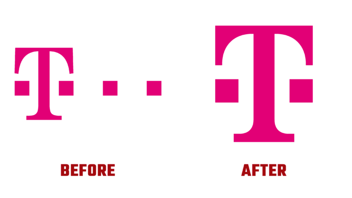
Changes that have taken place in the visualization have undergone minor changes. However, they were of great importance for such a large structure. Removing the squares and forming an ultra-thin graphic rendering of the letter T made the logo dominant and more attractive. The purple color previously chosen as the corporate color remains the main one in the new logo, providing brand recognition and clear identification.


