


![]() Dickies Logo PNG
Dickies Logo PNG
Although it’s a fashionable brand, the Dickies logo doesn’t look like a typical clothing label. It’s more rugged and substantial, associated with anything but fashion. This impression is formed at first glance at the emblem. However, the concept becomes clear later: the products are enveloped in softness and impress with reliable quality because they are designed for service personnel and, consequently, for intensive use.
Dickies began in 1918 in Fort Worth, Texas, when C. N. Williamson and Ernest “Colonel” Dickie opened a business making wagons and horse harnesses. In 1922, Colonel Dickie, Williamson, and his son C. Don Williamson bought the US Overall Company and renamed it Williamson-Dickie Manufacturing Company. The new focus was workwear for ranchers, farmers, and laborers across the American Southwest.
During the 1930s, the company survived the Great Depression and continued to expand its workwear range. During World War II, civilian production was halted, and Dickies produced 9 million heavy-twill uniforms for the U.S. military. After the war, the brand returned to the civilian market with jeans, jackets, overalls, shirts, and khaki work pants.
The khaki pants first worn by Texas oil workers became one of the company’s key products in the 1950s, later spreading to students, teachers, golfers, and overseas markets through oil workers in the Middle East. In 1967, Dickies released its most famous model, the 874 work pants, made from a 65% polyester and 35% cotton blend. In the workwear market, it stood near competitors such as Carhartt.
By the late 1980s and 1990s, the 874 moved into street culture through Southern California style, skate teams such as AntiHero, Zero, and Toy Machine, and hip-hop artists including Tupac Shakur, Snoop Dogg, Cypress Hill, and N.W.A. In 2017, VF Corporation, owner of Timberland and Wrangler, bought Williamson-Dickie for $820 million. The brand later moved under Bluestar Alliance and marked its 100th anniversary in 2022.
Meaning and History
![]()
Initially, the successful entrepreneurs were involved in commercial activities for a quarter of a century, trading hats in southwestern Texas. In 1918, the salesmen, along with others, founded the Overall Company. In 1922, Col. Dickie, C. D. Williamson, and his father, C. N. Williamson, bought out their friends’ shares, becoming the sole owners of the business. To emphasize this, they renamed the company Williamson-Dickie Manufacturing Company. Only the second part of the name has survived to this day, forming the basis for the logo.
Now, the world’s number-one workwear manufacturer is very different from its original form. Movie stars, models, rappers, and hip-hop artists gladly wear its products, turning them into a cult attribute instantly recognizable by the horseshoe on the tag. This emblem conveys the brand name (the horseshoe resembles a “D”), as well as the hard work, resilience, and spirit of the American people.
The visual identity of the sewing and trading manufacturer was represented not only by the building’s sign but also by the label on the clothes. Thus, the emblem became a trademark, signifying the product’s original origin.
What is Dickies?
Dickies is a well-known brand of specialized clothing, supplying not only the USA but also many countries worldwide. Its range includes uniforms for workers in the medical, agricultural, automotive, hospitality, construction, and other sectors. Recently, it has also been involved in releasing capsule collections. The trademark belongs to the Williamson-Dickie Mfg. Co., a sewing enterprise founded in 1922 by cousins C. N. Williamson and E. E. “Colonel” Dickie. Its headquarters are located in Fort Worth, Texas. There are also several additional offices in different regions of the world, as it has become an international company, present in over 100 countries.
1920 – 1930s
![]()
The old Dickies logo is preserved as a label on clothing, embroidered with white and dark burgundy threads. It has a distinctive rectangular shape with rounded sides and is decorated with a wide ornamental border. In the center is the inscription “Dickie’s Best,” executed in an elegant font with varied letter heights. Above it, the company’s name and location are indicated: “Williamson-Dickie” in the first line and “Fort Worth, Texas” in the second. Additional product information is included at the bottom. The image’s texture resembles dense fabric, emphasizing the emblem’s vintage spirit.
1930s – 1940s
![]()
The logo from this era features a simplified, asymmetrical design. All the lines that make it up do not have perfectly smooth edges: they are uneven and shaky, with blurred contours. Therefore, the burgundy word “Dickie’s,” centered, appears handwritten. The same goes for the phrase “Fort Worth,” but in this case, the designers tried to imitate a rectangular font. The brand name is placed in a slightly curved yellow ellipse outlined by a burgundy stripe. A large black rectangle serves as the background. Due to the gradient, the letters appear voluminous, as if made of clay.
1940s – 2005
![]()
Dickies clothing was long adorned with a two-level inscription, “Dickie’s Guaranteed.” The first word is typed in neat semi-bold italic, and the second in a straight sans-serif font. The letters in the bottom line are so thin that they are indistinct on small labels. The phrase is embroidered with golden thread on a dark brown background and surrounded by a decorative frame whose sides resemble ropes. The emblem became a trademark, signifying the product’s original origin.
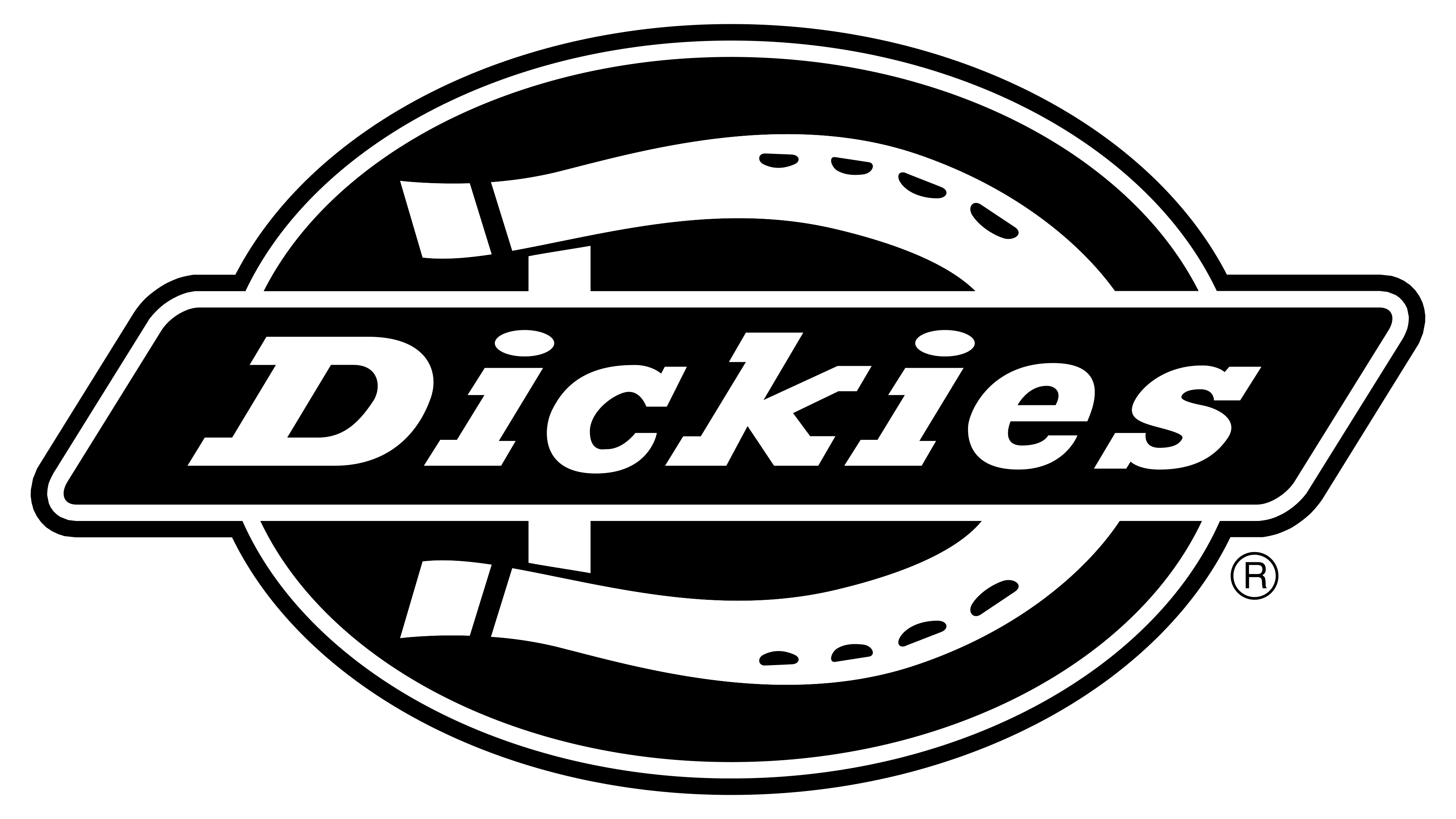
2005 – today
![]()
The Dickies logo combines graphic and text elements, perfectly merging the drawing and inscription into a harmonious composition. The central element is a dark blue parallelogram with rounded corners, bearing the fashion brand’s name at the center. The bold letters are serifed and colored in white. They are predominantly lowercase, smooth, slanted, and geometric. The background features a red oval with a yellow horseshoe, symbolizing:
- The company’s territorial affiliation (Texas, where horse breeding is common).
- The original application of the workwear (initially, the factory-made overalls for livestock breeders and farmers);
- The trademark (the horseshoe, which resembles the first letter of the name, stylized as “D”).
A single common frame unites all elements of the emblem. It’s thin and ornate, following the contours of the two geometric elements.
Font and Colors
The inscription in the Dickies logo is set in bold, lowercase font. Its closest analog is Rockwell Std Bold Italic, designed by Frank Pierpont and published by Monotype. The geometric glyphs are designed with rectangular serifs that are firmly connected to the glyphs.
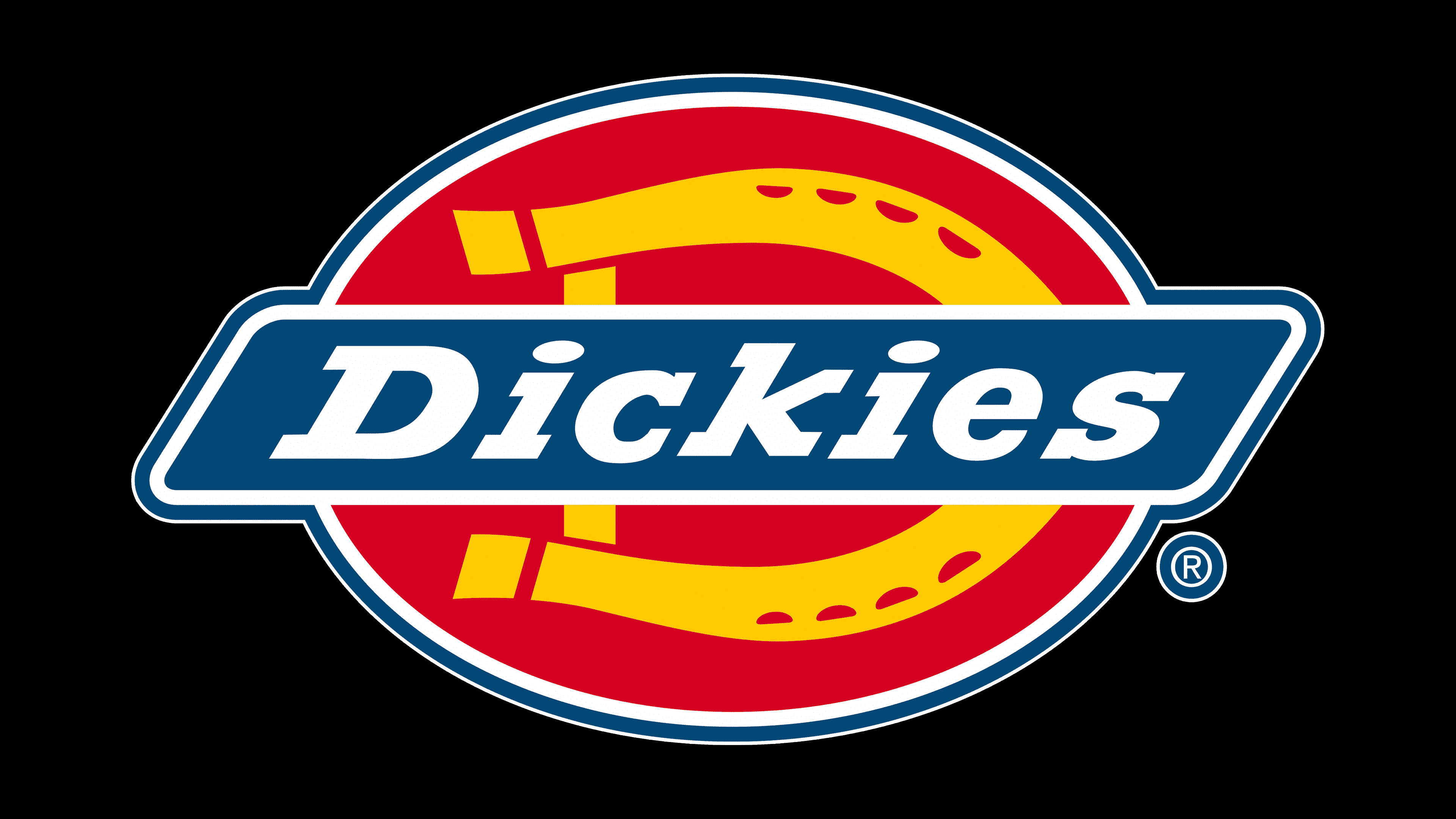
The brand palette includes dark blue, raspberry red, and sunny yellow, bright and warm colors. Together, they create a positive atmosphere, attracting new fans of practical clothing who confidently follow the trend.