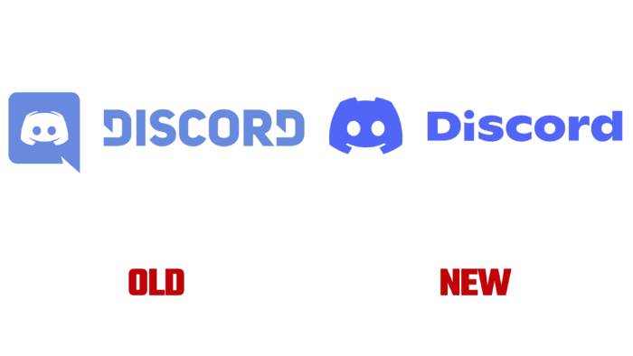
Discord has been around for six years, and the company decided to celebrate the date with a new look.
According to the company’s blog, Discord has become a real home for more than 150 million users and helps to communicate on completely different topics. The brand decided to rebrand for the first time, starting in 2015, when it appeared on the market. According to the company itself, their logo received completely different names, from Discord to Mickey Mouse pants.
The company logo has its name. The symbol’s name is Clyde, and in the new design, the creators decided to free him from captivity and remove the white square. Additionally, the designers worked on the symmetry of the picture, making the shape more square. The team made the character friendly and even gave it some emotion. Clyde can be happy, angry, or sad. The antennae on the character’s head have lost their sharpness due to the inconvenience of using printed versions.
Additionally, the company decided to change the font to make it playful and fun – a custom font based on Ginto typography. Thanks to the new design, even the name without a picture look stylish and attract users’ attention.
The changes also affected the brand’s color palette. The famous Blurple color has become brighter, and the creators have added a red tint to the palette. Discord said that the colors used to be too pastel, and the shades had complicated names: “Dark, But Not Black” or “Not Quite Black.” With the help of red, the designers diluted the palette.
In addition to the visual changes, Discord has added a new slogan – Imagine a Place. With the help of the slogan, the creators wanted to convey the idea that the service can be used for various activities around the world. The team also shared information that they were able to communicate with their users. They learned exactly what Discord means to customers. They were able to interview 26,000 users and integrate the results into their designs.
The styling updates are available on Discord. Users will be able to notice updates on the registration and login page and inside the service itself. The new typography will also be available in some headlines. By the end of the year, the company plans to replace the image on the tabs with tips.


