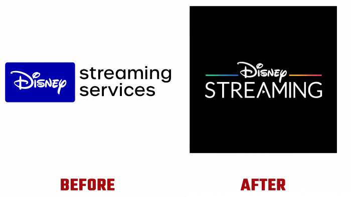
Founded in 2015 as BAMTech Media, which changed its name to Disney Streaming Services in 2018, it has been rebranded. From August 27, 2021, the new visual identity has already been demonstrated on all channels, the Internet, and the company’s advertising products. The process of reorganizing the appearance coincided with some reformatting and expansion of the direction of the entertainment channel. Today, Disney +, Hulu, ESPN +, and STAR + Teams make it easy to access your favorite stories. Combined into a single Disney Streaming Services, they effectively solve the problem of promoting a relatively new direction – streaming, while applying innovative technologies. All of their activities are aimed at creating proposals that are consumer-oriented and especially in demand by them. With a focus on particularly compelling destinations, Disney Streaming Services ensures timely information and convenient delivery of the most exciting social and business news, original idea shows, entertainment, and more.
The new design created a completely different visual perception of the brand’s appearance. In the new interpretation, the main accent mark – the name of the Disney corporation that binds everyone – was preserved in absolute accordance with the historical graphics. At the same time, the logo has undergone dramatic changes. The current emblem is attractive and attractive, which makes it easy and easy to remember. The black background creates the conditions necessary for the selection of other elements of the composition. The main element – Disney and the second word of the brand name “Streaming,” made in a contrasting white color, stand out brightly and clearly. The latter is in a sans serif lowercase font. In it, the designers applied an original visual move – in the letter “A,” they used an enticing element – an arrow “START VIDEO” in place of the middle crossbar. A color stripe executed in a gradient color scheme, which is a symbol of color streaming television, is used as defining aides to the left and the right of the brand mark.
The new rendition of the logo is a spectacular demonstration of the direct connection between the brand’s past, present, and future. It reflects the main characteristics of Disney Streaming Services – attractiveness, variety, contrast, and consistency of both the brand itself and the content offered.


