


![]() Dockers Logo PNG
Dockers Logo PNG
The brand with the Dockers logo offers many men’s clothing models. The emblem reflects the brand’s distinctive style and exact correspondence to measurements and sizes. Therefore, fashionable things are suitable for both work and leisure.
The image of a sailboat in the logo alludes to the maritime tradition and history associated with Dockers pants, which are a comfortable, practical garment for sailors. Therefore, the Dockers logo symbolizes convenience, comfort, and freedom of movement, which are important characteristics of the brand’s products.
Dockers emerged from a gap in the mid-1980s wardrobe of American office workers. Levi Strauss & Co. dominated denim and workwear, yet lacked an option between jeans and formal suits.
The name appeared earlier. In 1982, Levi’s Argentine division launched “Dockers,” a nautical-themed denim line. In 1985, the Japanese unit applied it to casual cotton trousers. That same year, Susan Kilgore brought a pair to San Francisco, drawing attention inside the company.
In 1986, Dockers launched in the US as a separate brand. The first line focused on men’s khaki pants in neutral tones. Positioning targeted a middle ground between office dress and weekend wear. The “Talking Pants” campaign used humor and helped establish early visibility.
By 1987, a women’s line was added. Late 1980s exposure grew through TV shows like Cheers, where characters wore Dockers without paid placement. The brand later appeared in Seinfeld.
Growth accelerated with Casual Fridays. In the early 1990s, Levi Strauss distributed a workplace guide promoting relaxed office attire. Khakis became a standard in many companies. In 1994, revenue reached $1 billion. Expansion into Europe followed around 1993–1994, with further presence in Japan, Australia, and Latin America by 1995. Campaigns like “Nice Pants” reinforced brand recognition.
By the 2000s, demand shifted. Premium denim labels such as 7 For All Mankind and True Religion returned jeans to offices. Attempts to expand into shirts and footwear diluted focus. In 2009, leadership under Jim Calhoun refocused on core products. The 2011 Alpha Khaki line, aimed at younger consumers, gained traction through retailers like Urban Outfitters. In 2025, Levi Strauss agreed to sell Dockers to Authentic Brands Group for $311 million.
Meaning and History
![]()
The Dockers’ debut emblem appeared alongside the first collection. The khaki work trousers were adorned with the original wing-and-anchor label. New York artist Milton Glaser created the stencil for the drawing, one of the famous “I Love NY” rebus lettering authors.
The nautical motifs were meant to highlight the West Coast’s heritage. At the same time, they fit perfectly into the style because the clothes resembled Dockers’ uniforms worn by UK port workers. This logo has been in use for 14 years. In 2000, the designers simplified it, leaving the anchor with four stripes and the brand name. The new trademark lasted almost 18 years.
In 2018, Levi Strauss & Co. announced the return of the legendary 1986 Dockers emblem. This is how a modernized version of the first label appeared on clothing, shoes, and accessories. She also adorned the manufacturer’s packaging, marketing materials, and outlets.
What is Dockers?
Dockers is an American brand of Levi Strauss & Co., founded in 1986. He specializes in denim clothing. At first, he focused on the men’s line, and a year after the opening, he introduced the women’s series. In 1993, the brand went beyond the country’s borders and began “expansion” in Europe. Its head office is located in San Francisco, California.
before 2005
![]()
The brand name is written in a straight uppercase, sans-serif font in the old Dockers logo. The solid letters inspire the confidence that underlies the brand concept. The font is similar to Craft Gothic Bold Extended from FontSite Inc. The only difference is the “K,” which consists of a vertical line and an angle bracket. The anchor at the bottom reflects a connection to the sea because the company makes clothing similar to port workers’ uniforms. In addition, the anchor symbolizes reliability, stability, and safety. All elements are white and are inside a dark blue rectangle. This color scheme evokes a nautical theme while giving the logo a classic, stylish look.
2005 – 2018
![]()
In this version, the “K” has a more familiar structure and resembles the letters in the Craft Gothic Bold Extended font from FontSite Inc. The anchor is separated by four short horizontal stripes to its right and left. These lines are associated with traditional nautical apparel, such as striped vests. The black pattern and lettering are on a blank white background.
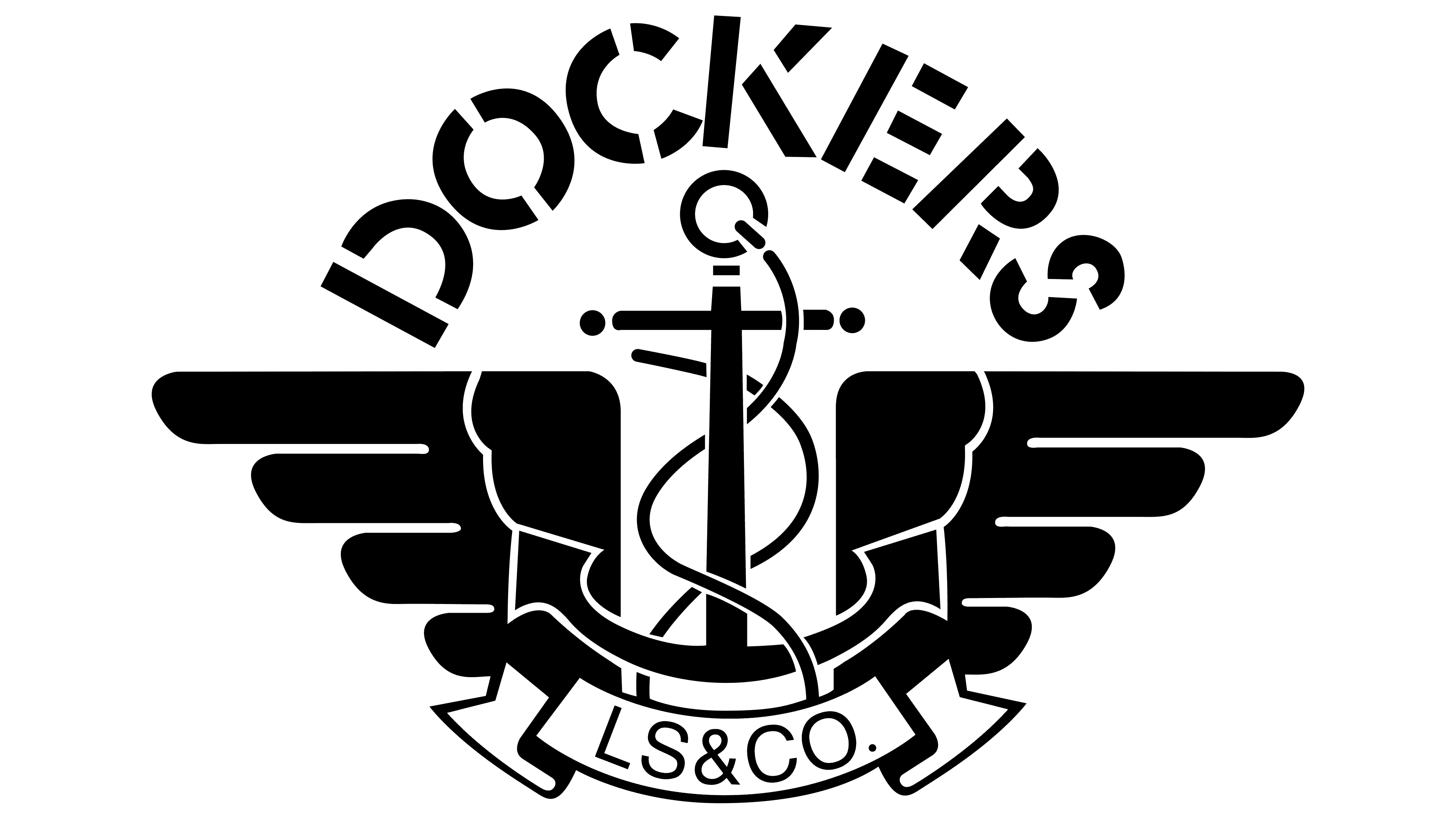
2018 – today
![]()
In 2018, Dockers updated its logo by adding two stylized wings with feathers of different lengths to the anchor. This was done to emphasize its connection to travel and freedom. The wings, in this case, symbolize height and spaciousness, reflecting the brand’s philosophy of creating clothes for people who love adventure.
Now the anchor is wrapped with a long, thin rope, and at the bottom is a curved ribbon with the inscription “LS&CO.” That’s the acronym for Levi Strauss & Co., the owner of Dockers. As for the brand name, it is located above the anchor and curves into an arch. It uses a stencil typeface that mimics the style of industrial markings. This design was chosen to show the brand’s connection to port workers and to emphasize its modern, versatile nature.
Font and Colors
The brand’s logo, still adorned with the anchor and wings proposed by Milton Glaser at the very beginning of the brand’s career, remains. He developed the basis in the form of a stencil: an anchor entwined with a rope and stepped wings with four feathers on each side. Below is a wide bar with teeth showing the year the company was founded. On the right is a large inscription with the name of the fashion house. It is in uppercase letters, similar in style to the signs on shipping containers. By design, such an emblem is as close as possible to the uniforms worn by British dockers.
In its logo, the company management used a typeface that exactly resembles stencil lettering. This is indicated by the smoothness of the letters, the simple style, and the broken lines. As a result, the word “Dockers” looks like a combination of separate fragments. The color palette is monochrome, which includes white (background) and black (key elements).
FAQ
Are Dockers still around?
Yes, they are still popular worldwide. The company, known for its khakis, now offers a range of fits and styles to meet different needs. The brand continues to evolve with thoughtful designs and advanced innovations, ensuring its products are comfortable and stylish.
The brand was introduced by Levi Strauss & Co. and quickly became known for casual yet professional attire. Their khakis became a staple in many wardrobes because they are versatile and comfortable. Over the years, the brand expanded its offerings to include traditional khakis and a range of pants, shorts, shirts, and accessories.
The company’s wide range of styles ensures something for everyone, whether you need clothes for the office, casual outings, or special occasions. Their focus on fit and style appeals to a broad audience, from young professionals to seasoned businesspeople.
Are Dockers owned by Levi’s?
The brand is owned by Levi Strauss & Co. and is known for its garments and accessories, especially khakis. Levi Strauss & Co., based in San Francisco, California, introduced Dockers in 1986.
Levi Strauss & Co. originally specialized in denim jeans. They saw a demand for casual yet professional attire, so they launched Dockers to offer a versatile alternative to jeans. This allowed the brand to expand its product range and reach a broader market.
The company quickly became popular for its comfortable, stylish khakis, suitable for both casual and professional settings. Over the years, the brand has expanded to include clothing items such as pants, shorts, and shirts, as well as accessories. Using their experience in the apparel industry, they ensured that products met high standards of comfort, durability, and style.
What made Dockers famous?
The company became famous for creating the khaki category and for making khaki an American classic. The brand played a big role in the casual movement, offering men smarter, more comfortable, and versatile clothes for all occasions.
The brand launched amid a demand for casual yet professional attire. Men needed clothing that could transition from the office to social settings.
The brand’s marketing strategy helped its fame. The company positioned its khakis as the perfect choice for men who wanted to look good without sacrificing comfort. Their advertising highlighted the versatility and practicality of khakis, appealing to a wide audience. The brand’s message connected with men who liked the mix of style and function. They expanded their product range to include pants, shorts, shirts, and accessories. This allowed them to cater to different tastes and needs, broadening their customer base.
What does the Docker logo mean?
The logo features a rope-wrapped anchor with double-sided wings, representing the West Coast heritage of Levi Strauss & Co., its parent company. The anchor symbolizes stability and strength, while the rope shows the brand’s durability. The wings evoke a sense of freedom and movement, reflecting the brand’s focus on comfortable, versatile clothing.
Below the anchor, the abbreviation “LS & CO” acknowledges Levi Strauss & Co., highlighting the brand’s commitment to quality and tradition. The brand name “Dockers” is at the top of the logo, reinforcing its identity. The winged anchor has been part of the brand’s identity, reflecting the rugged, practical nature of British dockers’ clothing.
Why is the Docker logo a whale?
The logo features a whale because it was chosen in a design competition run by Dotcloud on 99Designs. The whale won out over other designs, such as cranes, giraffes, and acorns, because it accurately conveys the company’s main concepts: delivering, automating, loading and unloading, and warehousing cargo containers.
The whale carrying a stack of containers symbolizes the company’s ease and efficiency in managing containers. Whales are strong and can carry heavy loads, reflecting Docker’s ability to handle complex tasks easily. The whale’s friendly design conveys that the brand simplifies container management, making it accessible to users.
What is the font of the Dockers logo?
The logo uses the Stencil font. This font choice connects to maritime and industrial themes. The stencil font looks like markings made with a stencil, used for labeling containerized cargo at ports. This design matches the brand’s rugged, practical clothing style, especially its rough denim.
Using the Stencil font gives the logo a bold, practical look that aligns with the brand’s image of durability and functionality. It emphasizes the straightforward, no-nonsense approach of brand clothing, designed to be tough and versatile.