Dofinity, a leading web product development agency known for its exceptional service to global giants like P&G and Nestle, has unveiled a new visual identity, marking a significant evolution from its inception in 2007. The firm, which prides itself on solving complex problems with simple, effective solutions, has long been the behind-the-scenes force propelling its clients to competitive advantage through cutting-edge technology. With operations spanning three continents, six countries, and five different time zones, Dofinity’s commitment to accessibility and partnership has set it apart in digital development.
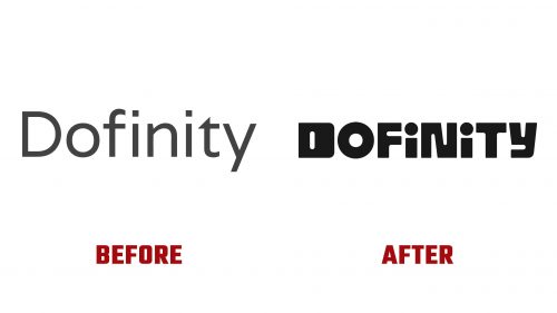
Introducing the new Dofinity logo signifies a bold departure from its predecessor, embracing a creative and playful approach that better captures the agency’s dynamic spirit and innovative prowess. The design leverages Source Type’s Reform typeface as a foundation, adopting a unique, somewhat unicase, and geometric approach that defies conventional categorization. This refreshing take on the wordmark injects a dose of personality into the brand, with each character of the logo specially tailored to stand out—except for the “O,” which retains a more conventional shape for contrast.
Animations are crucial in bringing the new branding to life, offering a series of engaging and whimsical transformations of the logo’s characters. These animations highlight the logo’s flexibility and playfully nod to Dofinity’s name, which resembles “infinity,” enhancing the brand’s identity with endless possibilities and innovation. Additionally, introducing an abstract icon set further complements the brand’s digital-first ethos; despite their conceptual stretch, these icons effectively embody the company’s values and stature as a trusted partner for industry leaders.
The choice of Reform for headline typeface across digital platforms, while maintaining visual consistency with the logo, raises concerns about overshadowing the brand identity due to their similarity. Meanwhile, Karl’s supporting typeface offers a casual, approachable vibe that contrasts with Dofinity’s sleek, innovative image, hinting at a deliberate blend of professionalism and approachability.


