Preparing for the opening of the original cafe, Dozer Coffee (Ann Arbor) has taken the formation of its external identity very seriously. Turning its attention to the creative, strategic development of Skidmore Studio (Detroit, Michigan), the brand decided to entrust its identity to this creative studio.
Distinguished by a non-standard attitude to preparing and presenting one of the most delicious drinks – coffee, which Dozer Coffee demonstrates, it clearly distinguishes it among similar establishments. It is one of the best in the hospitality industry, a part roaster, part cafe, part lounge. With its unique attitude to this process, Dozer Coffee has made coffee not just a delicious drink but has created a real art of delight out of the process of its consumption.
All this required a non-standard attitude to forming its own identity, which Skidmore Studio successfully coped with. The corporate identity had to reflect the early morning energy, which is conveyed by a cup of good and tasty real coffee. At the same time, all visual developments required versatility to apply to all members of the brand’s family.
When developing the logo, all options for its future placement and application methods were taken into account, including with the help of modern digital technologies.
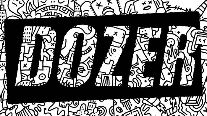
The formation of the visual style was based on the peculiarities of aesthetics characteristic of punk culture, which is distinguished by a vivid expression of its individuality, a demonstration of independence from generally accepted standards and stereotypes. This was matched by the simplicity and laconicism of the logo itself, executed in stock type on a black substrate with the help of negative white space, which formed the letters of the name – Dozer.
All external identification has taken on an unpolished, gritty appearance, filled with an abundance of bright accent colors, textures, and illustrations to create a perception of external balance. They perform their task very effectively – combining various elements into a single whole, which creates the required perception of the brand itself in the overall perception of the composition.
Looking through images that show a personal approach to the formation of image and style, you can notice the abundance of phantasmagoric, sci-fi illustrations, unknown creatures and monsters hidden behind graphic elements of Easter eggs, and a variety of stories from the field of history and coffee making. The development of a new identity became a demonstration of unique advertising art that gave viewers many reasons for thought, the desire to learn something new, explore, discover based on the spiritual side of Dozer Coffee, taught in a fun and naughty way.


