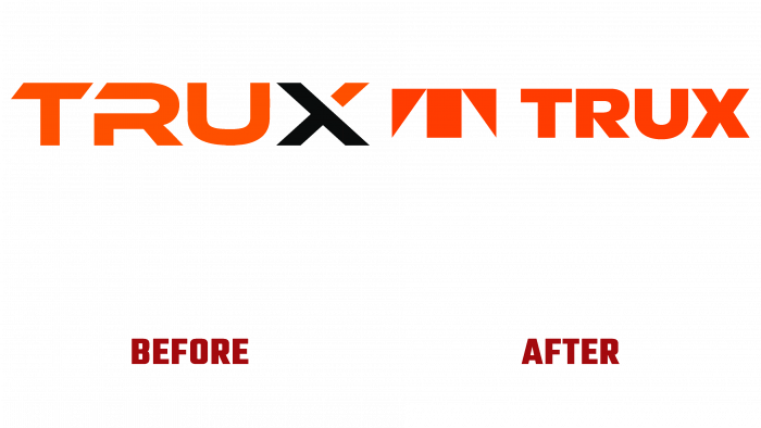
The developers of the popular logistics application Trux have announced a rebranding. Launched in 2015 to optimize logistics, trucking, building materials, and delivery companies, Trux has already become indispensable for 28,000 users. During this time, the platform’s user interface and its functionality have undergone several important changes that make it easier to use and expand its capabilities. This led to the need to “correct” the design of the application. The new look was supposed to reveal the upgrade that took place more fully.
Trux is a unique technology to optimize a wide variety of processes – planning, scheduling, providing feedback between the office and drivers, tracking time, and providing the operator with a complete picture of the movement of vehicles. This provides high efficiency of the logistician’s work and significant savings in time and money for the formation and delivery of goods.
Atlanta-based design agency Matchstic was responsible for developing the brand’s new look. The designers managed to convey technical innovations in a simple visual language understandable for users of all levels. With the help of the new identity, it was possible to highlight the main brand strategy – the fusion of heavy equipment, the human factor, and the latest technologies. The rejection of the use of analogs, “historicity,” and stereotyped solutions helped to achieve this. The decision to use the abstract letter “T,” stylized as a dump truck on the track with the full brand name placed next to it in a general color scheme, provided the logo’s required attractiveness and informational content. This, combined with the use of cinnabar color, provided the new logo with fresh perception, confidence in the need for this product, and a unique visual demonstration.
In the overall design, earthy shades of the color palette were applied using textures typical for various types of soil. This approach reinforced the specifics of the platform’s belonging to the logistics transport industry. Fonts such as Pilat Compressed and Mikro, with their simplicity, emphasized the ease of use of the platform. A well-thought-out grid layout, placing each branding element in a dedicated space, echoes Trux’s main goal – streamlining all transport logistics.


