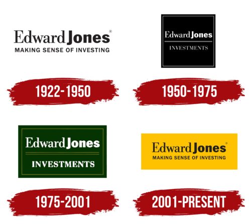
Simplicity, professionalism, and maximum informativeness are the priorities of this emblem. Therefore, the Edward Jones logo does not contain cumbersome elements and immediately informs potential clients of the company it represents. It looks like a large business card.
Edward Jones: Brand overview
| Founded: | 1922 |
| Founder: | Edward D. Jones |
| Headquarters: | St Louis, Missouri, United States |
| Website: | edwardjones.com |
Meaning and History
In fact, the roots of this company go back to 1872 when a prominent representative of the financial circles at that time, Jones, opened his financial institution in St. Louis. He was the founder of the business, which later became the main family business. Then, using the acquired base, his descendant established a similar firm.
From the beginning, the young organizer of the investment company aimed to cover suburbs and rural communities in the United States and Canada. Therefore, its branches appeared on both sides of the border, although this caused a flurry of problems. However, management found solutions, and the network expanded further, receiving a common name in honor of the founder – Edward David Jones. It served as the basis for visual identity: it simply changed forms as a result of rebranding.
What is Edward Jones?
Edward Jones is an American financial service providing investment services to the population, so the full name of the company is Edward Jones Investments. It entered the specialized market in 1922. The company was founded by banker Edward David Jones Sr. Its headquarters are located in St. Louis, Missouri.
1922 – 1950
The bright logo consists of a yellow rectangle, a single-line name, and the investment company’s slogan. The first row is executed in a combined font. The founders’ first and last names are almost connected, so the distance between them is minimal. To visually separate them and make the phrase clear, designers highlighted the second part with bold letters while keeping the first thin and elegant. The font also plays an important role: letters with serifs are on the left, while those without are on the right. At the bottom is the motto, “Making Sense of Investing,” reflecting the company’s concept and mission. It predominates with uppercase glyphs and extensions at the ends.
1950 – 1975
The most business-like Edward Jones emblem resembles an elegant business card and consists of a black square with a two-level inscription, separated by a thin horizontal line. The upper and lower rows are centered. The words “Edward” and “Investments” have sharp serifs, while “Jones” has none at all. Double borders frame the geometric figure.
1975 – 2001
The visual principle of dividing the name into two parts using different fonts was preserved, but the black square disappeared. In its place, a green rectangle was introduced, symbolizing the attraction of monetary flows. Designers also maintained the double frame. However, they supplemented the dividing line with another identical one in thickness and length. As a result, the logo became more expressive.
2001 – today
After experimenting with geometric shapes of various forms and colors, Edward Jones Investment Company chose a minimalist logo, where the main focus is on the text. There are two inscriptions: the company name and the slogan. The black letters on a white background look professional. They are distinct, clear, and expressive. Serifs are only used in the first word, while the rest have slab serif letters. The absence of borders symbolizes the limitless possibilities of investing, which attracts clients.
Font and Colors
The Edward Jones logo uses two types of typefaces. The first one is Clarendon, a classic serif font. The second font resembles Acumin Pro Semi-Condensed Black with minor modifications.
The company’s color palette consists of attractive colors that catch the eye and carry significant meaning: yellow represents gold, light gray signifies silver, and green symbolizes dollars. Black and white are also present to maintain balance.
Edward Jones color codes
| Fluorescent Orange | Hex color: | #ffc100 |
|---|---|---|
| RGB: | 255 193 0 | |
| CMYK: | 0 24 100 0 | |
| Pantone: | PMS 7549 C |
| Raisin Black | Hex color: | #221f1f |
|---|---|---|
| RGB: | 34 31 31 | |
| CMYK: | 0 9 9 87 | |
| Pantone: | PMS Neutral Black C |


