For those who are familiar with website building, the industry-leading Elementor workflow in WordPress is familiar and important. Creating websites with its help for more than seven years, web developers have long appreciated all its advantages and conveniences. Its self-taught creators, Yoni Luksenberg and Ariel Klikstein knew very well the urgent needs of designers, marketers, web developers, and they were able to satisfy them all with their application. Constantly evolving, the platform took into account the recommendations and requests of users, becoming more and more efficient and perfect. The basis for creating a new visualization was a respectful attitude to everything that has been achieved so far and an understanding that the company and its service can develop further, becoming more and more going beyond the dreams of its founders.
Being digital professionals, the founders were immediately able to identify the need to create a new digital world for web professionals, covering all the market’s needs. The new identity reflected an important feature of the brand – providing comprehensive digital independence in the context of the sharing economy. At the same time, visualization demonstrates an important brand advantage – the ability to use any web design, marketing, and development tools. The new visualization reflected this all-in-one combination, becoming the basis of a new strategy.
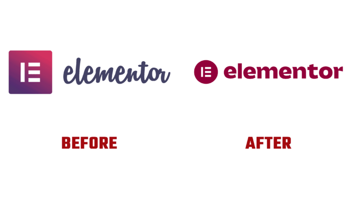
Keeping the main and most effective elements of the past in the new logo, the designers updated and improved them to the requirements of modern technologies. The original logo in its execution is a visual representation of three types of users. A new background has been developed, which is represented by a circle shape, symbolizing the community created by Elementor. A traditional classic font such as Serif was used to provide a professional look, adding authority to writing text elements.
When forming the corporate palette, an extraordinary approach was applied. His main colors are pink, green, and orange. At the same time, the palette was expanded due to additional shades of these colors. Each primary color has become a reflection of one side of the user audience. As a result, a unique and free visual language was created, which provided the possibility of forming three interfaces – a graphical one with three lines a photographic one in the spirit of creating your world. To express individuality, a character was created for which a series of unique and attractive illustrations and icons were created.


