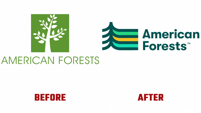
American Forests has unveiled its new logo to the public as a showcase for the transformation of the organization and the formation of a powerful new visual identity. American Forests is committed to caring for the environment, conservation, and reforestation throughout the US. As the planet’s lungs, the main soil protectors against forest corrosion, help slow climate change while maintaining a healthy Earth. Their protection and restoration is the main and important task of the organization, which is effectively conveyed through the new corporate identity.
The new company logo is a more effective visual demonstration of the spirit and direction of the company. His graphic performance allowed him to create a graphic composition that symbolizes the strength and comprehensive coverage of the movement of all the problems that characterize the critical state of the US forests today. Leading this movement in all cities of the country, the company strives to create a close-knit community of people united by a common idea – saving forests. This is what the new corporate identity and graphic elements of the logo successfully demonstrate. The stylistic image of trees used in it, converging with their tops at the top point, becomes a symbol of unity. At the same time, the upward direction of the graphic elements symbolizes the growth – the number of community members and the forest areas saved by them. At the same time, the lack of completeness of the top demonstrates the constantly growing possibilities and the expansion of the effectiveness of actions. The lines on the right side of the sign are a symbol of paths, routes laid by a person, with the help of which it is possible to complete the task, achieve the necessary progress in achieving the goal. They inspire hope that technology will not harm but will become a way to preserve wildlife successfully.
This visual demonstrates the four pillars of an organization’s performance – unity, hope, growth, and progress. The new logo is the baseline for all kinds of American Forests’ visual identity. It is designed to meet the demands of modern typography and digital technology. The name of the organization applied to the right of the sign is consistent with the height of the sign and aligned on the right side, which ensures harmony and unity in the visual perception of the entire composition. Placing words in two lines made it possible to ensure a compact composition and ease of reading.
The color palette includes a rich dark green color – a symbol of living and healthy nature “diluted” with a light green shade of young foliage, sprouting new plantings, and an accent bright light yellow solar demonstrates the strength and vitality of nature.


