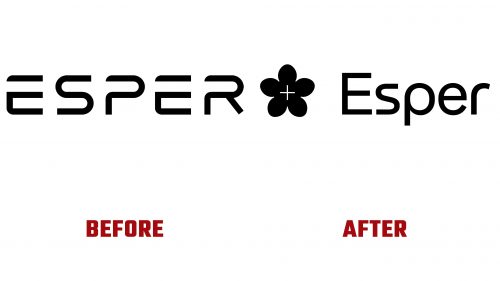
Esper Bionics, a trailblazing startup in human augmentation, has launched a new logo, marking a pivotal development in its brand evolution. This change reflects the startup’s ambitious drive to innovate in the realm of electronic implants and bionic ecosystems. Established in 2019 and based in New York, with additional R&D facilities in Ukraine and Germany, Esper Bionics is a key player in transforming the landscape of prosthetics and human augmentation technology.
Introducing the new Esper Bionics logo is more than a visual update; it’s a symbol of the company’s philosophy. The logo, an artistic representation of a flower with a slender plus sign at its core, beautifully illustrates the synergy between organic life and advanced technology, embodying the core mission of Esper Bionics.
Dima Gazda, the co-founder who brings a unique perspective as a medical doctor and serial entrepreneur, envisages a future where electronic implants go beyond mere augmentation, playing a vital role in combating diseases and extending human life. The company’s initial focus on revolutionizing prosthetics is a stepping stone toward a broader vision of creating comprehensive solutions for electronic implants.
The choice of HAL Matex for the logo’s wordmark resonates with the company’s innovative spirit. The typeface, a blend of geometric precision and organic fluidity, mirrors the fusion inherent in Esper Bionics’ work. Despite some minor challenges in letter sizing, the typeface successfully complements the logo’s design, reinforcing the brand’s forward-thinking identity.
The brand’s new identity extends into various applications, showcasing futuristic prosthetics in stunning 3D renders that highlight Esper Bionics’ technological prowess. However, the brand’s identity seems to explore multiple directions, from gradient applications to diverse layout designs, suggesting that a more unified approach could further strengthen its visual impact.
Photography is a critical element in Esper Bionics’ branding, focusing on people using prosthetics in their daily lives. This human-centric approach is vital but could benefit from greater consistency to better match the brand’s futuristic tone and narrative.
The Esper Bionics logo, with its sophisticated blend of natural and technological imagery, strategically positions the company at the crossroads of medical innovation and consumer technology. While it currently leans towards a tech-heavy image, infusing a bit more warmth could make the brand even more relatable.


