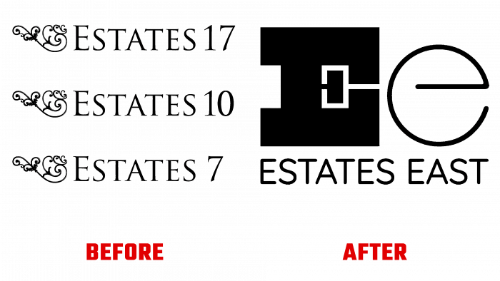
Estates 17, Estates 7, based in East London, have rebranded their own identity with Form branding. The rebranding covered all areas, including the design of the central office located in Walthamstow, all types of advertising – print and digital. As well as marketing materials. East London founder Neil Collins was attracted by the originality of the agency’s previous work, which focused on rebranding bands and festivals. He found it difficult to make a brand with such a profile visually successful. And what the design team showed was particularly good. The choice fell on Form.
The created visual identity and the new strategy of the agency were able to reflect the creative approach to each task of the company’s team. The vibrant and varied spirit that characterizes East London’s neighborhoods, its constant development bring the people and history of the neighborhood to the forefront, making them the centerpiece, the dominant elements of the brand. This approach provided the opportunity to visually appeal to the area’s residents, reflecting the current demographic situation. Thanks to the creative graphic reworking of the logo, the company was able to attract the attention of the new young “sprout” of the district, taking more advantageous positions and significantly expanding the domestic market coverage.
At the same time, with the help of rebranding, a manifesto was passed that broke the clichés prevailing in this area. With his help, the cardinal changes in the set of rules of the agency were conveyed to the consumer. The entire composition is focused on forming a monogram of two letters, “E” – uppercase and lowercase, which are selected from different types of fonts. Capital – Estates, a blend of industrial but artisanal East-end typography and modern serif typeface, speaks to the brand’s reliability, honesty, and transparency. The lowercase – denoting East is a showcase of East London’s creative young, and independent spirit. This combination guarantees a harmonious balance between the “heavy” performance of the first letter and the light dynamic – the second.
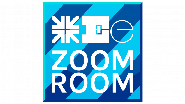
The accent elements of the composition are tiles in a variety of configurations. They consist of various symbols, arrows pointing exactly to the East. Their variety of configurations is to provides a flexible and even plastic visual identity. “Tiles” symbolize stability and constant relevance of updating, its practicality in use in various formats, on a variety of media, regardless of size.


