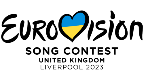
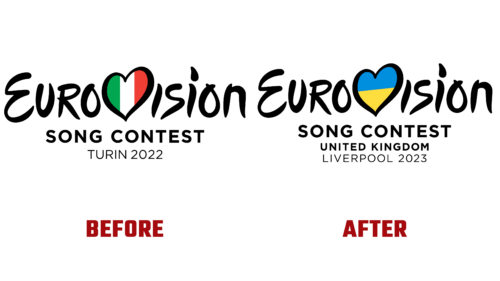
On October 7 this year, the EBU committee presented the emblem of the Eurovision Song Contest 2023. At the same time, he named the place that will host the festival. It was Liverpool – a musical city from the UNESCO list and the sister city of Odesa (Ukraine). He, accordingly, is indicated in the symbolism.
The logo is made in the traditional style and is graphic and textual. Designers did not deviate from the canons and used standard elements. The heart is in the center. It is drawn with smooth white curved lines. They have an average thickness corresponding to the width of the stripes that make adjacent glyphs. Thus, the heart is in harmony with the style of the inscription.
This is on purpose because it is in place of the capital “V” in the word “vision.” Its inside is painted in the colors of the flag of Ukraine – as a symbol that this country is the winner of last season and it was supposed to be the main organizer of a grand concert, but because of the war, it was moved to the UK.
The letters in the “Eurovision” lettering are soft and streamlined. They have roundings and no sharp transitions, and the corners, despite their presence, do not look too sharp. In general, the design of the text resembles strokes applied with an artistic brush.
Below is the phrase “Song Contest,” which is typed in bold grotesque. The font is strict, even capital. This is followed by a line with the designation of the country where the international music festival will take place – “United Kingdom.” Beneath it is the name of the host city in fine sans-serif glyphs.


