


![]() Everton Logo PNG
Everton Logo PNG
The Everton logo is connected to its home district and the club’s founding history. The emblem features a local tower, a symbol of tradition and pride. The laurel wreaths convey a sense of victory and aspiration, reminding us of the team’s strong roots and character.
Everton F.C. was founded in 1878 by Reverend Ben Swift Chambers as St. Domingo’s FC, giving local youth a winter activity beyond cricket. The team won its first match 1:0 and soon attracted players beyond the parish. In November 1879, it was renamed Everton, after the district, while the nickname “Toffees” came from a nearby sweet shop.
The club initially played at Stanley Park and Priory Road, moving in 1884 to Anfield, rented from brewer John Houlding. In 1888, Everton became a founding member of the Football League and won its first title in the 1890–1891 season.
A dispute with Houlding over rent and control led to a split in 1892. After he failed to register a new Everton entity, he formed Liverpool F.C. Everton moved to Goodison Park, which was opened the same year as one of England’s first purpose-built football stadiums.
The interwar period brought success with Dixie Dean, who scored 60 league goals in 1927–1928, a record that still stands. Everton won another title in 1938–1939 before World War II halted competition.
Stability returned in the 1960s under Harry Catterick, with league titles in 1963 and 1970. The 1980s became the club’s strongest era under Howard Kendall. Everton won the FA Cup in 1984 and the European Cup Winners’ Cup in 1985, defeating Bayern Munich and Rapid Vienna, and also won another league title.
The ban on English clubs in European competitions after 1985 limited further progress. The last major trophy came in 1995, when Everton won the FA Cup under Joe Royle.
Meaning and History
![]()
All of Everton’s emblems fall into two types. The first category includes stylized letters “E,” “F,” and “C” standing alone or in a monogram. This is an abbreviation of the football club’s full name, Everton. The second group is more numerous. It includes graphic signs featuring the top of Prince Rupert’s tower, a heraldic shield, and two laurel wreaths. There are also combined variants in which letters are paired with a shield or a tower.
What is Everton?
It is a football club that plays in the Premier League. It is located in Liverpool and holds its home matches at the local stadium, Goodison Park.” The sports organization was founded in 1878 and became one of the founders of the English Football League the following year. The following season, it won its first championship.
1920 – 1931
![]()
The monogram on a blue shield introduced by Everton in 1920 marked the beginning of the club’s logo history. Supporters saw three interwoven letters E, F, and C for the first time, spelling out the full name Everton Football Club.
The shield featured outlines that were uncommon for football crests. The top was curved, and the sides curved smoothly, widening toward the bottom. A double border outlined the shield’s silhouette. The background was filled with a deep blue, which became the club’s primary color for many years.
Inside was a white monogram with elongated letterforms. The typography drew on Victorian traditions, with hints of Gothic influence.
1938
![]()
At the end of the 1937–1938 season, Everton secretary Theo Kelly initiated the development of a new club badge. The work took nearly four months. The design was based on Prince Rupert’s Tower, one of the oldest structures in the Everton district of Liverpool, built in the late 18th century. In the past, the building served as a temporary holding place for offenders and intoxicated residents.
The result was a shield with a shaped outline and a stylized image of the round tower inside. The structure was rendered as a line drawing, with its silhouette defined by a conical roof and a circular staircase at the base. Symmetrical laurel wreaths associated with Victory were placed on both sides.
Above the shield, the official club name Everton Football Club Co., Ltd. was set along an arc. The inscription used a Gothic typeface with wave-like elements and broken strokes. Below the shield was a ribbon carrying the Latin motto NIL SATIS NISI OPTIMUM, divided into three parts.
Originally, Theo Kelly intended the badge for use on staff ties. Later, when he became head coach, he saw his design adopted as Everton’s official symbol.
1972 – 1976
![]()
In 1972, Everton introduced a simplified badge, moving away from the complex heraldic structure and accompanying imagery. The new version was built around the three-letter abbreviation EFC.
The composition was oriented vertically with a slight slant. The letters were arranged diagonally from top to bottom. E occupied the top position, F was placed below, and C completed the sequence.
The design used the club’s blue color and a calligraphic typeface with flowing lines and fine curls. In style, the lettering echoed classic script fonts such as Edwardian Script or Palace Script.
1976 – 1978
![]()
In 1976, the club presented an emblem that maintained a minimalist and restrained approach. The mark was reduced to three capital letters: E, F, and C.
The composition was arranged horizontally. All letters were set on a single line and rendered in blue. The typography was based on simple geometry. The typeface was a sans-serif and stylistically close to Helvetica or Univers.
1978 – 1982
![]()
After a series of experiments, Everton returned to the 1938 emblem and reworked it to fit a later aesthetic. The logo was a circular shape with a blue border. Inside, at the top, was the inscription EVERTON F.C. in uppercase letters. The typeface was sans serif.
Inside the circle sat a shield with a wavy top edge. The shield outline was highlighted in green, and the inner field was filled with dark blue. Inside stood a white tower with a conical roof and detailed masonry. Two symmetrical green laurel wreaths were added on either side of the shield.
At the bottom of the emblem was a blue ribbon divided into three sections. The abbreviation EFC appeared in the center, with the Latin motto NIL SATIS NISI OPTIMUM placed on the sides. The lettering used a simple typeface. The ribbon featured soft curves.
1982 – 1983
![]()
In 1982, Everton revised the emblem design. The shield and the motto were removed, while the main symbols, including Prince Rupert’s Tower and the laurel branches, were retained. The mark was placed inside a circle with a double border. The outer line was blue, the inner line white.
The background inside the circle was dark blue. At the top, set along an arc, was the word EVERTON in yellow uppercase letters. The typeface was sans serif, closely resembling Futura and Gill Sans Bold.
At the center was a yellow tower with detailed masonry at the base and a sharp top. Symmetrical laurel branches with large upward-facing leaves extended along the sides.
1983 – 1991
![]()
Everton updated the club badge again, moving away from a circular form. The new version was built around lettering and familiar symbols.
At the top were the three letters E, F, and C. They followed an arc, were slightly curved, and rendered in dark blue. The letters were large, serifed, and stylistically close to Clarendon.
A yellow tower, a symbol of Everton, occupied the lower section. The drawing was simplified and linear. Brickwork was shown at the base, with a rectangular window above, and the top was finished with a sharp point, suggesting a roof. On either side of the tower were two symmetrical wreaths in the same yellow color, formed from dense leaves and meeting at the bottom.
1991 – 2000
![]()
In the 1990s, Everton reintroduced the 1938 emblem with minor design changes. The version was updated without major changes, keeping the core elements intact.
The base of the badge was a heraldic shield with a wavy top line and soft side curves. Its outline was rendered in a rich blue color, with a white interior field. A tower with a conical roof stood at the center. The brickwork was shown as a grid of horizontal lines, without fine detailing.
Two laurel wreaths were placed on either side of the tower. The leaves were short and dense, oriented upward. The wreaths were executed in the same shade of blue. At the bottom, a ribbon-shaped scroll was added, with curled ends and three bends. The motto “NIL SATIS” appeared on the left and “NISI OPTIMUM” on the right. The letters were white on a blue background, set in a sans-serif typeface.
The club name was removed, leaving a set of symbols long associated with Everton.
2000 – 2013
![]()
The Everton logo from this period repeated the previous design, adding more color variation and a new detail. The main color inside the shield shifted to light blue, with a gradient from darker at the edges to lighter toward the center. The transition created a highlight effect in the middle, emphasizing the key elements.
At the center stood a white Prince Rupert’s Tower. The tower was drawn in simplified form and built from stylized brick blocks. Short horizontal strokes suggested masonry. Two white wreaths were added on the sides, symmetrical and balancing the composition.
The shield was outlined with a thin yellow line. The numbers 18 and 78 appeared on either side in dark blue, together indicating the club’s founding year.
Below the shield ran a blue ribbon with the motto NIL SATIS NISI OPTIMUM in white letters. The ribbon also featured a yellow outline, echoing the shield border. Below that, a new detail was added: the word Everton. The lettering used a blue serif typeface, close to the tone of the numbers. The emblem had no shadows or perspective, with depth created through blue tonal transitions and the combination of blue and yellow.
2013 – 2014
![]()
In May 2013, the club introduced a new logo, but it was used only briefly and drew a strong reaction. The laurel wreaths and the familiar motto were removed. An online petition opposing the update appeared and gathered thousands of signatures within days. The club agreed to return to the previous look, but the new emblem had already gone into production, so it was used throughout the following season.
The logo retained the English shield shape. The inner field was filled with a solid dark blue color. The outline was made double, with a black inner line and a yellow outer line.
A white Prince Rupert’s Tower was placed at the center. The tower was simplified but kept key details, including the conical roof and several horizontal masonry bands. Light shading was added on the left to suggest volume. The numbers 18 and 78 were placed on either side of the tower, marking the club’s founding year. The numerals used a rounded typeface with soft serifs.
The name Everton was positioned closer to the lower edge of the shield. The lettering was set in a serif typeface, closely resembling Plantin or Bembo. The removal of the motto and wreaths made the badge stand apart from earlier versions.
The Everton logo from this period is remembered mainly for the supporters’ reaction and for the club’s reversal of the update.
2014 – 2021
![]()
In the fall of 2013, Everton unveiled a new crest and, for the first time, gave supporters the right to choose the badge. The club offered three designs and held a vote among registered community members. The more traditional style option won. The design included Prince Rupert’s Tower, laurel wreaths, a shield, the motto, the team name, and the founding year. The emblem was officially introduced in the summer of 2014.
The base of the badge is a classic shield with a deep blue background. The outline is double. The top of the shield has three raised points, and the bottom tapers to a sharp point.
At the center stands a white Prince Rupert’s Tower. The silhouette is vertically elongated, with a conical roof. Horizontal bands on the structure suggest masonry. On either side of the tower are two symmetrical wreaths made of short leaves.
Below is the name Everton. The lettering uses a serif typeface that closely resembles Bembo or Palatino. Beneath the name is the year 1878.
Below the shield runs a ribbon with the motto NIL SATIS NISI OPTIMUM. The letters are white, and the text follows the ribbon’s curve.
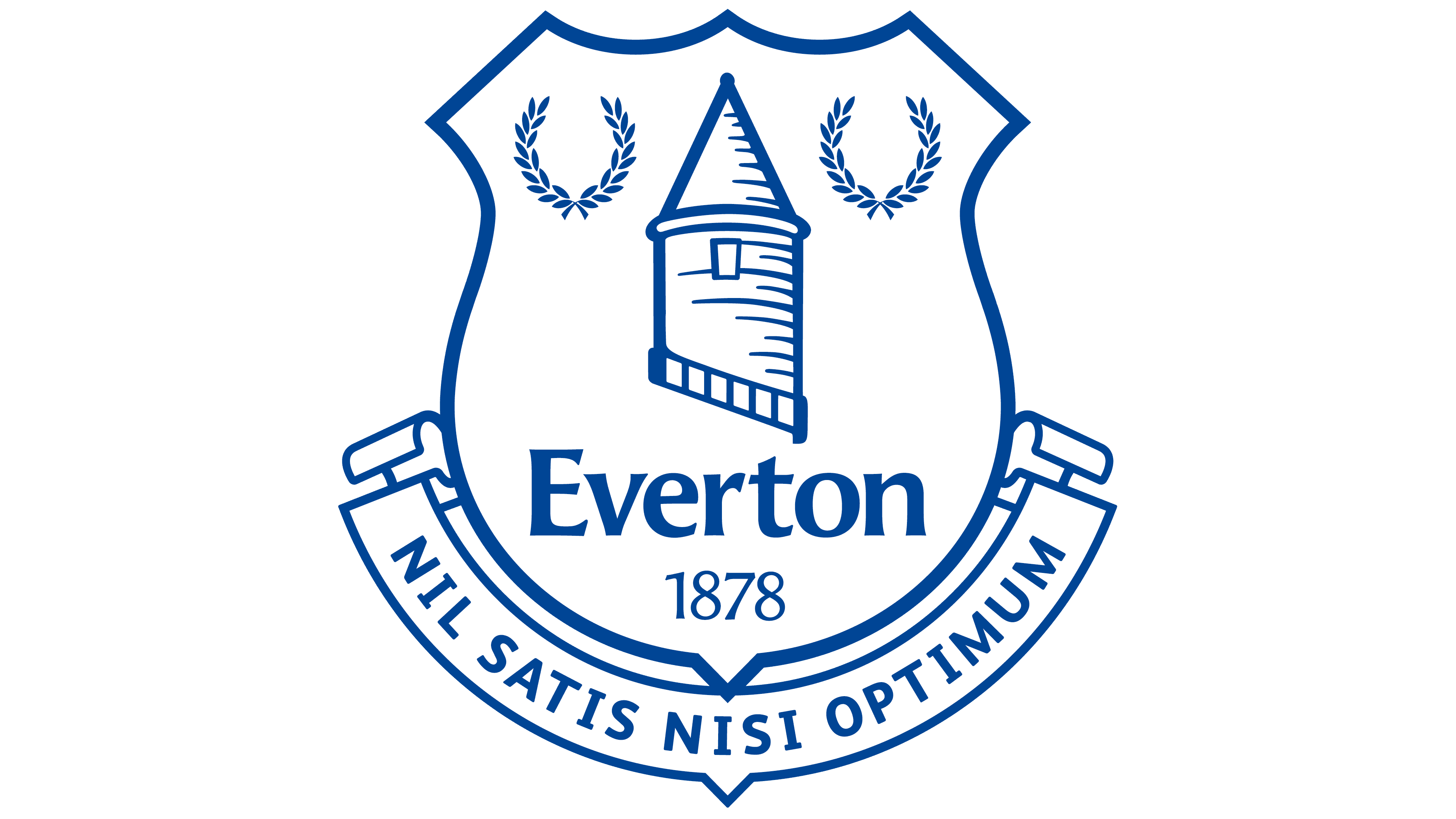
2021 – today
![]()
With the logo update, the club limited itself to small adjustments and did not change the composition. The shield, tower, wreaths, and their placement remained the same. The main changes affected the color. A more saturated bright blue replaced the calmer blue, giving the badge a different appearance.
The shield shape remains the same, with three points at the top and a sharp bottom. Prince Rupert’s Tower is shown in white, with a conical roof and horizontal bands resembling rows of masonry. On the sides are two laurel wreaths made of short white leaves, placed symmetrically.
Below the tower, the name Everton and the date 1878 remain. Beneath the shield runs a blue ribbon with the motto NIL SATIS NISI OPTIMUM.
The new color scheme made the emblem brighter and more in line with contemporary club badges, while all familiar symbols remained in place.
Font and Colors
The word “Everton” and the Latin phrase “NIL SATIS NISI OPTIMUM” are written in different fonts. The team’s nickname is typed in an elegant serif font similar to FF Angie DemiBold. The creator of the FF Angie family is typographer Jean-François Porchez. In the motto, a bold sans-serif was used instead.
Over the course of a hundred years, the club changed inscriptions, rearranged the laurel wreaths, and experimented with Prince Rupert’s Tower, but never abandoned the color blue. Designers only periodically complemented it with green, white, and yellow. This is the most distinctive feature of all “Everton” emblems.