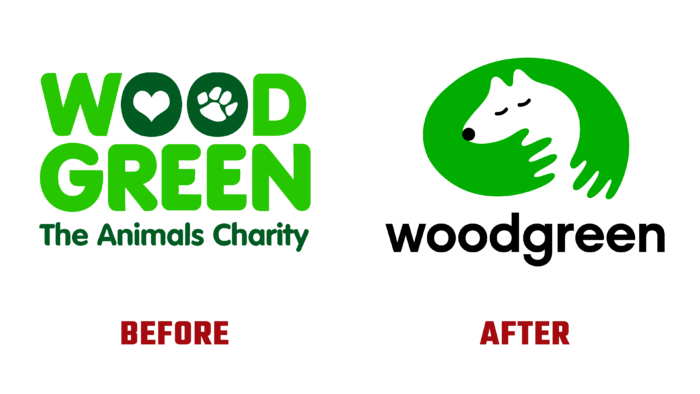
On the eve of its century, the world famous company Woodgreen felt the need for a radical change, starting with forming a new identity. Every day there is an opportunity to receive professional advice and support for pet owners at any stage of raising pets. A general and individual plan is created on an extensive program, including the regimen and methods of nutrition and treatment, behavioral training, and recommendations for owners. After the training and training period, each pet becomes the owner of his loving home and trained owner. The brand not only accepts the homeless but also provides owners with several important services, including free consultations by phone and via the Internet. The company organizes information support, seminars, and classes, which, among other things, inform its current and future customers about its updated visual identity.
The change began with a completely redesigned company strategy to reflect Woodgreen’s uniqueness by focusing on the close bond between pets and people. At the same time, it was noted that the former is the heart and main focus of the brand. A touching symbol reflecting this inseparable connection, which effectively used both positive and negative space, became the center of the corporate identity. In this way, it was possible to very accurately reflect the direct dependence of these groups on each other. The slogan – Helping pets and their people, placed under the logo, perfectly sums up the idea that the company looks at all problems from the point of view of a pet.
All images of the identity are very important in expressing the essence and meaning of the brand. Photos of pets are concentrated at eye level of the latter, making them the center of attention. All images are documentaries made by professionals, staff, and volunteers. They are an integral part of the story, demonstrating all the nuances of the ongoing charity. Additional works highlight an important connection and core mission.
The font selection was due to the need to reflect the tone and personality of the company. The applied type Raisonne Pro from Colophon Foundry is the main type used in all elements of identification, demonstrating the kindness, high qualification, and professionalism of the company’s employees. Modern and simple, it forms a distinctive voice that reflects all of Woodgreen’s communication styles.
In this way, a visualization is formed that allows you to convey all the values, compassion, and social benefits that create a special relationship between the company and its customers.


