For more than ten years, the Movable Ink brand has fallen in love with more and more new customers. The company specializes in creating unique visual creatives for email, websites, advertising to digital marketers, making personalized designs on demand.
As the executive creative director of Lindie Gerber emphasizes, the brand is significantly different from other digital companies, whose corporate culture is dominated by blues and blues. Evolutionary and unconventional was using a pinkish-purple hue in the logo interspersed with neon colors of light turquoise. Such a bright combination of colors with a soft elongated black font symbol “MOVABLE” and a white inscription next to “INK” in capital letters expressively indicates the restless imagination of creatives. It makes it clear that the agency can set a special tone for a starting startup.
When the logo was conceived, the competitors were probably only thinking about whether to dare to make such a creative experiment in identity or not. But the guys from Movable Ink decided to fully live up to the name of their company and make their recognizable chip out of the digital bright spot.
Representation of any business begins with a logo analysis. And suppose it is organically combined with the name of the company. In that case, this is already a guarantee of a further increase in interest in the brand, a path to a loyal customer’s heart and profit prospects. The authors of the Movable Ink logo have always emphasized that their company is a promise. A promise to lure, delight, impress and inspire creative solutions and interactions for creative purposes.
By the way, another message of the logo is magic. This is the magic of colors combined with fun and multiplied by innovation. The brand management notes that they pioneered the field in 2010 and have not lowered the bar for digital creative products industry leadership.
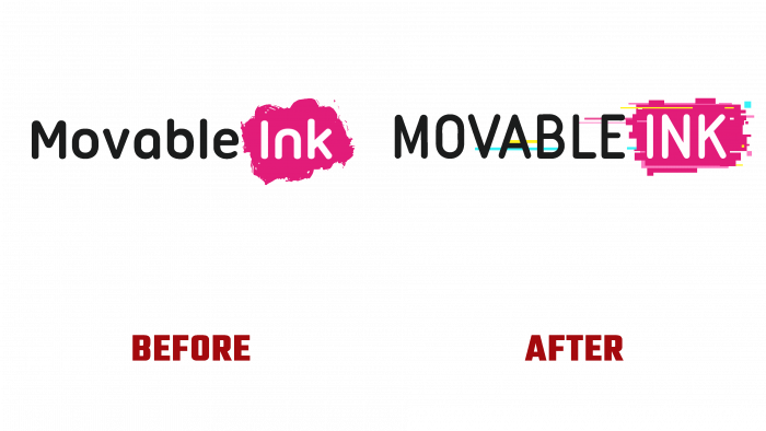
Previously, the logo was not that bright. It was an inscription in a similar font, more rounded and as if expanded. The pink blot looked like a rough brushstroke, but it didn’t create an intrusive effect. The spot is rounded, without clear boundaries, but looked great nonetheless. Yes, the old one is more static, timid, dumb, and out of balance compared to the current logo.
The current one, with new stripes in the form of a rectangular digital brushstroke, as if dissolving into the air, reflects the new era of brand identity, new stages of the company’s development. Tradition and convenience, which used to be held in high esteem, have replaced digital art and expressive colors.
New challenges of modern society, tasks, and business goals changing in a chaotic world explain the craving of creative agents of such famous brands as Movable Ink to keep up with the times, keep a bright brand and delight their customers with eye-catching visual products.


